App Redesign
Redesigning the UI of an association management application
Overview
While working on AGrENDA and MinForening, I sometimes had some downtime. I used some of that to start working on a redesign for the MinForening app that could be used for another version, intended to be marketed for companies.
At the time of writing, this is still an ongoing project put on pause while I worked on this version of my website.
Role
UX/UI Designer
UX & UI Design, Prototyping & Testing
2021
Background
MinForening is a free platform for organising the matters of various associations. The app is used for users to interact with the associations and groups they are part of, but does not offer administrative tasks that the web version does. In my free time, I decided to try to make a new UI for the app, one that would fit the iOS native theme better. This was unprompted and was a private undertaking for the purposes of practicing my skills.
What I achieved
I got to practice my skills in Adobe XD and Illustrator, as I have created all icons and elements from scratch. Projects like this are a great way of keeping my skills sharp.
Having a go at it
With the redesign, I wanted to address some problems I had with the original design. I wanted to create a version that has both light and dark themes, as this option was missing from the original design, tweak the chat interface, and create a new menu in which more settings and future additions to the app would take place. Another focus of mine was to provide an alternative to the activity wheel, as described in the following section. I like doing everything myself if possible, so I designed the icons used in this prototype and tried to create a new logo that retains the spirit of the original with a fresh coat of paint.
The Activity Wheel
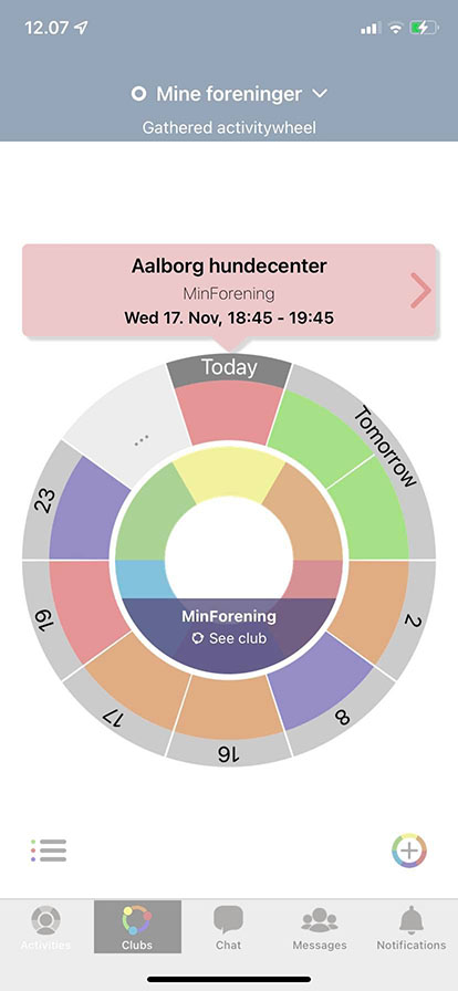
One key focus was creating an alternative for the app's activity wheel. While it is nice to play around with, I feel its "form over function". One of the issues is that it just packs upcoming events next to each other, which does not sufficiently inform the user about the time span between them. Another problems is as more events populate the wheel, it becomes really crowded and makes it hard to interpret at a glace.
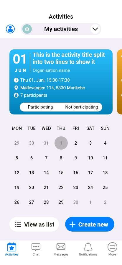
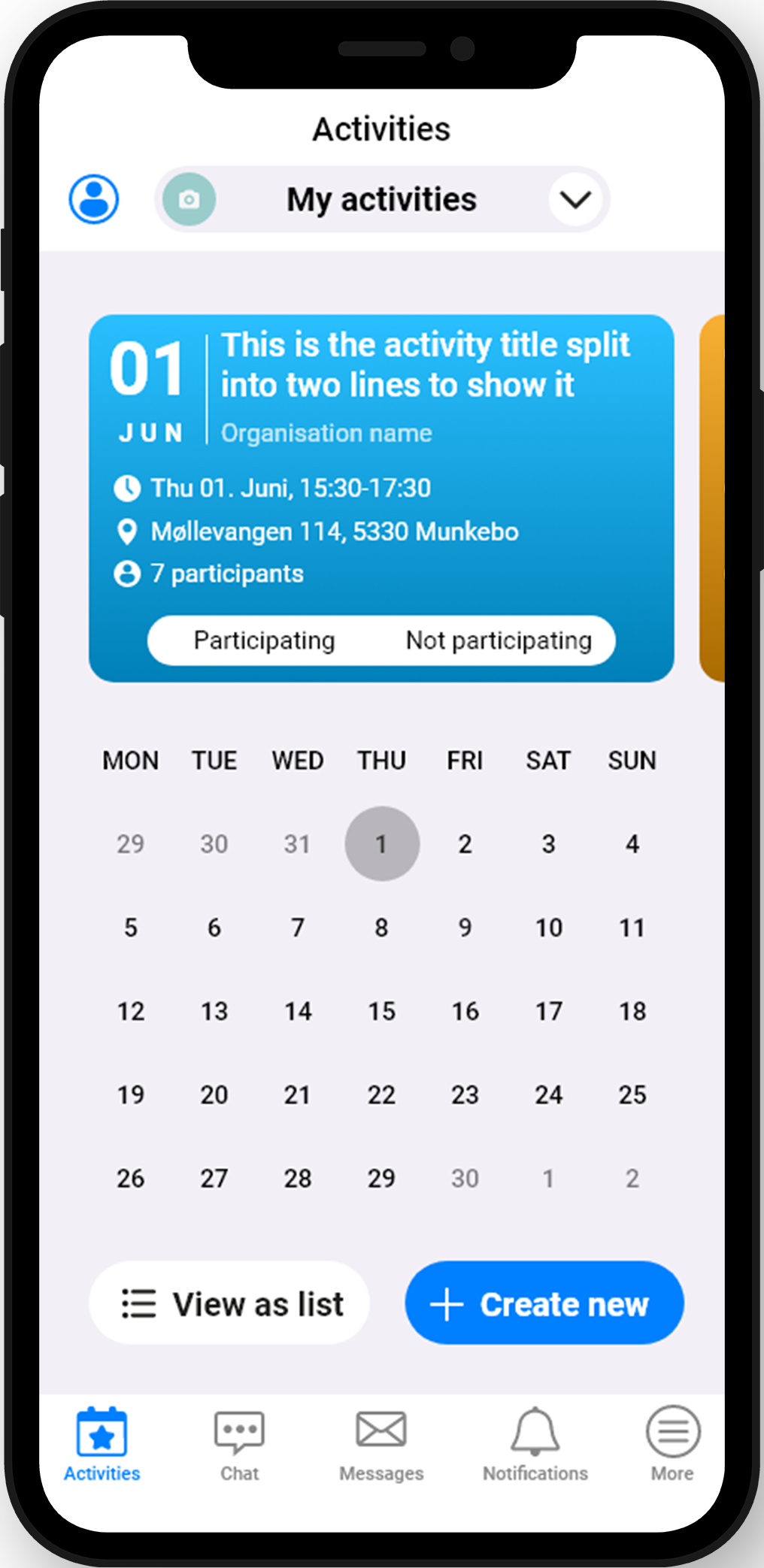
My solution was to replace it with a section for cards that contain information about the event, using a different background colour for the different event types, followed by a calendar that marks the current date and the date of the upcoming event. This approach was my attempt to make the design communicate more to the user at first glance. The cards themselves also match the style of some iOS widgets.
At the same time, I tried to merge the "Activities" and "Clubs" tab of the original, as they served the same purpose but listing out activities for users or associations, respectively. Doing so frees up a spot on the navbar, leaving space for a menu element, in which settings and additional features can be put.
One feature I have not gotten to so far, is having small dots in the calendar under dates that have events scheduled.
Minor touch-ups
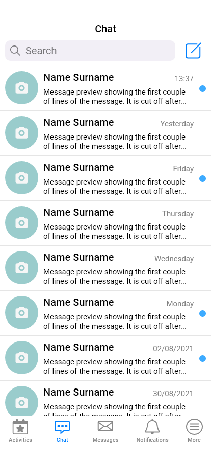
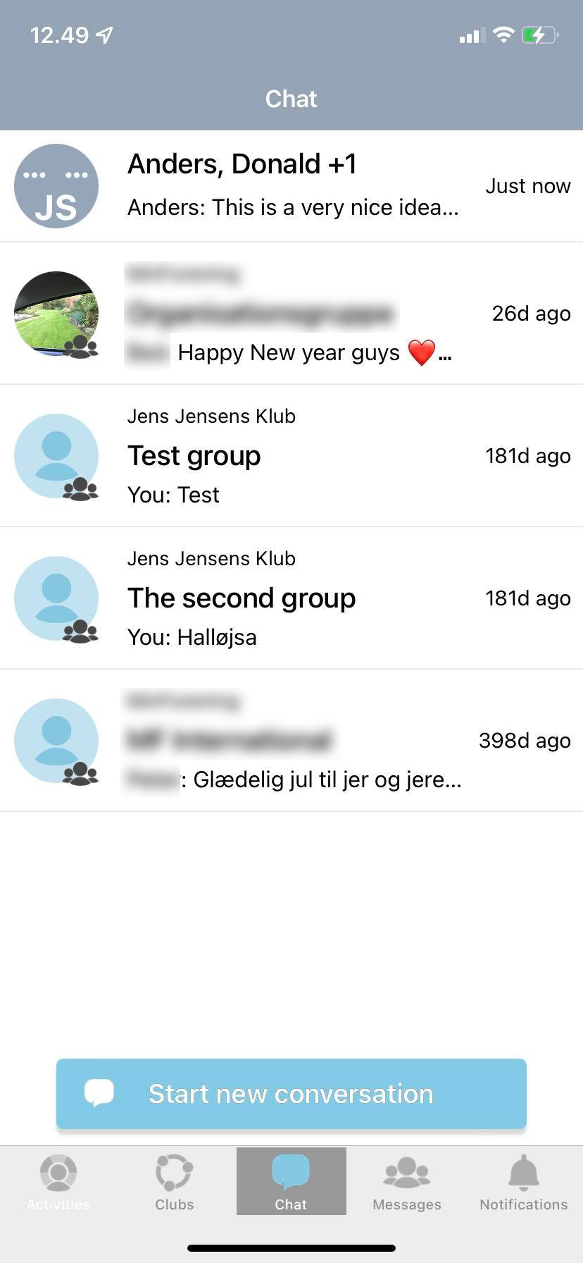
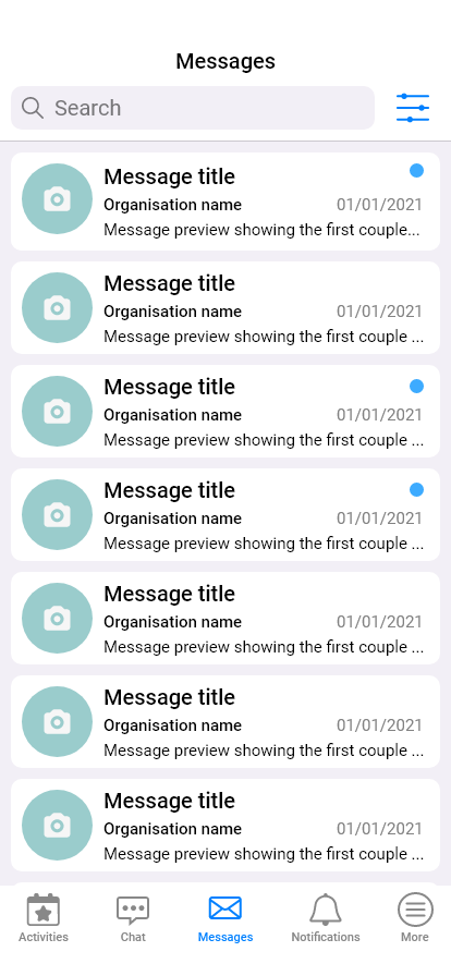
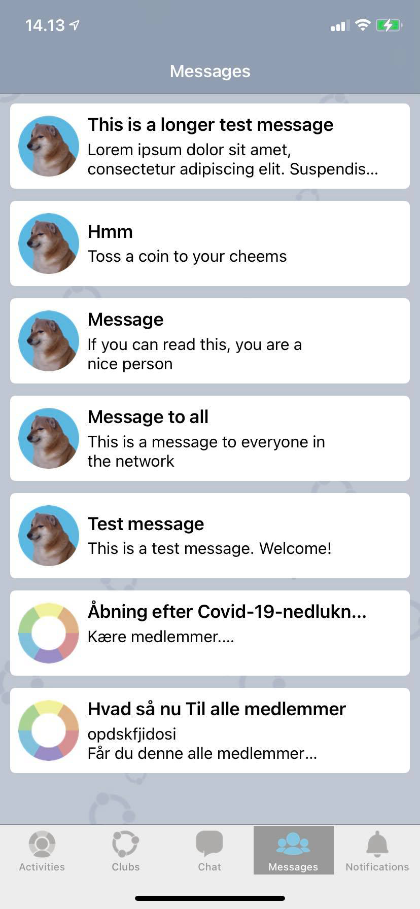
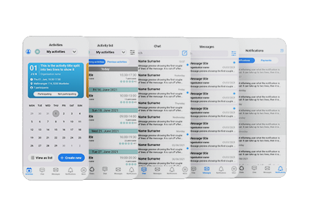
I did not make major changes to the "Chat" and "Messages" tabs. I adjusted the colours and made it look more in line with the rest of the iOS design. The biggest change on these tabs is the search bars, added for ease-of-use when looking for a specific sender or content within messages and chat histories.
On the "Chat" tab, I moved the create new chat up in the top so it would not obscure the last chat displayed in the window. At the same place in the "Messages" tab, I put a filter used to filter messages by Organisation. I also gave a new icon for "Messages", as the previous one did not match the content.
Even smaller touch-ups
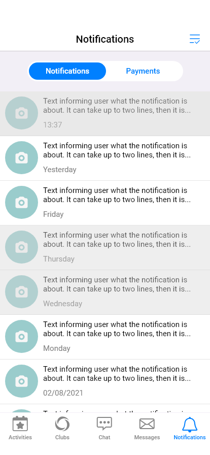
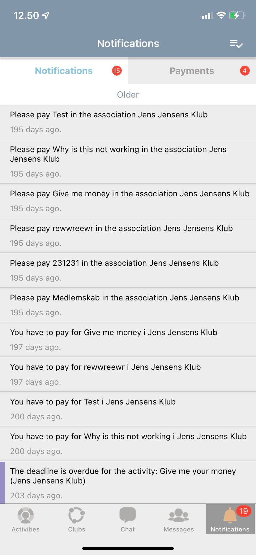
Much like with the previous two tabs, I left "Notifications" largely unchanged, just changing it enough for it to be in line with the rest of the redesign. One change that is not visible in the prototype is the change in how the notifications are worded. I made them a bit more concise.
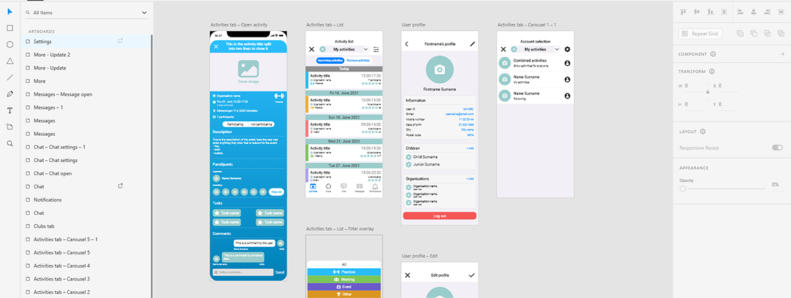
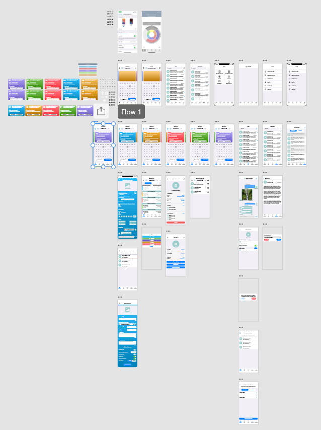
The prototype features some screens and popups not shown on this page, but are implemented in the prototype. You can see the state of the project on the image below, and I'll make the prototype publicly accessible once it's done.
Next steps
There's not a lot needed for me to consider this project complete. There are a few screens that
I'd
like to add and I plan on finalizing the colours. Once the project is complete, I will update
the
page accordingly. If you have any questions, feel free to reach out!
This was one of
the first tasks I did, and looking back now, it's woefully lacking. I can do better with my current
skillset, and when time allows, I'll try to revisit this project and do it in a way that better
represents what I can do now.
