Content Creator
Updating content creator for improving user experience
Overview
The goal of this task was to provide a redesign of the content creator on a web administrator platform, because users expressed frustration over using it, and were resorting to alternative methods, such as using the mobile app instead as it caused less frustration.
I conducted user interviews to see what exactly is causing the frustration to our users, and this research yielded some unexpected but nevertheless beneficial findings.
Tasks
Redesigning the content creator involved:
Competitor Research, User Research, Prototyping & Design, Testing, Validation & Evaluation
Background
This project involved redesigning the user interface of a content creator used within our clients' web administrator portal. We had received negative feedback and learned that users often preferred the mobile app's content creator over the web version. Having prior experience with the content creator, I was eager to take on this challenge. It was clear that a significant and comprehensive overhaul was necessary, rather than minor tweaks. However, the focus needed to be on the users' needs and experiences, not just my own ideas. I began by conducting user research to identify the sources of user frustration and simultaneously explored state-of-the-art solutions from other platforms.
The solution that was the subject of redesigning was the only content creator the applicatoin used across all the modules. This meant that this creator was used in modules that were meant to post short-form content where additional content types mattered little, as well as for writing long-form content. For this reason, an "offshoot" content creator was designed to be used in modules such as the social walls and ideas, so this time we needed to create something specifically for articles or long-form content.
What I achieved
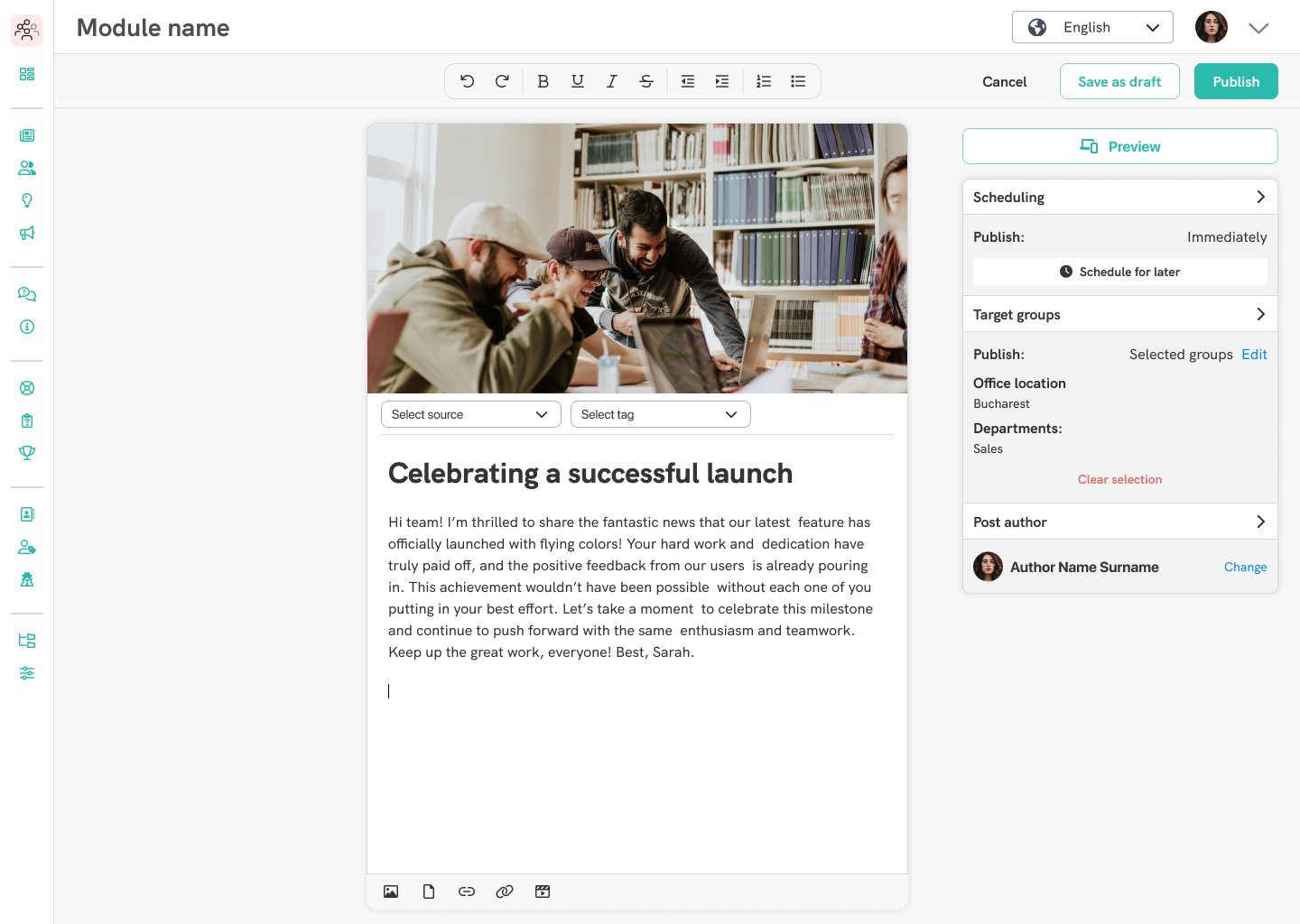
The outcome is a completely redesigned user interface that allows users to create content more easily and quickly, minimizing cognitive load by simplifying the number of UI elements. The new interface aligns more closely with familiar solutions, as identified through user interviews. Furthermore, only one new content type was introduced—a gallery element—ensuring that implementation required minimal time and effort from developers. Importantly, the new interface is largely compatible with all previous entries created with the older version.
Research: competitive analysis and user interviews
When the task landed on my desk, I started out by looking at other content creators that are in use on major sites that might be used on other major platforms. These included Facebook, Wordpress, LinkedIn, and more. It was important that this content creator was distinct from some of these other solutions in that it was not only meant to write short posts such as on Facebook, but it should support long-form content where various content, such as images, embedded videos, hyperlinks and more should be able to be freely placed anywhere in the content.
I found the closest solutions to what I was aiming for was LinkedIn's article writing interface and the content creator on WordPress, so these served as the main source of inspiration in the early steps of wireframing, while the user interviews were being set up. I didn't want to take these concepts further without seeing the findings from the user interviews.
For these interviews, I identified users who either use our content creator, or any other solutions on other platforms as part of their jobs. The interview questions drafted for this research aimed to find out the following:
- What content creators do they use to accomplish their tasks
- If they use the our content creator, do they prefer the web administrator portal or the app, and the reason for their preference
- Their overall experiences with our solutions
- What aspects of the current design they would like to see addressed
- What parts or features of any content creator are crucial for them to complete their tasks successfully
- Their process of writing and publishing content
- And finally to elaborate and illustrate an interface that would work best for them to create and publish content
These findings were then combined into a larger document, in which I write more about the purpose of these interviews, followed by a summery of takeaways, with bulleted lists for the key findings. This was followed by notes of observations from the interviews. These included anything from troubles navigating the web administrator platform's user interface to other thoughts relating to the current implementation. These sections were followed byth e user illustrated interfaces and the full text of the interviews. This document can be read below:
Findings from the interviews
The interviews yielded some very important findings, and we discovered some new issues, that were not considered earlier. One such example is that the users preferred the mobile application for creating content because they had access to the images on their device, while on the web administration platform, users have to interact with a rather cumbersome legacy file manager that adds unnecessary complexity and frustration into the content creation process. Discoveries such as this is why I always advocate for involving the end-users in the design process. We found a major usability and user experience issue that otherwise could have gone unnoticed until after implementation was complete. This way we not only managed to save time and energy, but we could address a point of frustration and overcome it in the next implementation, greatly increasing user satisfaction and adoption rates.
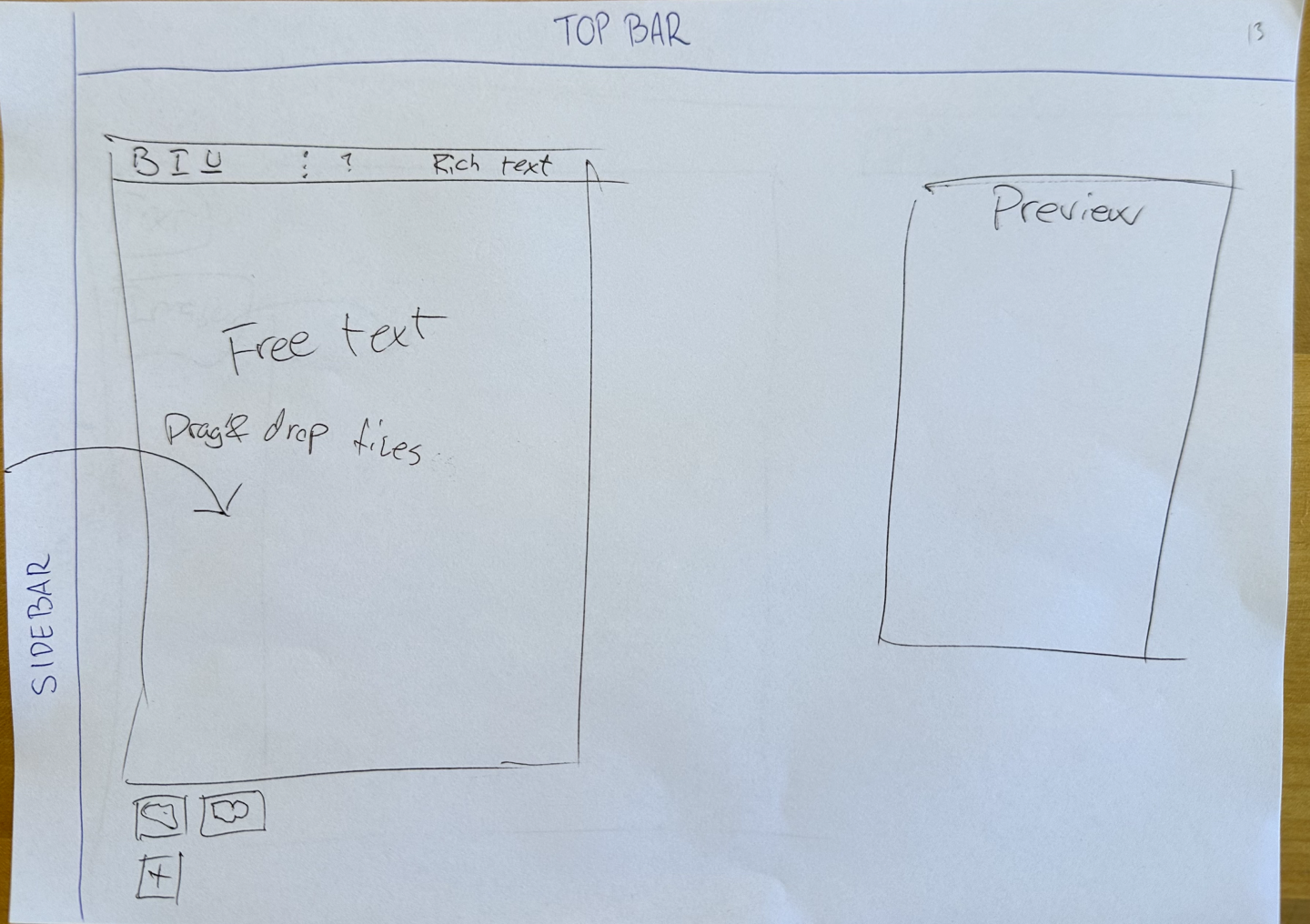
As for the other state-of-the-art solutions users are using, LinkedIn, Facebook and Instagram came up the most. Users wanted a single element they can edit the content in, which is in stark opposition of our current implementation.
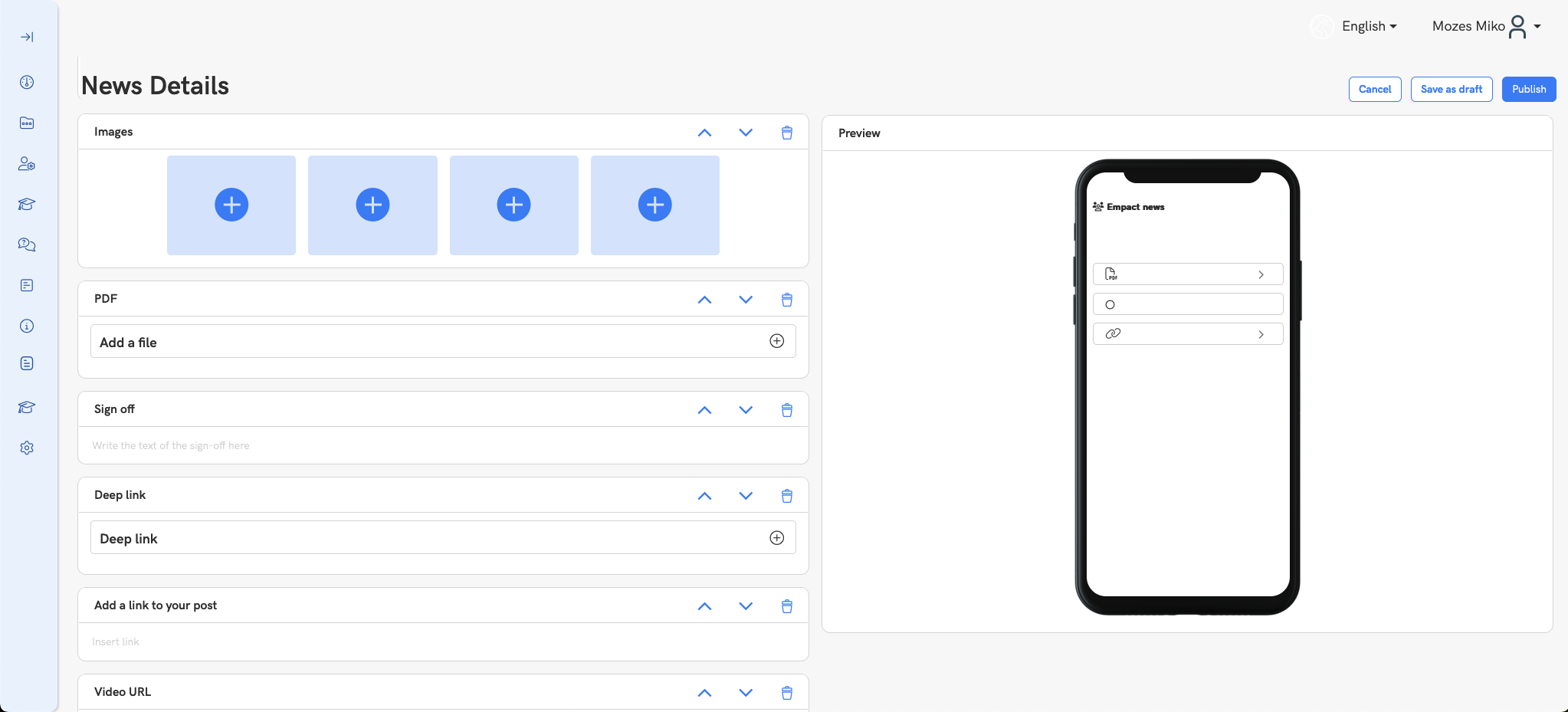
Users expressed frustration that the current content creation process took too long, having to add each piece of content in the form of content blocks. While these could be arranged any way the users desired, they introduced significant cognivite overload to the users, and made it difficult for them to arrange the text the way they desired. It required additional planning on their part, often forcing them to use other tools such as Microsoft Word to create the post. The goal now is also to keep them within our ecosystem, taking the burden of swapping between tools off their shoulders.
Another important finding was that certain settings, such as post scheduling and setting target groups cluttered the UI further, and in many cases were irrelevant to the user. These have been moved and redesigned to enable for a clean, overseeable interface while still maintaining functionality. "Post expiration" was met with universal confusion, and users stated that they would not expect to have any piece of news expire, so this was removed from the new design.
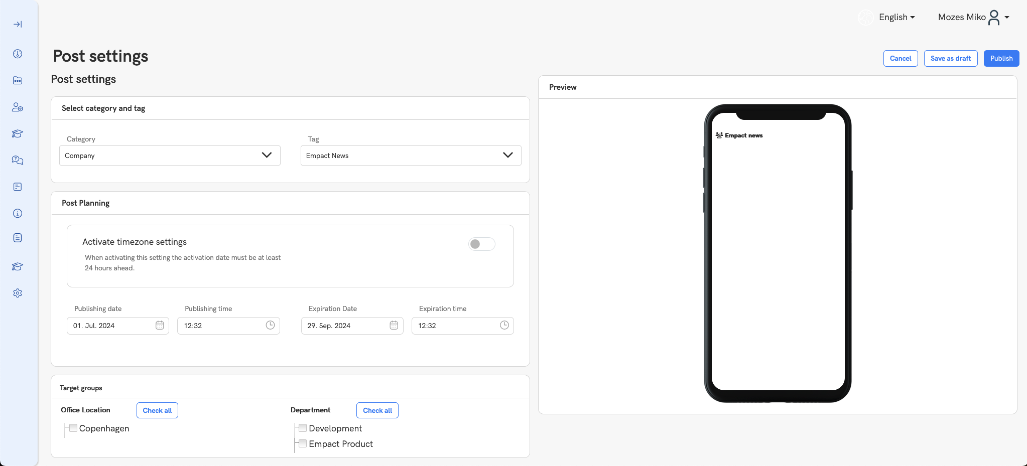
The old layout featured a preview at all times which was necessary to give users an impression as to how the published content will look like. This added clutter to the UI, and became somewhat obsolete and irrelevant since the application was also accessible as a responsive webs app, so the displayed preview would have rather large variance depending on the device it was used. The preview was moved to be behind an additional interaction, much like the LinkedIn article creator, and is only visible on demand. This made sense, because the new design would also function as a preview in itself, with the content being layed out exactly how it would appear upon publishing.
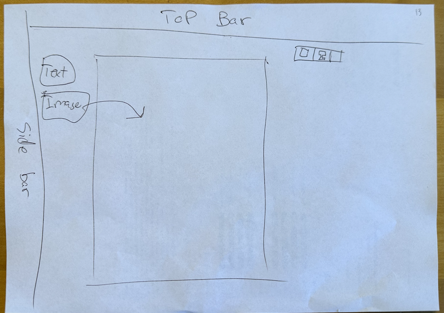
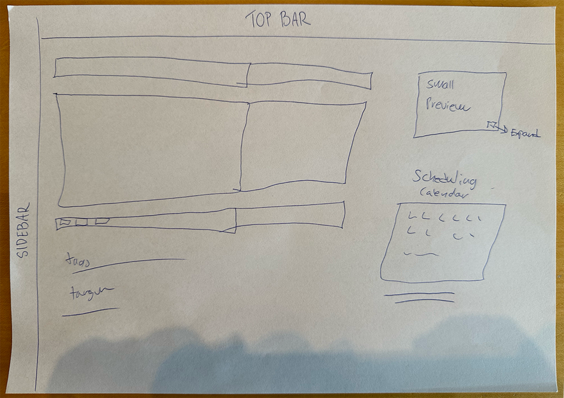
Interface mockups created by the users
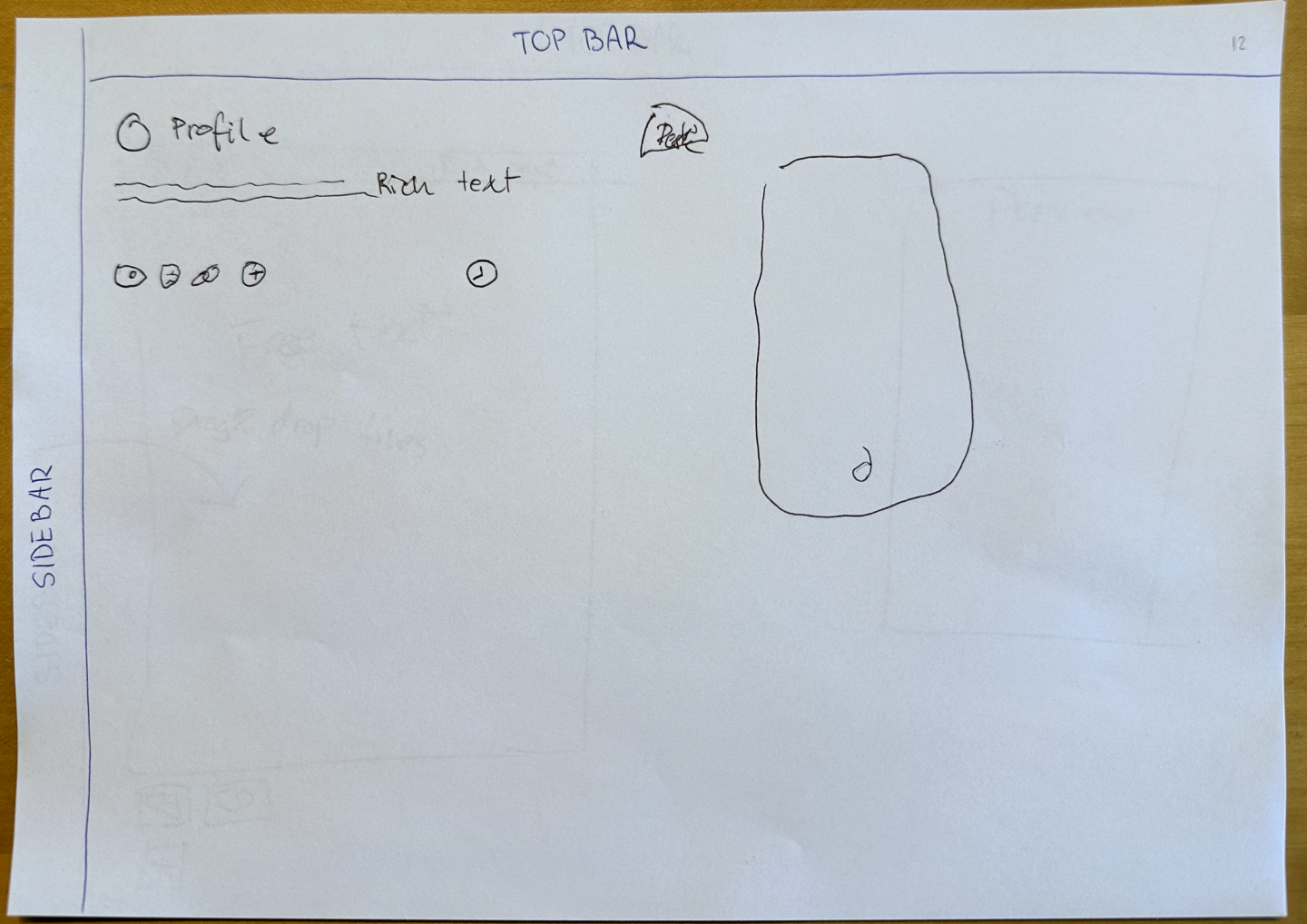
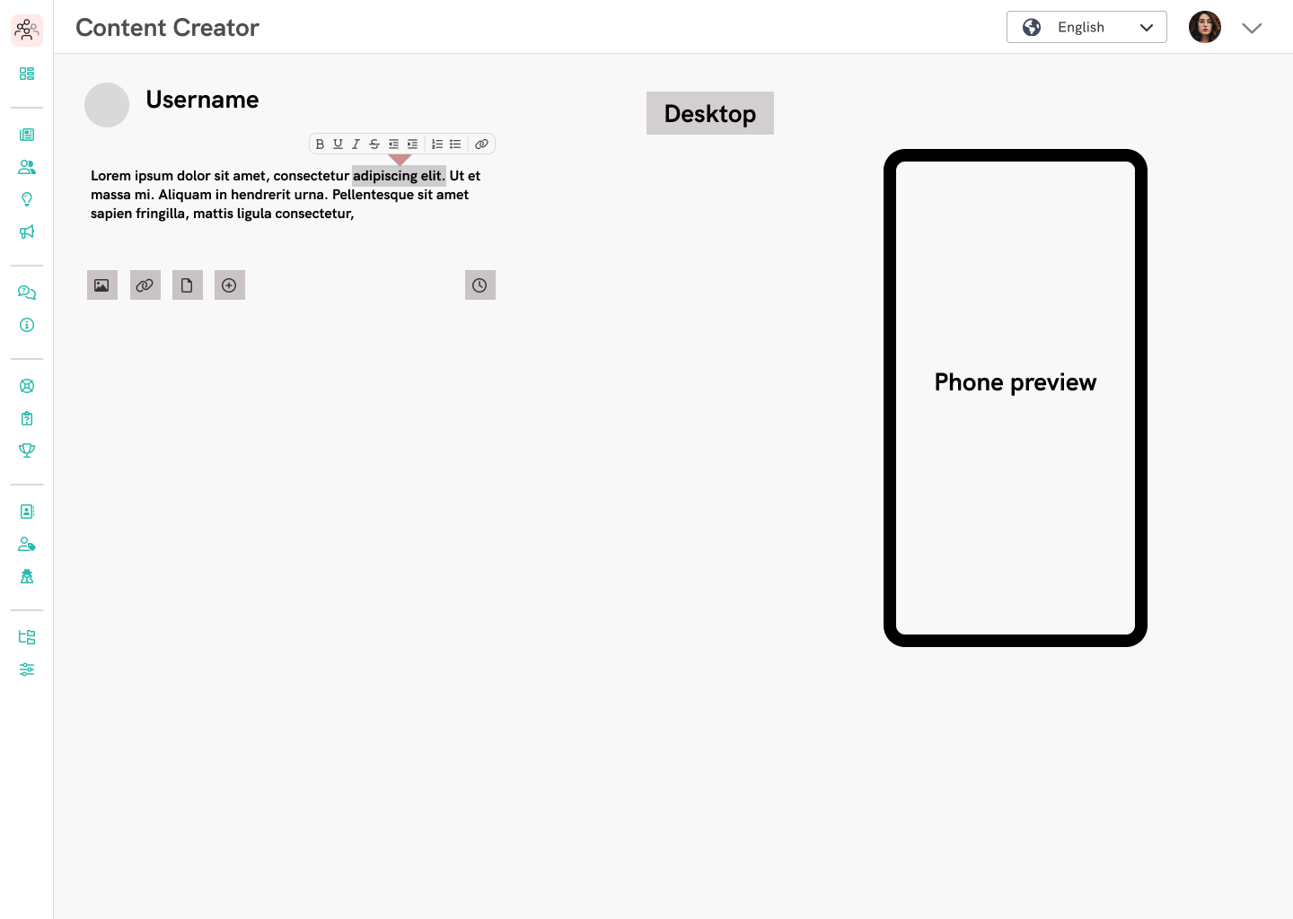
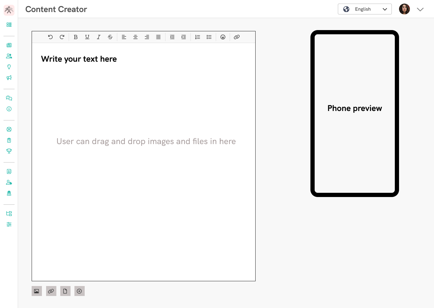
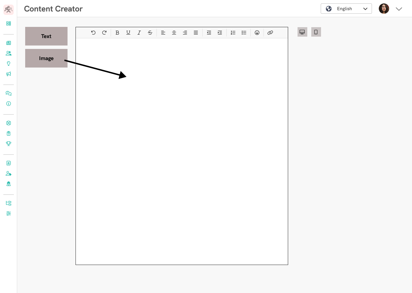
Below you can see some of the images thatwere created by the users about their ideal content creator UI. Next, I recreated these images as rough wireframes in Figma, to help figure out the UI and the layout in the new design.
As you can see, some of them still had the preivew present, but there are instances where the users preferred having them hidden by default, only appearing when clicking on a button. I chose to go with this idea, in order to keep the UI clean, but as I mentioned, the preview's functionality was also served by the new design, making it unnecessary to be shown at all times.
There was one instance where due the user's familiarity with both our solution and a content creator they used before, they retained the content blocks to some extent, but did not need the preview. Parts of this idea were incorporated into the final solution.
Creating the new design
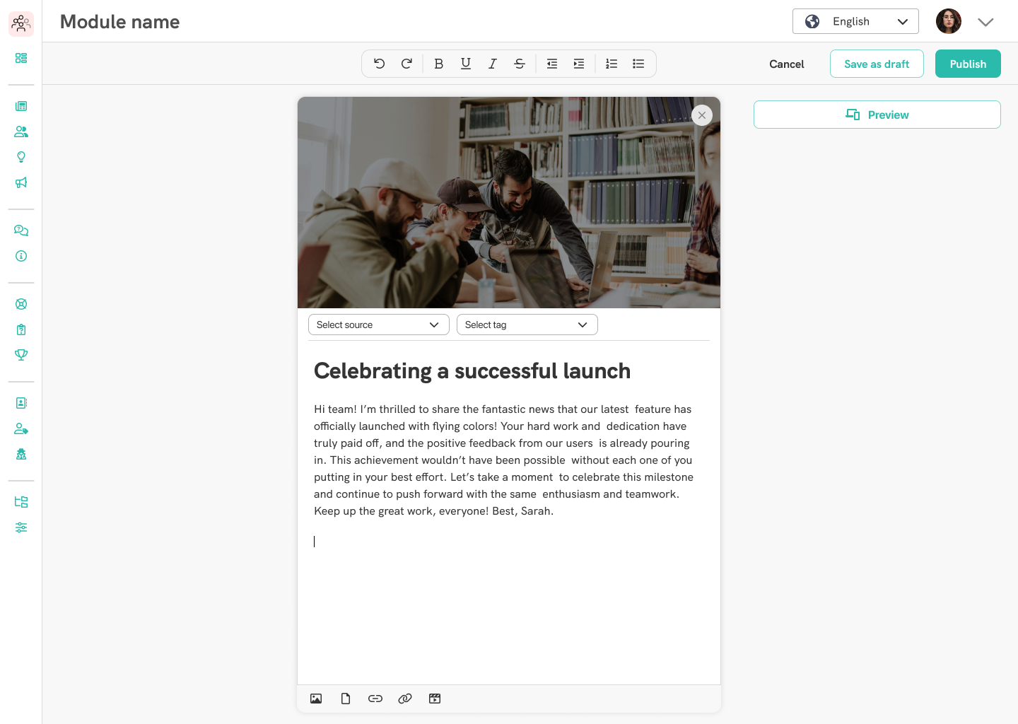
It was time to put the findings to good use and proceed with the work outlined by the wireframes. The goal was clear: a clear UI, with a single element in whicht the user can edit the content, being able to simply add new pieces of content, such as images, links, and more.
I made several designs with incremental changes, asking for feedback from the users throughout the process to see what works and what doesn't. I wanted to make sure that we get the correct placements for the UI elements so that it matches user expecations and retains most of the functionality of the current design. Once all important elements for content creation were accounted for, I proceeded to make a high-fidelity design, assured that everything mathces the users' mental model of such a system.
Organizing the design file
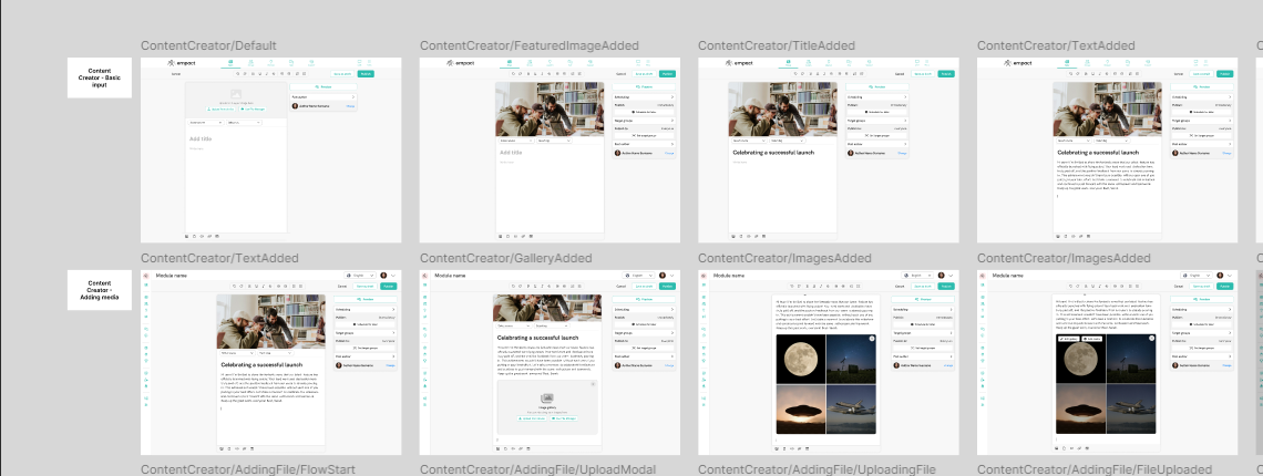
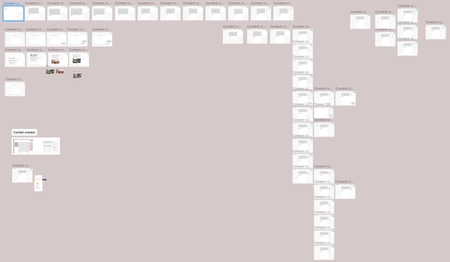
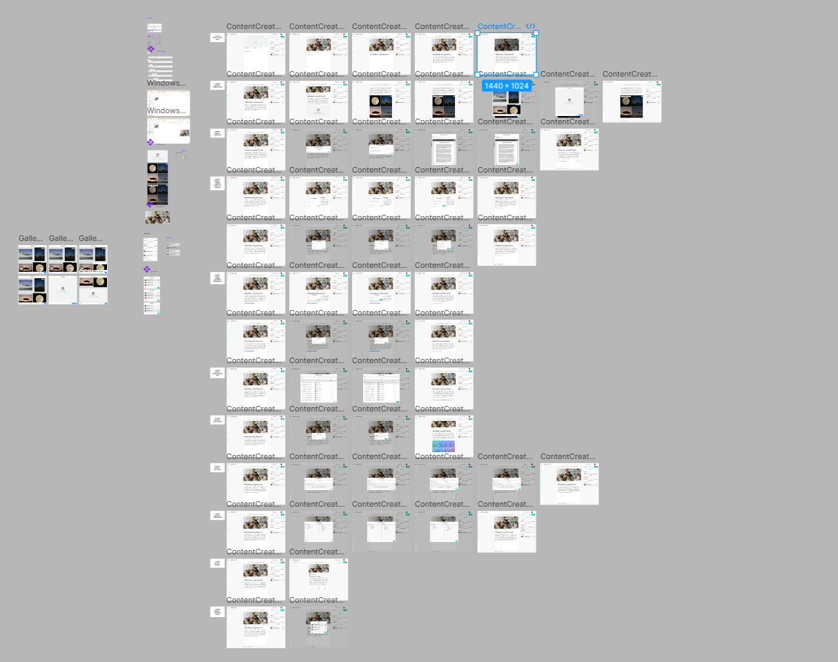
At first I attempted to make the design a single, end-to-end prototype where it showcases how adding each new content type works. I quickly found that due to the size and number of components and elements in this task, it would not only be hard to follow, but would complicate comprehension for other stakeholders looking at the file, mainly the developers. Due to this, I took an approach where I treat the featured image, source and tag, the title, and a single paragraph as "Basic input" to form its own flow, and then each content type would have its own, separate flow. How these worked together was documented and told the developers in an initial meeting so that they understand how the system operates.
Including the post settings
So far, so good. The new design was met with excitement from the users. All that was left is to include the post settings somewhere in the design.
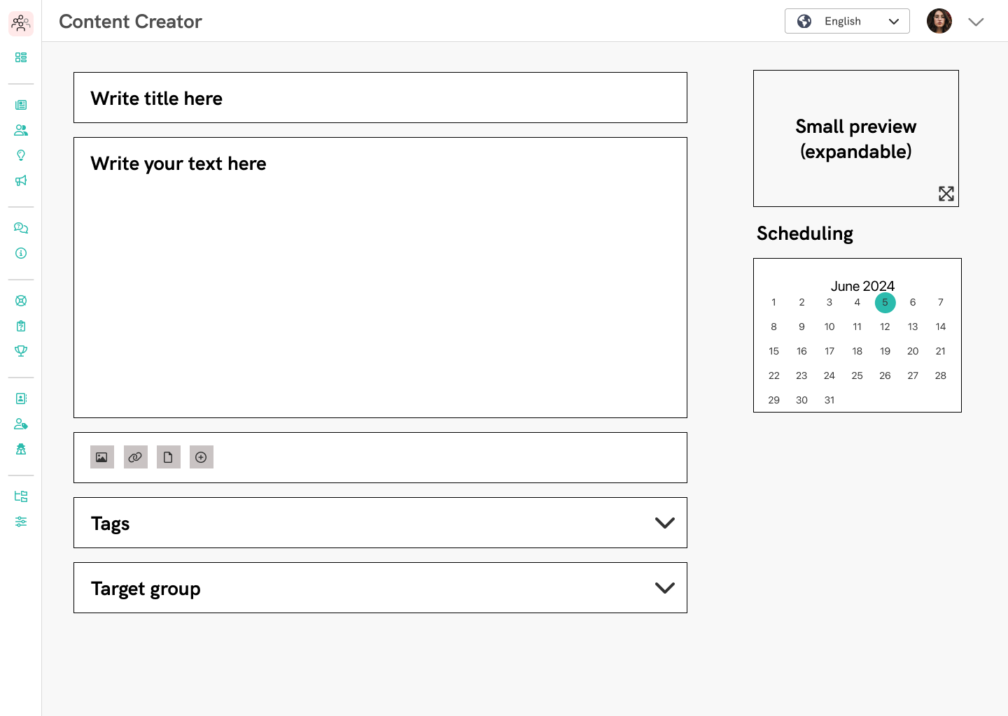
As I mentioned earlier, these settings were just below the content blocks on the left side of the screen. I wanted to have easier access to them, keeping them in a prominent place without them taking up too much real estate, seeing as most of these were optional. One of the user-created UIs had a nice little spot for them just to the right of the content creator element, below the "Preview" button, and it seemed like the perfect place to put them.
The question was how to displey these. I did some iterations with different designs, and went back to the users to seek out their preference. I've made designs where they would take up the entire right section, similar to how Wordpress does it, versions where they were just either secondary or tertiary buttons, and versions where they were placed in an accordion, both collapsed and expanded by default. Users were partial to the solution where it was an accordion, with all of them expaned by default, so that is what was designed.
During the interviews, it was apparent that users were not sure whether they needed to make a selection in these settings, or they could just leave them as they were by default, and that would mean that it is published immediately for everyone to see. In order to avoid confusing the users, by default the publishing settings are displayed, so they do not need to make a selection, but once they do, it would overwrite the dispalyed default settings, so it's clear at a glance as to who will receive it. We also added an option to be able to choose the author, in case a client has an account for "Marketing" or "Sales" for example, and the post creator can just post on behalf of those accounts.
Making new selections for the setting would open a modal, where the user can make their selection. From then, they can either clear the entire selection with just one click, or edit them, opening the modals again.
I am currently making changes to the website to allow multiple carousels, and possibly will embed the prototype here, but until then, here is an image of the final design with the post settings included:

Time to see how it holds up
Following the design and implementation by the developers, I wanted to do a round of testing with the users. I had both of the content creator solutions (the old and the new designs), and asked them to complete a task by creating a post with prewritten content and images provided to the users. The time to completion was measured in order to see whether the new design really did function better than the old one.
I did this using counterbalanced testing, where each user did the task using both solutions, and users were presented in a different order to control for order effects and minimize bias. The results indicated that all users were able to complete the task faster with the new solution, meaning that the new design was an succesful in minimizing cognitive load and providing a smoother user experience.
Conclusion
As mentioned above, the new design was able to decrease time to completion, and based on feedback sessions from users, it is seen as a major improvement over the old design. Not only does it hold up against other, state-of-the-art solutions, leading to better user adoptions, but it also has a great benefit of not differing too much from the previous solution on the backend.
We were able to reuse most of how the old one was created with a shiny new coat of paint, the only discrepancy was a newly designed image gallery. This piece is the only aspect of the new design that is not compatible with pervious posts, but this was a necessary step to take. You see, previously users could only upload 4 images to an image block, and only by uploading them one-by-one, and as I mentioned we created an "offshoot" content creator for short-form content for other modules, namely the Social Walls, so we could reuse that concept here. Now users can add up to 15 images per gallery easily, both from the old file manager or directly from their device, solving a point of frusrtration with the old design.
I am proud not just how the design turned out to be, but also how the design did not alter the fundamentalities of the implementation too much, saving the company time and energy in the process.
