MinForening
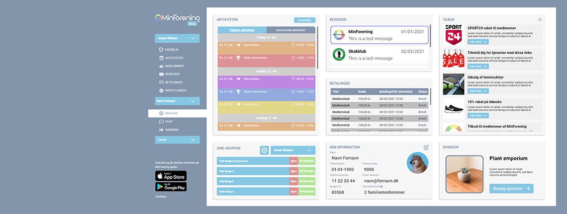
Maintaining brand look with newly created user dashboard
Overview
My work at AGrENDA was intertwined with multiple other projects, such as continuing some work for MinForening. For this case, I was tasked with designing a user dashboard for their web platform. This is currently live on the website.
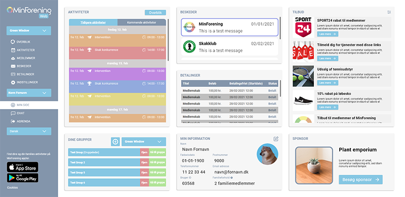
The aim was to maintain brand look with this new module. After some iterations, the current design was coined, displaying all required elements.
Role
UX/UI Designer
Design, Prototyping & Testing
February 2020
Background
MinForening is a free platform for organising the matters of various associations. The platform itself is split into a web platform, originally used for administrative tasks, and a mobile app used by members for interacting with the associations, with no option to carry out the the tasks afforded by the web platform. With this project, the goal was to create a dashboard for the users where all necessary information can be accessed from one place. I worked on the design in cooperation with the platform's creator in an iterative process until the final design was coined. As of writing this case, my design is implemented on the website and is working as intended.
What I achieved
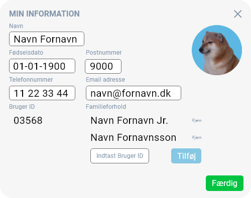
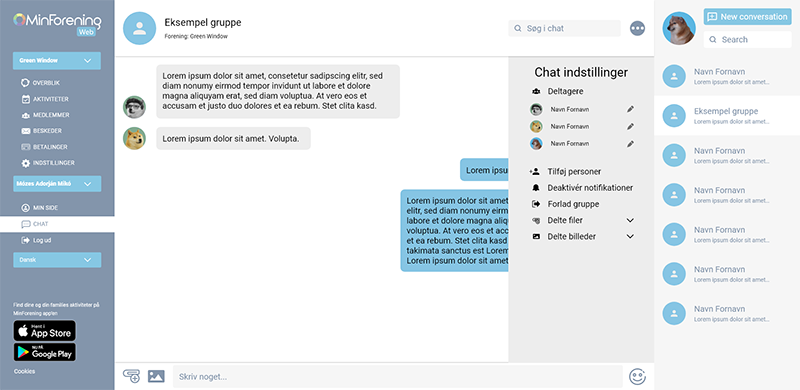
To make the task easier, I began by recreating the existing site in Adobe XD, and following that I created various versions of the dashboard in an iterative process until we were happy with the design. This is the first piece of work of mine that made it to proper release, and I am satisfied with how it turned out. The live version has one adjustment as one of the elements were shelved until later, so another element took its place, thus the final design is a 3x2 design instead of the one visible in the prototype. There were also talks with a chat module, which is in the prototype but has not yet been developed as time of writing this.
The problem
The original design for the web version of MinForening was only allowed for administrative tasks. The goal was to create a user dashboard, where non-administrators or group leaders can access account settings, messages, and activity information. This was a straightforward task, where only one extra page needed to be designed with the rest of the information architerture being unchanged. Through internal stakeholder interviews, I gathered what was required to be on the page in what manner.
The idea was to present all the necessary information on one page without and folds, so everything is visible at all times. This was achieved by the design depicted in the image.
Creating the module(s)
Through internal stakeholder interviews, the necessary features were listed out, based on which I created sketches and low-fidelity prototypes. It wasn't long until we reached the final design. The high-fidelity prototype I created for this task has all necessary features, pop-ups and even simulated interaction via filling out input fields. The prototype was done in Adobe XD.
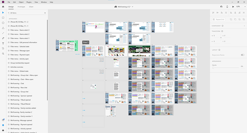
The chat module, currently not implemented, was based on how the chat functions in the mobile application. It was not a priority, so I would say it's about 95% complete, with the remaining things I'd like to do being simple tweaking to make the process of creating a new chat look a bit nicer on a wider screen. It has all required elements and I think it's a well-executed mix between the mobile and web versions.
Retrospective and takeaways
This was an enjoyable, task that yielded good results. What was missing was design validation through user testing, but the key stakeholders were satisfied with the result, and the design is fairly simple, so in my opinion it probably would not have been subject to too many changes.
It would have been even better if the chat was developed and rolled out as well, but seeing as how I still felt that it needed some more looking into, it's not a big issue.
The prototype will be made publically available in the near future.