Design system
Creating a design system to improve workflow and consistency
Overview
This case study explores the development and implementation of a comprehensive design system for Empact. The design system was created to unify and streamline the user experience across various digital platforms, including the web application, mobile app, web administrator portal, and internal tools. The project aimed to address inconsistencies in design, enhance user interface coherence, and improve overall efficiency in the design and development process. By establishing a standardized set of design principles, components, and guidelines, the design system has successfully facilitated a more cohesive and scalable approach to product development, resulting in a more intuitive user experience and faster time-to-market for new features.
Tasks
For this task, I performed
Research, Design, Prototyping & Testing, Documentation, QA
Spread out over multiple sprints
Background
When I joined Empact, the other designer just started out with migrating the components from Sketch to Figma. Not everything used in the app was present in Sketch, and as such did not make their way into Figma. There were issues with visual consistency in the application, including but not limited to module icons in various styles using differing stroke weights and roundedness, different elements used for the same purpose across modules because they were not kept up to date, which caused confusion among dsigners and developers.
Additionally, as it was revealed through discussions within the design team, the company colours were not a deliberate choice, but were bought as a template by a previous employee a couple years prior and were presented as a result of in-depth research. The colours were almost an arbitrary choice, as the primary, secondary and tertiary colors did not compliment each other and followed no rules of color theory, and the base values we were using in our UI did not meet AA WCAG accessibility guidelines either, among other challenges.
The need for a design system became evident as the we started to scale and add new modules and features. I ran into a slight issue when designing a new module, as I recreated components from a user flow that turned out to be deprecated, despite still being in the app. I proposed the creation of a design system to address these issues by providing a single source of truth for design standards, fostering collaboration between design and development teams, and ensuring a consistent and high-quality user experience across all platforms.
The design system project involved extensive research, including user interviews, competitive analysis, and stakeholder workshops. The findings informed the creation of a comprehensive design framework that included reusable components, style guides, and accessibility standards. The goal was to create a robust system that not only resolved existing design inconsistencies but also anticipated future needs and growth, setting a foundation for long-term scalability and efficiency.
Colors
One of the difficulties we faced in the design and development department is the use of colours. Prior to me joining, all components used only the hex values, which were not recorded anywhere properly. The benefit of our app is that clients can tailor it to their unique brands by using brand colours across the UI. This meant that in the web administrator platform, managers could adjust any colour to their liking, which was made hard by inconsistently named tokens, and a confusing and not very user friendly system.
Working on the designs in our application, I noticed we had some inconsistencies regarding fill and stroke colours, and I wanted to overcome this by implementing a system that will be easier to manage for developers, and easier to work with as designers.
To this end, I decided on implementing and using colour tokens. This concept was new to me, so when I started to work on the responsive web application I thought it was a good place to start, since I was building it from the ground up. This way, I could experiment with it and find the best way to go about it before implementing it across the rest of our solution. I discussed the use with the developers working on the responsive web application, and we all agreed to giving it a go.
I did research into colour tokens, looking at how other brands, such as Lyft, and other design sytems, like Ant, are using them. This research aided in the formulation of the structure I was going to use. I also identified the core colours, and decided to create a list of tints and shades that could be used for different states or indicating visual hierarchies or emphasizing different elements.
Core colors
After looking through our UI, and categorizing the colours, I identified the core colours, and added a few more that would see increased usage throughout the UI:
- Primary
- Secondary
- Tertiary
- System (grayscale)
- Neutral
- Information
- Success
- Warning
- Error
Primary being the main brand colour that was used for call to action and across the UI. Secondary and tertiary were based on the colours in the brand guide, but were left completely unused due to the fact tha they were largely incompatible with the primary colour. System is the grayscale, that was used as the background on pages and cards, and for strokes on elements. Neutral is something I added to have a color we can use for buttons and other UI elements that are not meant to be any or the brand colors nor system color. I added the last four to have colours to indicate success, error, informative and warning as messages or just as colors for the users. Our solution did not have these before, but I thought our app would benefit from these both on mobile and web platforms.
With the core colours identified, and the hex codes for their base (100%) value defined, I took to Tint and Shade Generator to create a color scale for each of the colours. The purpose of the color scale was to have different options I could use for different states (hovered, pressed, disabled), or to be able to use them across the UI for emphasising elements or creating better visual hierarchy in text. So far, the mobile app did not use any state other than default for buttons, but I found it would be important on the responsive web application to better inform users and make it more accessible.Another purpose with these was to allow for the implementation of a dark mode, something our application lacked on all platforms. With this system, we could make use of Figma's newly added variables, and create a dark theme for our designs.
Base tokens
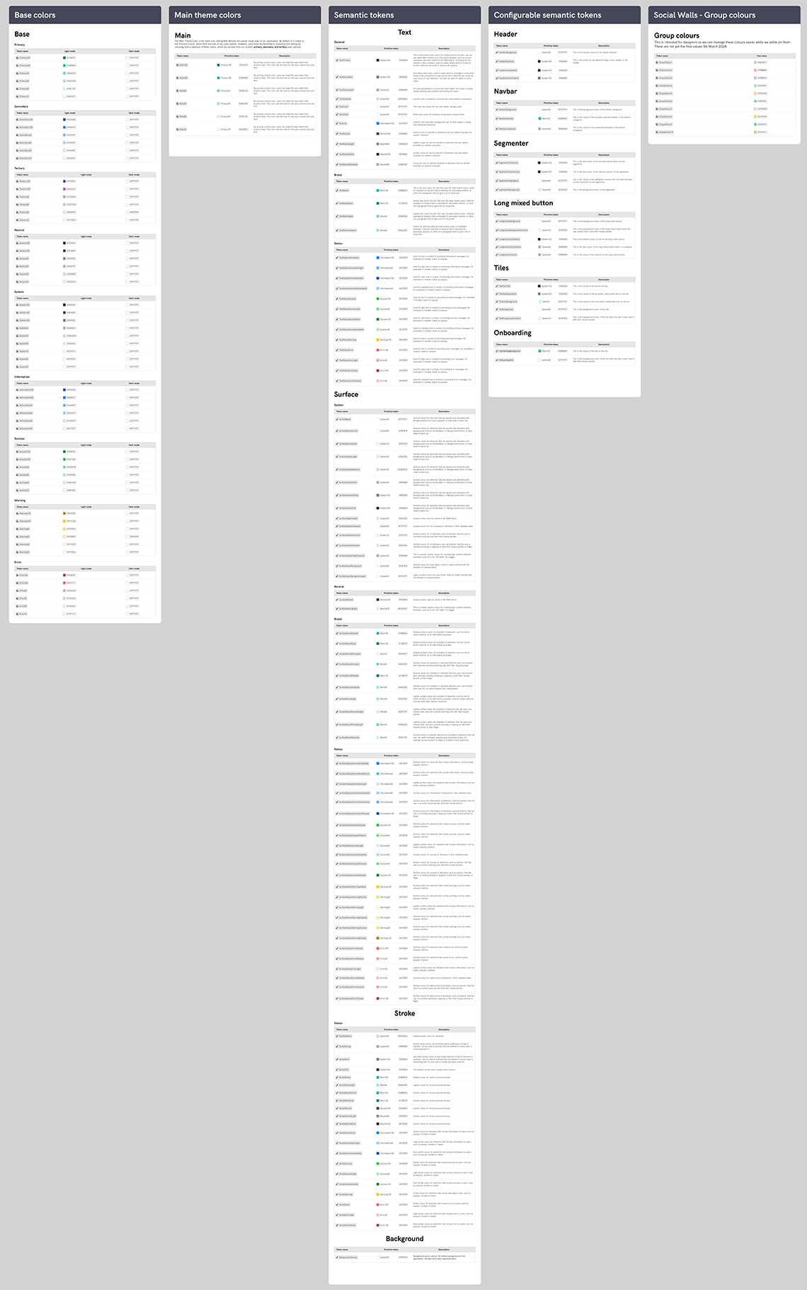
Now that I had the core colours and created a scale for each of them, I proceeded on definint the base tokens. I named them each absed on their name with a number at the end, showing what percentage they are in relation to the base value. For example, the defauult brand colour would be "primary-100" in this case, and a 10% tint of it would be "primary-10". With the base tokens ready, I was ready to make the semantic tokens, which I would be using in Figma for giving elements fill and stroke colours.
Semantic tokens
The role of semantic tokens is to map the base tokens to specific, meaningful roles within the design system. These roles align with the design language, such as indicating status, actions, or emphasis. By using semantic tokens, I could now change the base color values without affecting the entire system. For example, if the brand color changes, only the base token needs updating, and the semantic tokens will automatically reflect the change.
This system would not only make it easier to work with colors in Figma, but would make it easier to see what they stand for and what their functions are. For example, the token of the main text color would be called text-primary, and would have a value "system-160", while the token for disabled text color would be called "text-disabled" and would have the value "system-30".
This system offers considerable flexibility and robustness, and even if other designers would have to take on projects at a later date, would have an easier time understanding, updating or changing colors. An added benefit is that we could now use colors more consistently without having to refer to a chart of hex values on Confluence or elsewhere. But most importantly, we can now easily adapt our design system for the multi-brand solution Empact is. All-in-all, this was an important step towards a more cohesive and uniform UI, and one of the most impactful changes I have brought to the company.
Spacing values
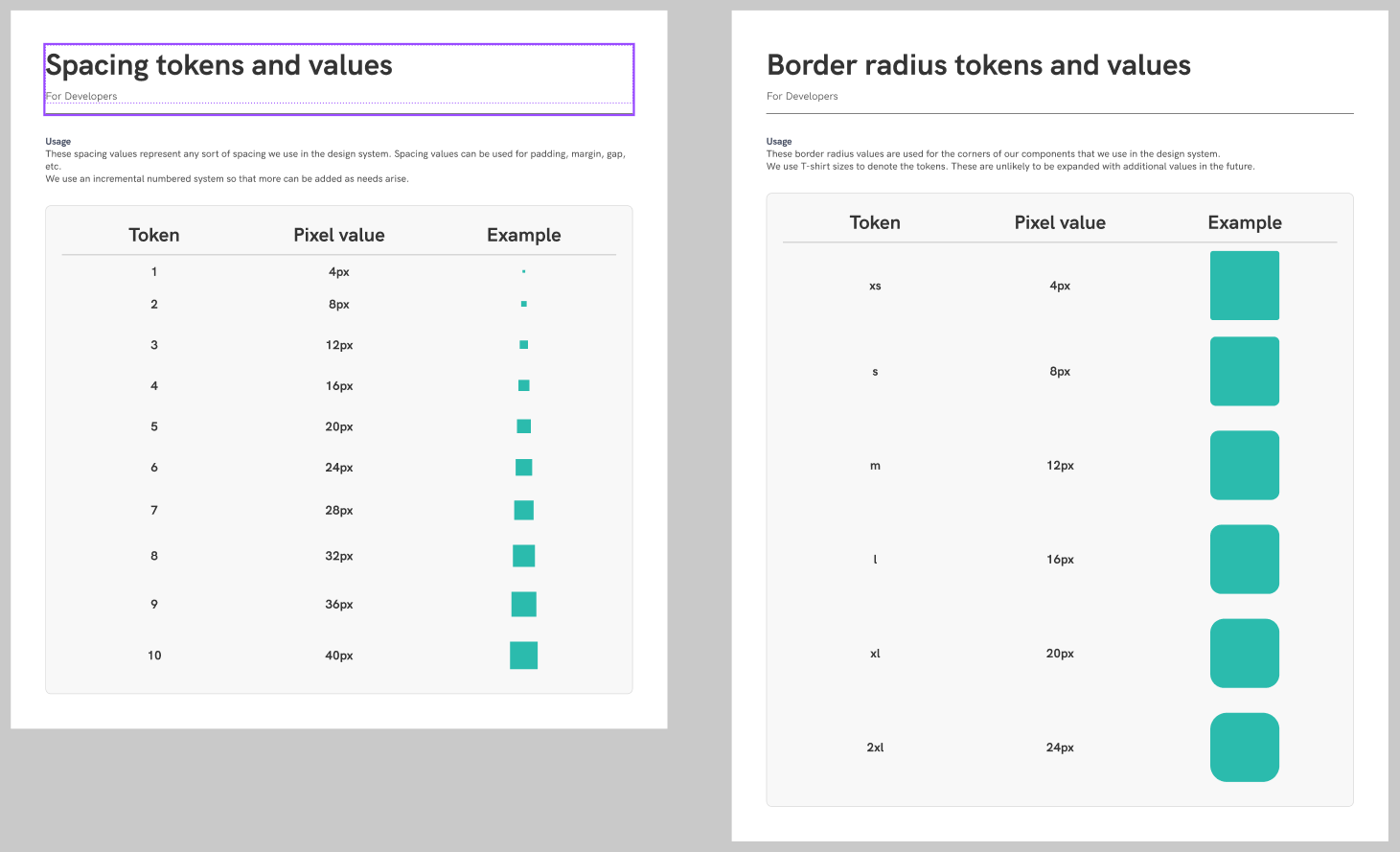
I frequently ran across instances where spacing was applied inconsistently in different places in our application, and in some cases, it was hard to determine which was using the correct values. In order to overcome this, and further increase the consistency within our UI, I created a table of spacing values and tokens alongside with them.
Spacing tokens
For spacing tokens, such as Margins and Paddings, I originally created a scale using an incremental scale, where values go from 1-10, each step being a 4px increment, starting at 4px. I used an incremental scale so that it would be easier to append new values should the need arise.
Corner radius
For corner radii, I used a T-shirt size system, where the tokens would be names "xs", "m", "xxl", etc., and were assigned a pixel value. I thought that the corner radii would not be subject to changes or additions, so this system works well for this purpose.
Typography
As with colors and spacing, there was a lack of definition and consistency with the typography we were using, with some redundant values here and there, so the next step in the process was defining these.
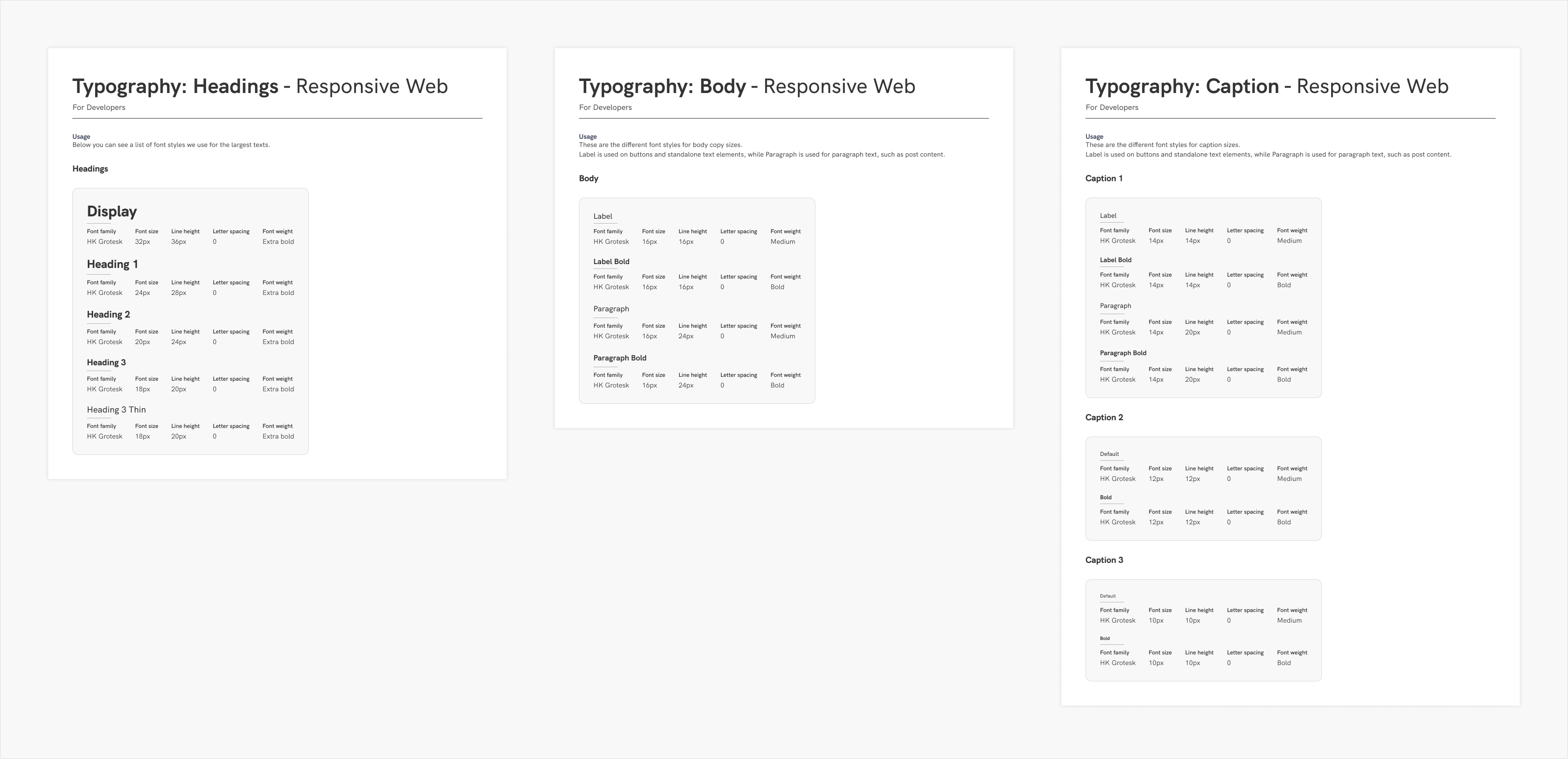
I set up a page in our Design System file for typography, and created sections for each platform and font we were using (Roboto for default on Android, SF Pro Deisplay for iOS and HK Grotesk for the responsive web application). In these, I display the text as it shows in the UI, with the px value, letter spacing, font weight and line height. This last bit was important, because we were using auto ine height which sometimes affected the legibility of text at certain sizes, so after some research into best practices and state-of-the-art solutions, I defined a line heihgt for our headings, body copy, and caption sizes.
Components
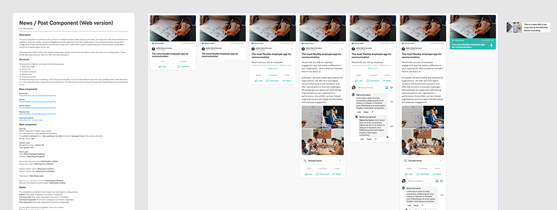
Sorting the components
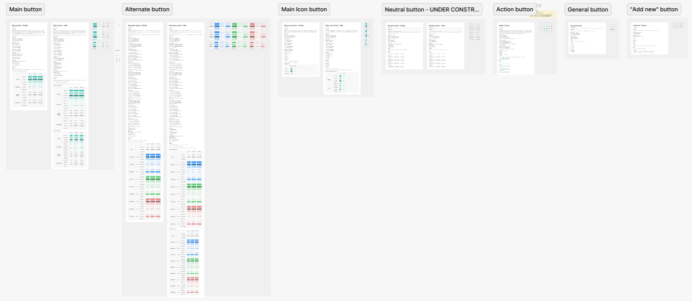
This portion of the design system has been ongoing while the above steps were eing worked on. Once what we had were migrated over to Figma, I tried to sort them in a logical manner. Initially, some function or module-specific components had their own page, but after some discussions with my colleague, I decided to split them in more broader categories where possible. For example, post elements for News and Social Walls had their own page called "Cards", as my colleague has been using that denominator for them.
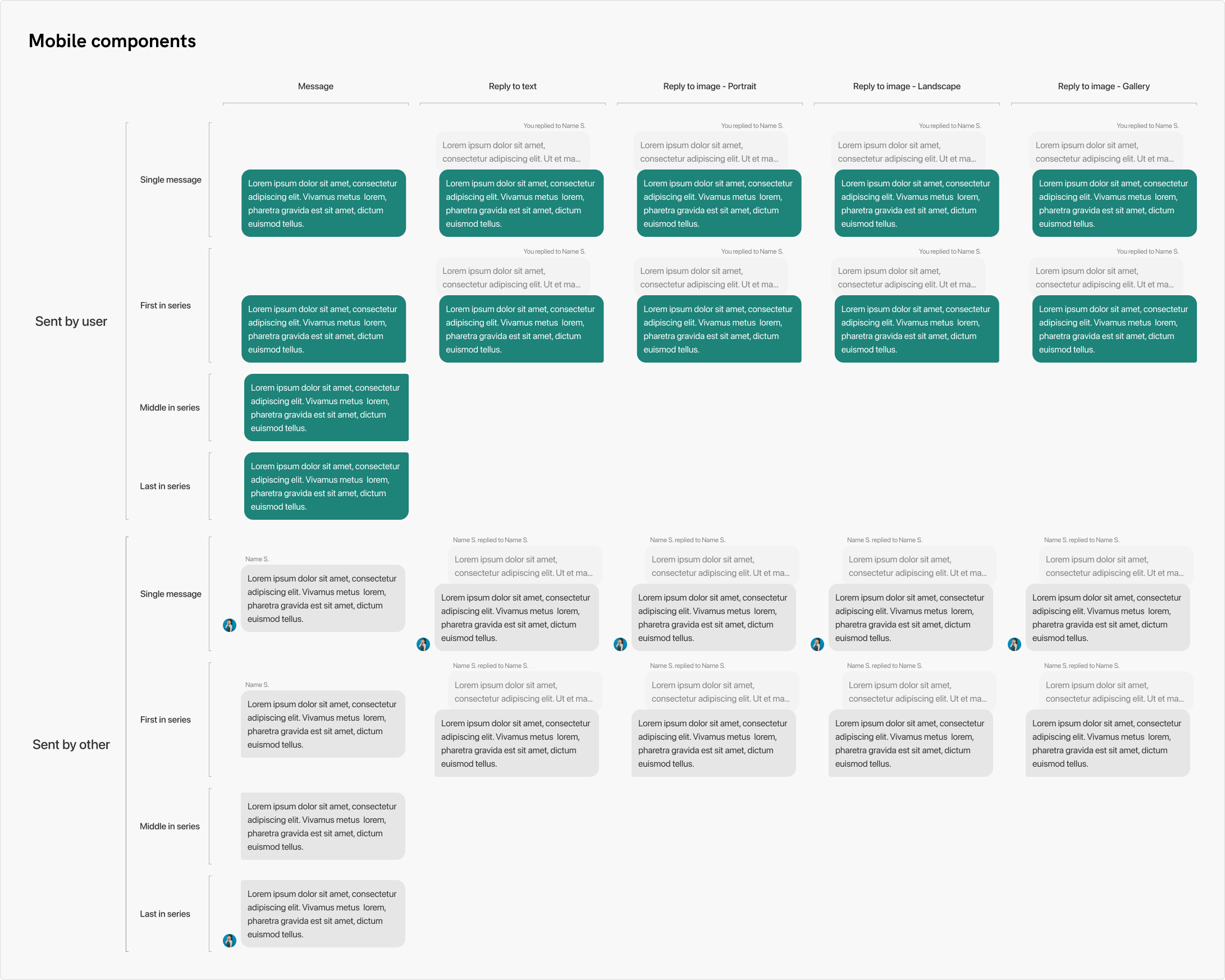
"Messaging" housed components used for this purpose. Components for chat, the message bubbles, and the comments for posts have been all moved here. "Buttons" is pretty self-explanatory, housing all different kinds of buttons that were created for our UI. Modals and popups housed elements such as communication form the system to the user, including confirmation dialogs, modals to name chats, add participants to conversations, the slide-up sheets, and so on.
These pages were arranged alphabetically within the Figma file for easier navigation. Sorting the components properly and logically not only helped structure our design system, but aided in correcting problems, where one lesser-used component was already in place but in an illogical place, causing us to create duplicate work. Before this work, components tended to be threwn around the file, but I arranged them neatly, each within its own section, making it easier to find a specific one at a glance.
Documenting the components
One issue that was constantly causing problems is the incorrect on inaccurate implementation of UI elements. Initially, I was under the impression that developers looked at the values in Figma through the developer view, but that was not the case. We discussed what can we do to aid a more precise implementation that adhered to the design, and we agreed to document the components in detail, which will not only help developers, but also future designers who start working with our design system.
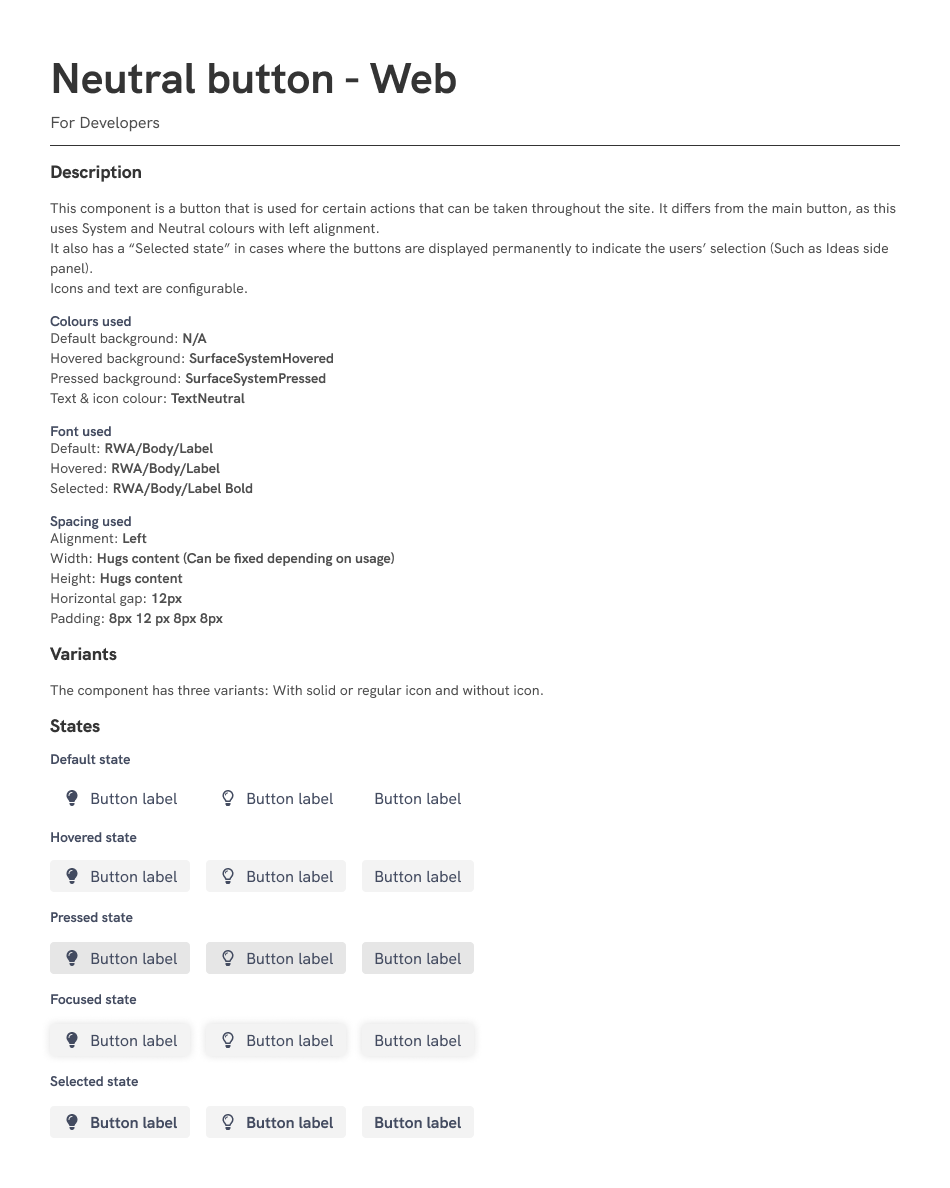
I created a series of components within Figma to serve as the building blocks for documentation, and created a standardized way to documenting the components in detail. It could be thought of as double work, since all of the necessary inforamtion is already in Figma, but it saved us time and energy, and cut down on some meetings we needed to have to clarify color and spacing values, component states and variants. I wrote documentation for existing components when I could, and whenever I finished working on new ones, wrote the documentation for them immediately.
The documentation included a description that told the purpose and usage of the component, then the next section housed all color, font, and spacing values for each variant and state, and a table showcasing all variants. This latter part was included because I used all possible options Figma had when creating the components, and as such some of the variants were not visible in the main component, where certain aspects could be toggled in the control panel. For example, the main component for the main button just included all variants and states with the text-only option, and the leading and trailing icons were not present, but they could be seen when consulting this table.
All this was a worthwhile effort, so this was kept in place. We saw that components got implemented correctly, and we saved ourselves some time not having to discuss these during meetings, making for a more productive process and environment.
Making it work for everyone
In some cases I made compromises with my colleague so that she would be happy with the direction and usage of the design system. We reworked the color tokens a little bit and changed up the naming that they was more comfortable with, and I made sure to be in constant communication with them wiht any changes I planned to make for the design system. This was a very important aspect of our work, so I took great care of it and made sure everything was organized and accessible at all times. It was important that this was something we in the design department were all comfortable with, and we were on the same page to further help in the creation of a unified, cohesive look for our application's user interface.
I thought of this as a living document, to which changes could be made at any time to keep up with Figma's technical developments, and also best practices. The layout, organization, and documentation made sure that any stakeholder that had access to Figma would be able to get a good understanding of everything in here without the need to consult the designers should we not be available at the time. New arrivals would also be able to see what we had in the system, as to what they can work with, and how we used these components across the application.
Reflection
To get this system to its current level, I did a lot of research on all aspects, and looked at other design systems for inspiration so that ours may keep up with state-of-the-art. I am very happy with how the design system turned out. It not only provides a nice overview, but in-depth detail as well, with everything that can be needed found in this file. We discussed replicating the documentation on Confluence, but I argued that we would have to maintain it in two places, and in case of a conflict and without a designer present, it could cause confusion as to which documentation has the latest information on the components. Confluence's tables are also very barebones and caused considerable extra work when trying to import the variants, so we decided to keep it within Figma.
As the design system grew, I noticed that our designs that we were working on independently maintained their consistency in terms of spacing and other values, and helped us save time by having reusable components that were created for both platforms, so reusing them across modules made for a more efficient workflow. This was not a one-and-done however, so it needed to be maintained and checked frequently to make sure that everything was correct and up-to-date.
Starting from nothing, this grew into quite a big document, but with great impact, as future designers will continue to work in this file using the frameworks I laid out that will help newcomers avoid some issues I had when starting out. In my case, I did not have such a system to look to, and when I had to work on new modules, I had to recreate UI elements based on screenshots, and in some cases I used something that was in our application in one module, but we used a different looking version of the element in other modules (like the title input field for content creation).