DigitalGuest
Company internship at DigitalGuest
Overview
While looking for a full-time position, I applied for an internship at an Aarhus-based scaleup company, DigitalGuest. The goal was to gain experience and broaden my skillset. Here I mastered Figma, and I worked with agile development in a cross-functional team.
I joined their UX Designer in updating legacy designs, creating new features, conducting user tests, doing UX writing, and QA on upcoming features.
Role
UX/UI Designer
Design, Prototyping & Testing, UX Writing, QA
May 2022 - June 2022
Background
DigitalGuest is creating a guest experience platform for hotels worldwide. The platform integrates with the properties' PMS systems (if they have one), and offers an ever-growing range of features that help hotels better communicate with their guests. Not only does this service help hotels reduce the amount of paper they use, but can also help drive sales and guest engagement in relation to reviews and direct bookings.
Here I worked under DigitalGuest's own UX Designer, and often together with the front- and backend developers. Working in such a cross-functional team made great use of the interdisciplinary nature of my background gained through my education programs, and helped me see the production workflow in a company where the developers worked in-house (in my previous internships the development was outsourced to external companies). What was also a great learning opportunity is having had the chance to see how agile development works in a scaleup, with sprint meetings, daily standups and post-mortems.
What I achieved
I applied for this internship with the goal of learning more of the UX and UI trade, and to have the chance to grow both professionally and personally. Safe to say all of these goals were met. Prior to my time at DigitalGuest, I have not used Figma, but thanks to my experience in Adobe XD, I could quickly pick up the pace and start contributing to the work here by using Figma. With this new knowledge, I worked on updating the legacy designs of elements to better match the current UI design, and I also created new UI elements and features.
Creating these new features was helped by multiple rounds of user tests, for which I wrote the questions and recorded and organised the responses. These tests also showed how important UX writing is, as our test participants from different countries and backgrounds understood certain things differently, so we had to find a way to phrase the UI elements and texts in a way that clearly communicated the functions to the users.
Furthermore, I helped out by creating new assets and improving existing ones in the company's design system (which is based on Ant Design System). This is where my organised and systematic approach could really shine, as I made sure that the newly created elements fit in design system as much as possible in an easy-to-overview manner.
Last but not least I also took part in doing QA for upcoming features. QA is always fun to do, and I enjoyed it a great deal this time around as well. Here I carried out exploratory testing sessions on the features in question, and recorded the errors I came across in our JIRA system, complete with detailed descriptions, images, and video footage on how to replicate the given error.
Updating legacy designs
My first task after the onboarding process was to update the design of certain outdated elements. This was also my first foray into Figma, so it was a great way to get my feet wet and my hands dirty. What I did was look at the current design for the various Page Editor Options, and give them a makeover so that they better fit with the current visual direction of the platform.
You can see an example of such an update below, with the old design on the left and my new design on the right. These are variants of the "Image Editing Options" asset, and they show when 2 out of 2 images are selected. What I did was relabel "Styles" to "Layout", and "Content" to "Image" ("Left image" and "Right image" with two-colum layout), to better express the functionality of the sections. Additionally, I grouped the selected images just above the settings that affect the respective image. This was done to group connected elements closer together, and also because the original version only allowed to change the image sizes and radii simultaneously, but the new design allows changing these values for each image individually.
I updated the "Image columns" element as well, renaming it "Number of columns", and replaced the button with two separate ones to make the UI more understandable. I was missing a button that would swap the two images without having to select a new one for both, so I added a "Swap image columns" button to the asset. Finally, I edited the image selection element. The old design did not allow for easy deletion of the images, and it did not match with the current visual direction of the platform. I added an Edit and Delete button in the same style as used elsewhere in the DigitalGuest webapp.
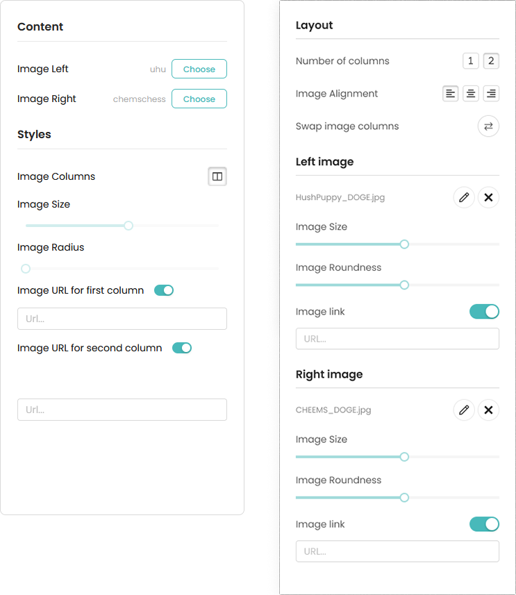
As you can see, for this task, I created new icons and buttons that matched the design of the other, currently used components. As usual, I created multiple different variants before settling on the final design. This helps see all the possible options and makes it easier to make a final choice. I presented these in an organised way, and that was appreciated by DG's UX Designer.
I made some flows interactive, so that the developers could better see the intended behaviour of certain elements. For this, I created multi-variant components, and below you can find a video showcasing one of my solutions. All-in-all, this was a really fun task to work on, and I greatly enjoyed it.
Creating new features and elements
Once finished with the updated designs, I got to work on helping the UX Designer with some new and upcoming features. We worked on separate elements or pages for the feature simultaneously, and occasionally we sat together and ruminated on the various design approaches to a new element. Working together on the same task gave me insight to their thought processes.
These tasks included incorporating a new dropdown into an existing feature that allowed selecting certain items from the hotel's PMS system and it would prepopulate the available settings in the DigitalGuest platform based on the respective item's properties. Below is an example showcasing the before/after images for two elements.
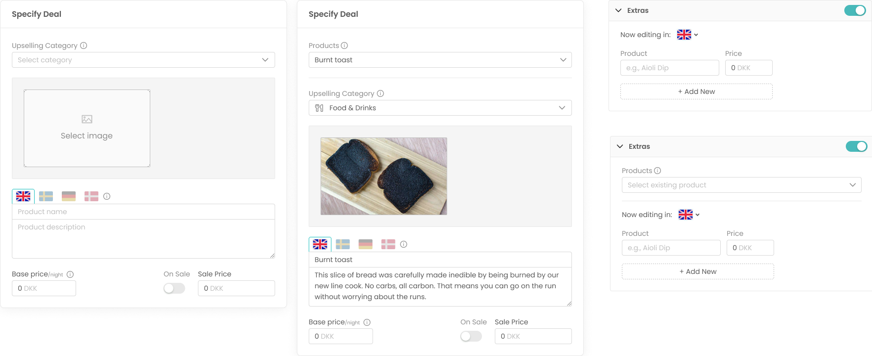
Another one was creating new popups with different warnings. This was not only a task about UI Design, but also about UX Writing. It was important to get the text be as informative as possible, as well as getting the correct labels for the buttons (depending on what action prompted the appearance of the popup). I iterated through multiple versions both design- and text-wise. As simple as this element was, a great deal of thought went into it not only to allow for good UX, but also to help avoid user error and lost work due to suboptimal phrasing.
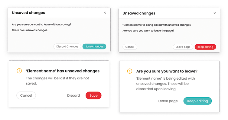
Another notable example was creating a brand new feature that helps with collecting relevant data from the guest regarding their upcoming stay at the hotel. This is done as a sort of registration form. As of the time of writing, I can not share further details about this feature as development on it is still ongoing.
What I can share is that this was the feature that I carried out user testing on. These tests also highlighted the importance of good UX Writing, as the labels and titles need to communicate what the feature holds so that the users know what to expect even before getting to those steps. A good UI uses correct icons and phrasing to be as clear to the user at a glance as possible. Through these tests we discovered the pain points of our design, and polished and corrected the more obvious mistakes before moving on.
Additionally, and I reworked an asset specificially for this feature, because the existing one in the design system did not suffice for our purposes. More on this in the following section.
Creating assets for our Design System
There were assets that we used frequently, but were not incorporated into the design system we've been using. This meant that we sometimes needed to look through all the other files to find what we were looking for. When I had some spare time, I worked on moving these assets into the design system so we had access to it at all times.
I also worked on creating new assets. My approach for this was to use the same style and labeling as Ant Design System does, both to have it look professional, and also to have the different variants laid out in an easy-to-overview manner. I recreated some assets from the live platform that were absent from the Figma files. The live component did not have certain states, and some parts of it behaved incorrectly, so I made sure to account for these in my design. My asset uses the new component properties, so changing the values is made much easier. Below you can see an example of my work, a Currency Input Number field.
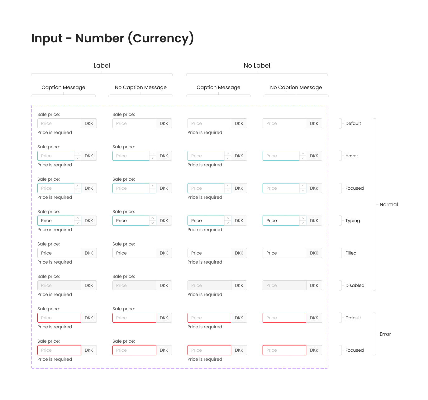
As mentioned above, I took an asset from Ant Design System and reworked it to suit our needs better. I took the Step indicator and made an alternate design for it. The reason for having to make this alternate design had to do with how the asset scaled and how the text was placed. My solution looks identical, but I adjusted how the track works between the points, and now the text now breaks and won't overlap if the asset can't take up a wide enough space. I used Figma's new properties to make editing of the text easier, and I added some extra variants as well. The only thing not included in the redesign is the ability to turn it vertical, as this was not relevant for our case, thus it was out of scope.
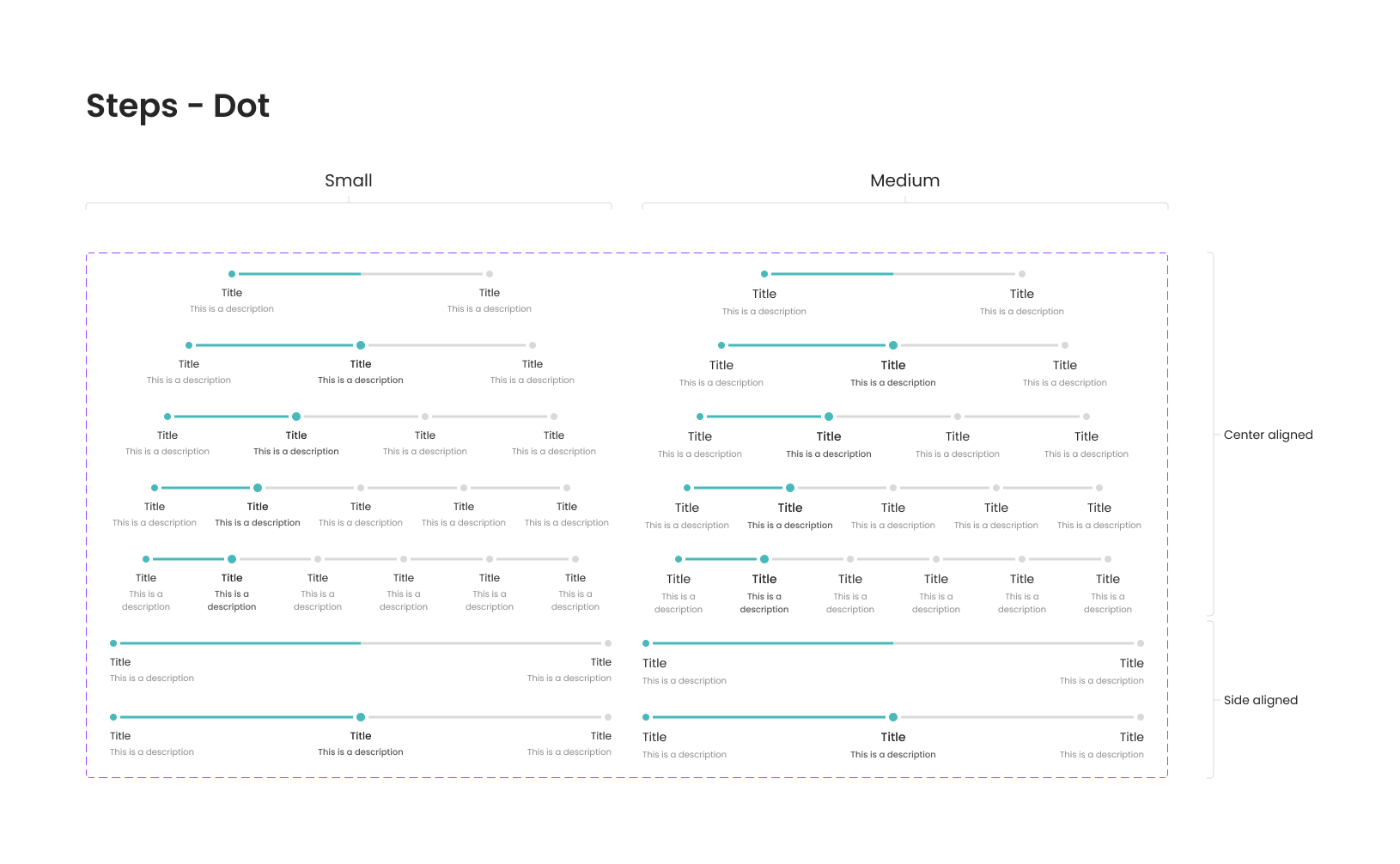
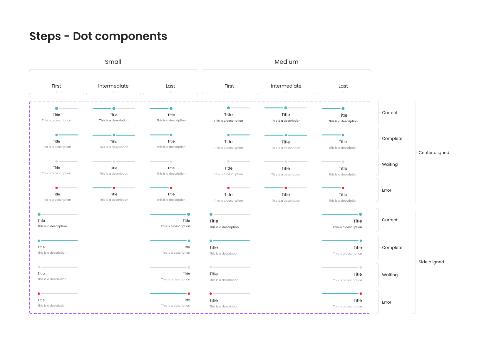
User testing and UX Writing
I took part in conducting user testing for an upcoming feature. I wrote the questions for the test, and recorded the participants' responses in separate files. Following this, I put all the answers in a special Figma file, which allowed us to oranise the responses based on whether they were correct, slightly misunderstood or completely wrong. Doing it this way makes it easier to get an overview on the state of the feature, and on what areas need to be improved. The first column features the question or task, followed by "Notes", then the three categories for responses (based on how correct they were), and finally "Fixes", where fixed issueas are moved, along with a brief description of the fix. Below you can see an image of how this system looks like.
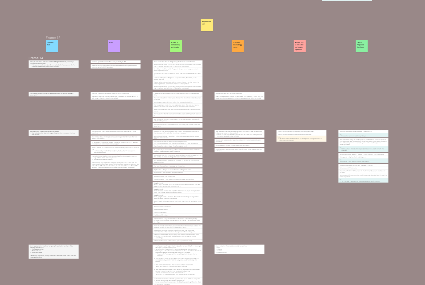
While testing, it became apparent that we needed to rephrase certain elements, because they caused confusion for multiple users. This highlighted that certain wording might be obvious to the designers, but that is not the case for the users. Confusion was caused either by misunderstanding the name of an element - for example "Text field", intended to be an input field, was understood as the label for the dropdown menu, where users could type in the question to which the response can be selected from the dropdown. Other issues included the users not knowing what to expect from a given feature before clicking on it. We worked tirelessly until we found solutions to these issues, making the UI be more clear to the user.

Quality Assurance
QA is something that comes to me naturally. I like engaging with systems and products so that I may understand them in depth, and as such I pick up on things that go wrong, or can go wrong. This task is always enjoyable to me, and thanks to my communication skills, I report errors in a precise way, understandable to anyone who picks up my report.
During my time here, I did ad-hoc QA while working on my other tasks and designs, and I've found and reported minor issues that have evaded the watchful eyes of the devs. Of course I undertook dedicated QA as well. These were exploratory sessions, as the devs did not prepare test cases for us for the feature that I was testing. I approached this the same way I try to approach all my other tasks: systematically and with an investigative mind.
During these sessions, I uncovered a few bugs and reported them in our Jira system. I always give a detailed explanation, and when applicable, I attach screenshots and videos to better illustrate the issue at hand, leaving no room for error.
Retrospective and takeaways
This experience was not only very useful, but also incredibly fun at the same time. I got to work with many talented and awesome people, and I gained valuable insight to how a scaleup company operates on a daily basis. Working from the office was a nice change of pace, as during my previous work experiences, I worked mostly from my home office due to the ongoing COVID-19 pandemic. While working from home is nice, I much prefer meeting up physically with my colleagues as I'm a collaborative type of guy.
I've been part of daily standup meetings, sprint planning, bi-weekly and post-mortem meetings. My work was done mostly together with DigitalGuest's own UX Designer, but I sometimes work together with others when the task needed it. Working in a cross-functional team is something that I enjoy very much, as my education programs facilitated this kind of project work.
Here, I gained an introduction to Figma, a tool I have not used prior to this internship, and I became very adept at working with it. Safe to say, this has become my favourite tool to work with. Thanks to my experience with Adobe XD, leaning Figma was much easier, and I could begin contributing to the company's work after a brief onboarding process, where the UX Designer and I covered the entirety of the platform and its features.
All-in-all, I've managed to grow from this experience both professionally and personally. I learned a lot of new things about UX and UI Design, also about the product development process using agile development, and last but not least, I learned someting about myself too. Working here showed me what I can do in a new setting, and these two months yielded a new perspective and some added confidence in my abilities. I am thankful to have been part of the DigitalGuest journey.