EasyR
Improving app flow and UX for a cleaning service startup
Overview
EasyR was creating an application where users could easily order cleaning services, similarly how Wolt and other related apps work. They had cleaning companies and over a hundred customers already signed up for a soft beta launch.
I joined the project shortly before the beta was supposed to launch, and was tasked with coming up with improvements to their existing UX and UI.
Role
UX/UI Designer
Research, Design, Prototyping, & Testing
November 2020 - December 2020
Background
As my first professional endeavor following graduation, I joined the small EasyR team as their first and only UX Designer. The company already had a working prototype and an established customer base, and the soft beta launch was only two weeks away. My task was to go through the entire application and improve the UX and UI where it needed polishing. What made this difficult is that there were no files nor documentation of any kind, something I intended to fix later on in the project. Unfortunately, the company disbanded mere weeks after I joined (the two events are unrelated), so I did not get the chance to follow through with what I intended for the project.
What I achieved
Despite the challenges of this task, I managed to get my suggestions implemented in the app, successfully meeting the deadline and fixing some key problems in the app, making it easier to use and less confusing for the users. I began setting up documentation and other important files, and also started working on designing expanded features and services for the application. Sadly, these never reached fruition, but I'm grateful to have had the chance.
The Problem
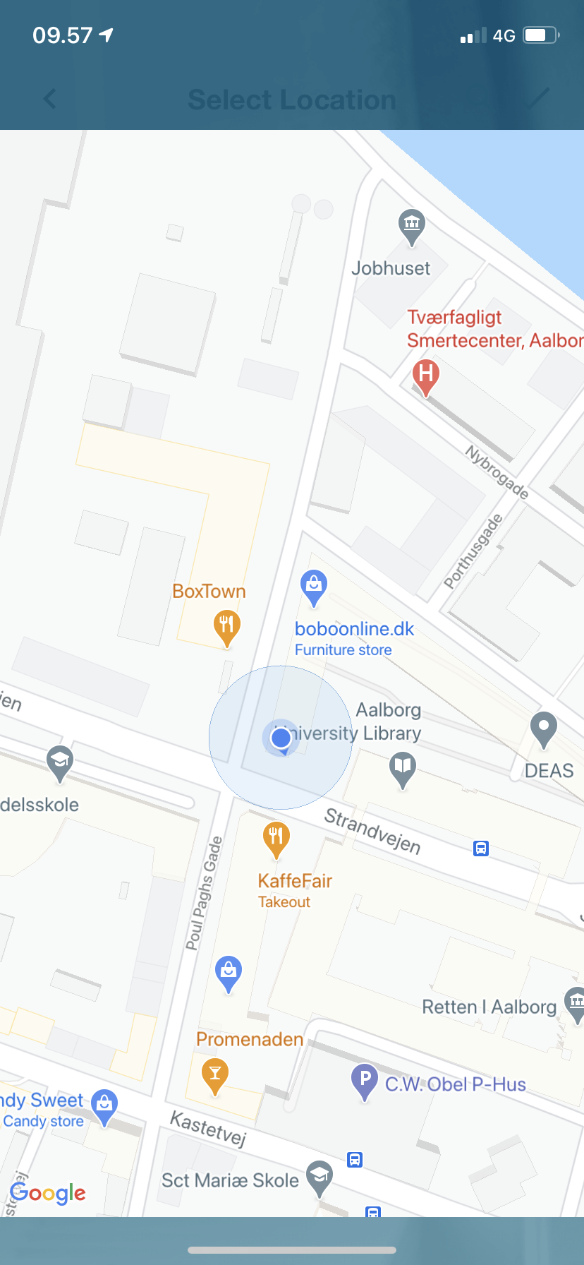
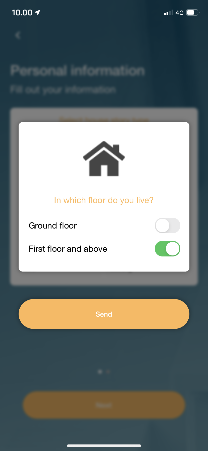
Before I joined EasyR, the company had external programmers create the application based on one of the key stakeholder's ideas. The designs lacked considerations for overall usability or functionality, and the features were implemented because they were "sexy" [sic]. Such things included the address selection process, where users were only able to select the address by dropping a pin on their location, and not optimal usage of certain UI elements, such as mutually exclusive toggle switches and using a continuous slider for discrete values.
There were no files containing a prototype that could be edited, and back then I lacked sufficient knowledge in wireframing and prototyping tools, so creating such a file would not have allowed me to finish the task on time. To overcome this, my workaround solution was to grab a screenshot of every screen in the application and quickly edit them in Photoshop to illustrate my proposed solution. While not an ideal solution, it worked well at the time, and this prompted me to start using Adobe XD once the task was done.
Exploring the application
In order to get a better understanding of the information architecture of the application, I sat down with the aforementioned key stakeholder and walked through the entire process. I took notes on how things functioned and what the intent was behind certain decisions so that I may retain these with my proposed solutions. I also asked them if they had any changes they thought about making that I should keep an eye out for. Following this meeting, I sat down with the app alone and went through the entirety of it, taking notes and screenshots as groundwork.
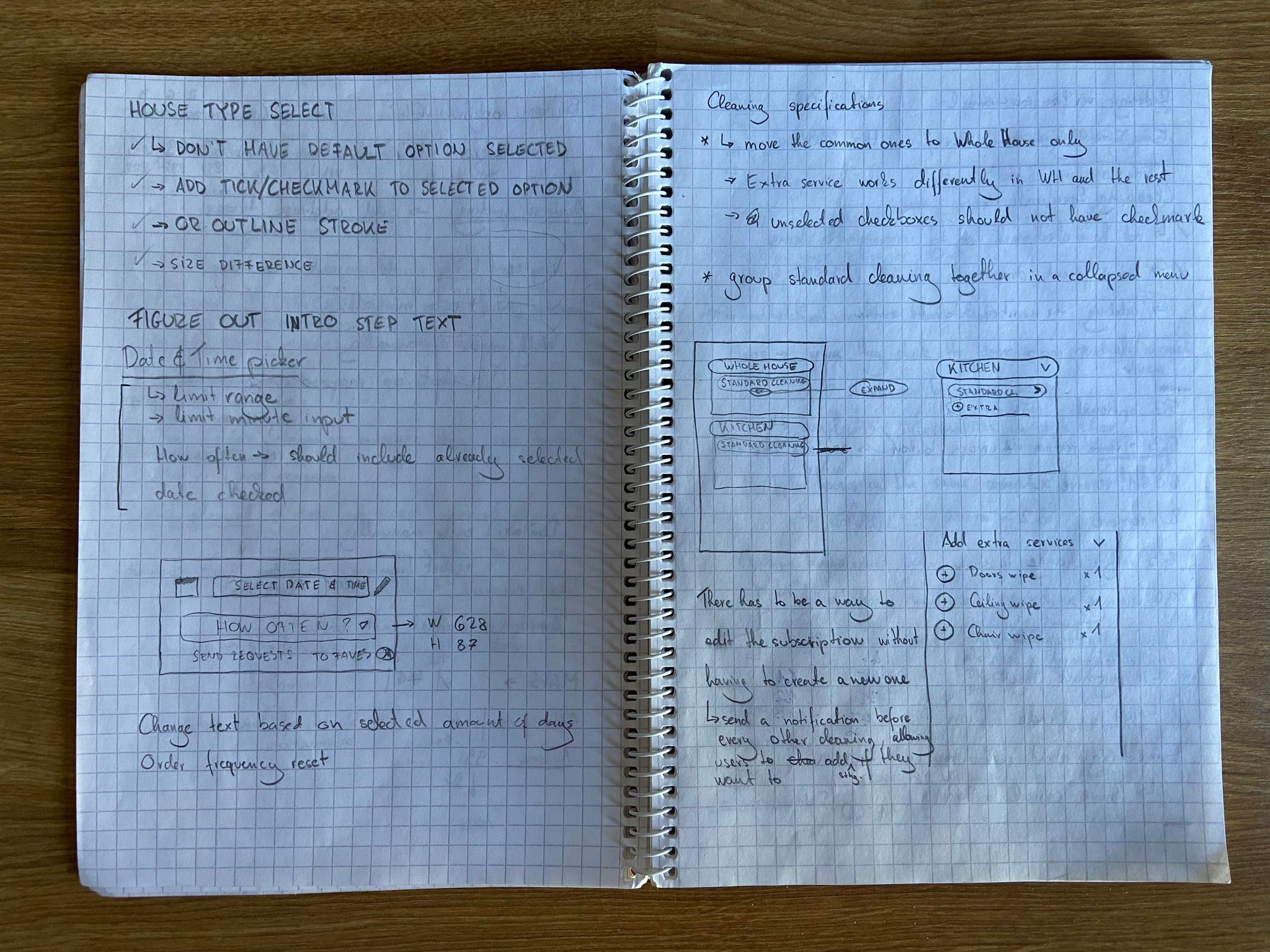
Through note-taking and gradually increasing my understanding of the app, I was able to write a comprehensive list of things I perceived as threats to the overall user experience, and prioritised them based on how much of a problem they posed. Since time was of the essence, the things needed immediate fixing were compiled into a document and presented to the rest of the stakeholders before being sent to the developers. The other, non-time sensitive issues were taken note of and were held off until the main issues were corrected.
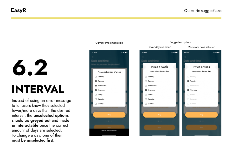
Coming up with solutions
In order to make the application more user-friendly, I took a look at how some other applications and competitors tackled the same aspects in their respective programs. Establishing a baseline based on these findings, I made adjustments to our UI so that the process would be more likely to understood by the users, all the while trying to make the UI speak more to the users and have the input be significantly easier through quality-of-life changes that helped shave some time off of the process. I tried to remove redundancy and focus of what could be of importance of the users, which would've been validated through users tests at a later point.
In some cases where applicable, I offered multiple possible solutions to a problem, so that we could make a decision together as a team. These solutions were compiled in a document that mimicked a previous document by our graphic designer. This was my attempt to start creating a unified look for our current and future documentation.
Optimizing app flow and onboarding
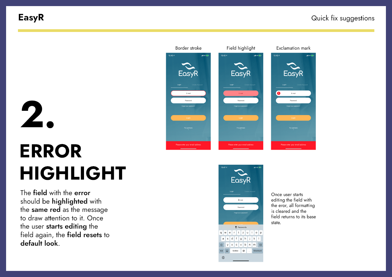
With some of the changes that I proposed, my aim was to avoid letting the user make some mistake during input, as in its current iteration the app did not notify the user of an error until the user tried to progress to the next step of the process. I managed to make adjustments to the process that were accepted, and I had plans to reduce the amount of clicks and steps by consolidating some parts of the process.
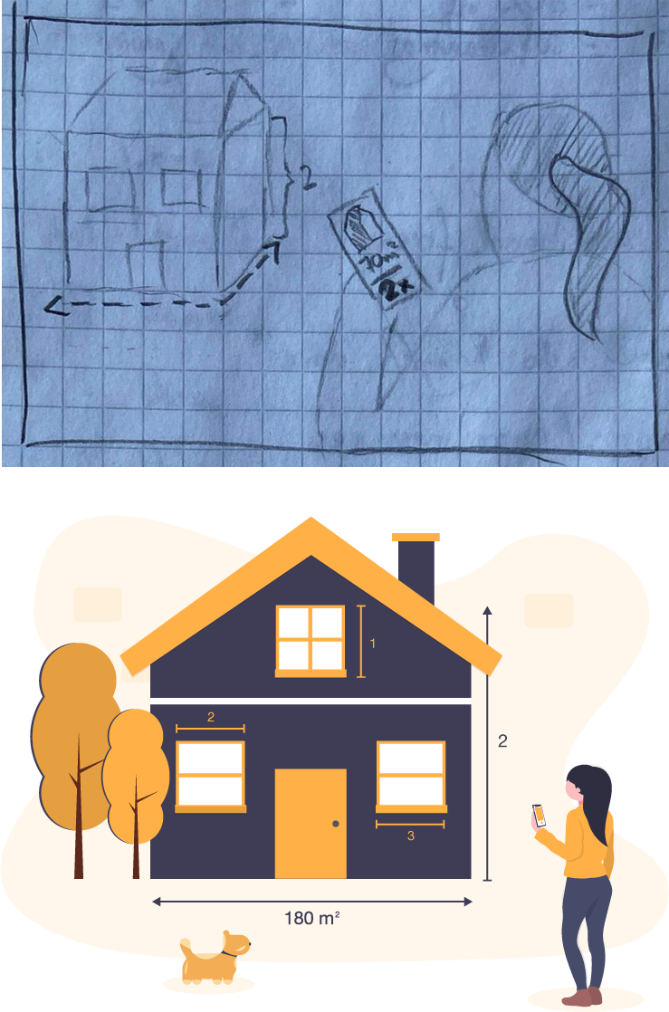
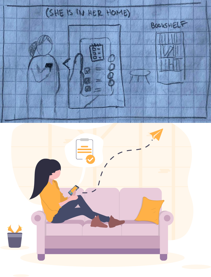
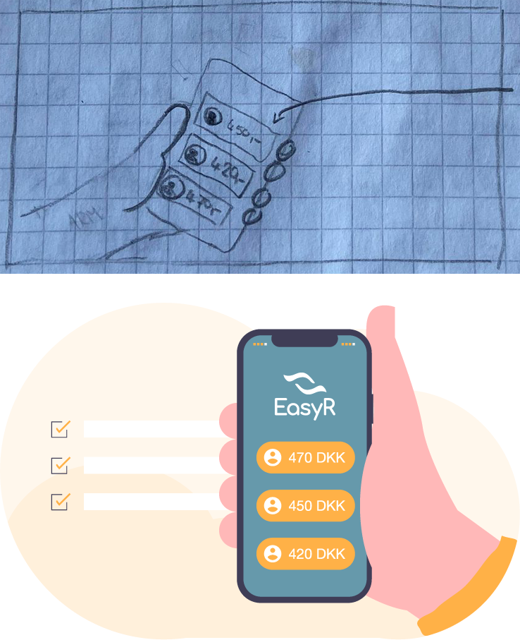
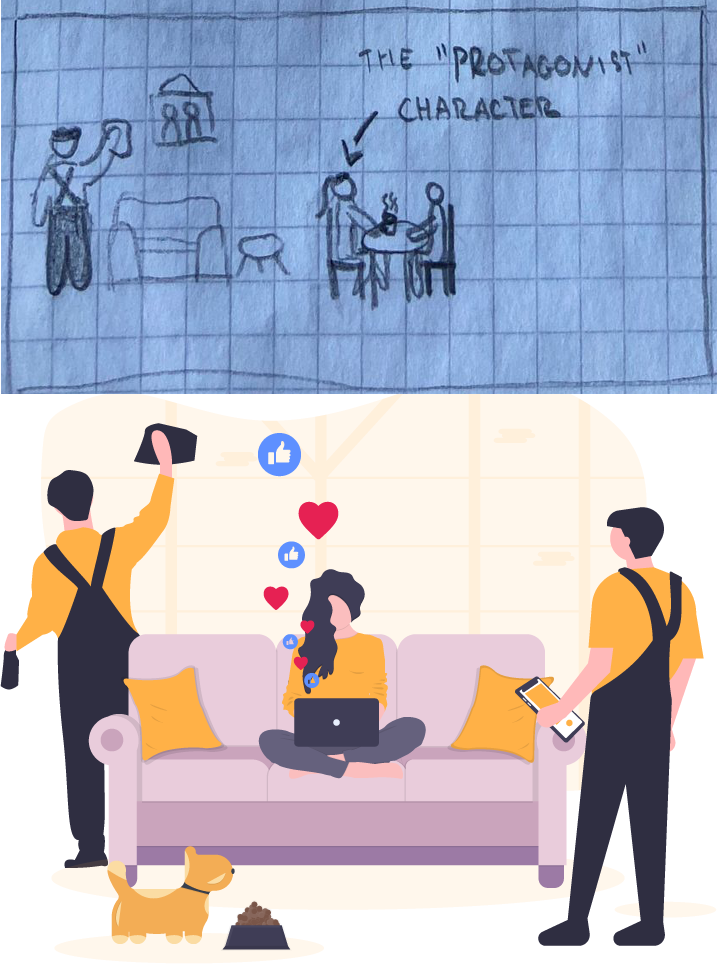
The app also had some onboarding images shown upon first use. I tried improving upon them by making the images correlate better to the step that is described below and making the process clearer by featuring the character for the user be present in all of them. Below you can see my sketches that were turned into nice illustrations by our graphic designer.
What never came to be
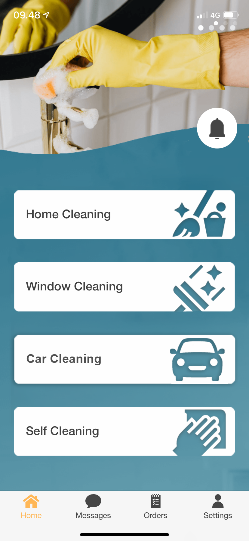
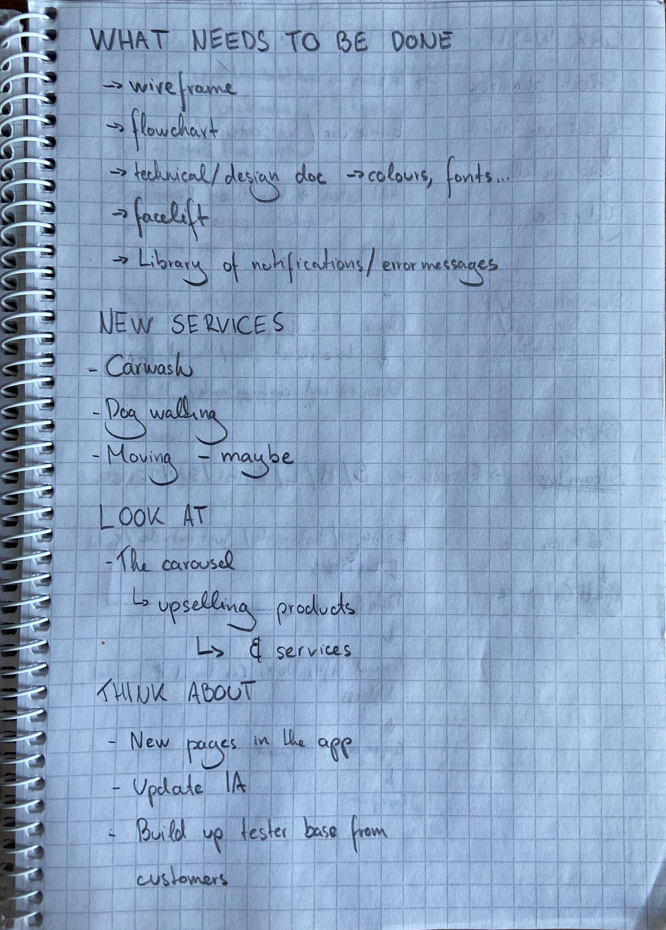
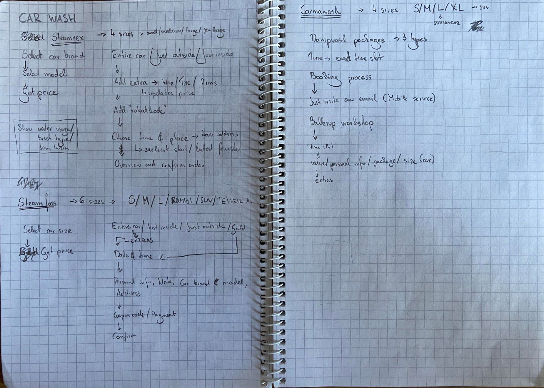
As mentioned earlier, our work at EasyR was cut short by an unexpected chain of events that ended with the company being disbanded. It was a real shame, as I really enjoyed my time here and we already had plans laid out for the future. I did not have a chance to finish some things I've already started working on, such as new features to be implemented: car washing and dog walking services, among others. A report on fixing error messages, data validation and error checking was done, but it was never implemented. I was also working on flowcharts and other technical documentation to make work on the app easier in the future.
Retrospective and takeaways
Despite of some hardships that came with this experience, the process was great for learning and opening me up to new interests. I got to see how a startup works (and ends), and it provided me with some insight about how I like to organise my work. Even though the company disbanded, I still met up on the remaining days of my virksomhedspraktik with my two colleagues and I spent the time learning about Adobe XD and other best practices in my field.
A key takeaway for me was how important it is to have everything organised and keep a living document on the development of our application. A prototype that can be edited and changed, a technical documentation that can bring everyone up to speed about the app, and how important it is to have someone who can connect developers and users to other stakeholers. I came away from this period with more knowledge than I had when I began, and I couldn't ask for more.