Sales dashboard
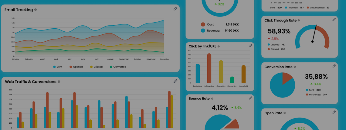
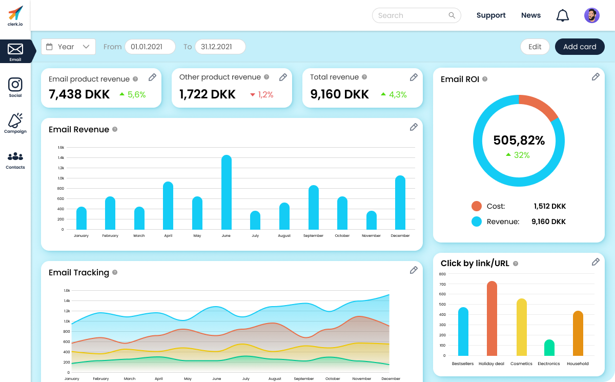
Designing a sales dashboard for email product performance
Overview
This was a take-home task for a job interview that had me redesign a dashboard that is used for displaying the statistics of an email product dashboard.
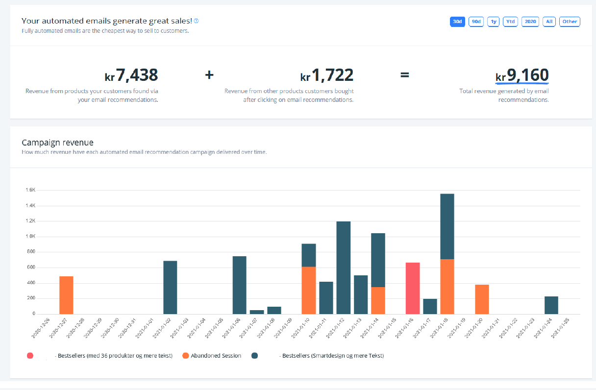
I was given a few screenshots of the dashboard's current appearance, but the rest was up to me. I created the design for this using Figma.
Role
UX/UI Designer & Researcher
Research, Design & Prototyping
May 2022
Link to Figma file: Click here
Background
The dashboard displays the performance of the company's email product, and what effect does the product have on their total revenue and conversion. The following three values needed to be considered: ease of use, intuitiveness and reason.
I was doing a company internship at DigitalGuest when I had to work on this task, so the work was done during my daily commutes and in the evenings after work. This is a first pass on this design, and with the exception of two icons, all assets were created by me.
What I achieved
I designed a dashboard with the aforementioned values in mind. The idea was to create a design that is modular and would allow for easy customisation to meet the different companies' individual needs. Since I was still a relatively new user to Figma, I wanted to do as much as possible on my own.
I believe the design meets all the values, and is organised in an easily understandable manner. As I write in the file itself, it is not completely feature complete, because that was out of the scope, but the submitted design covers what was required in the brief.
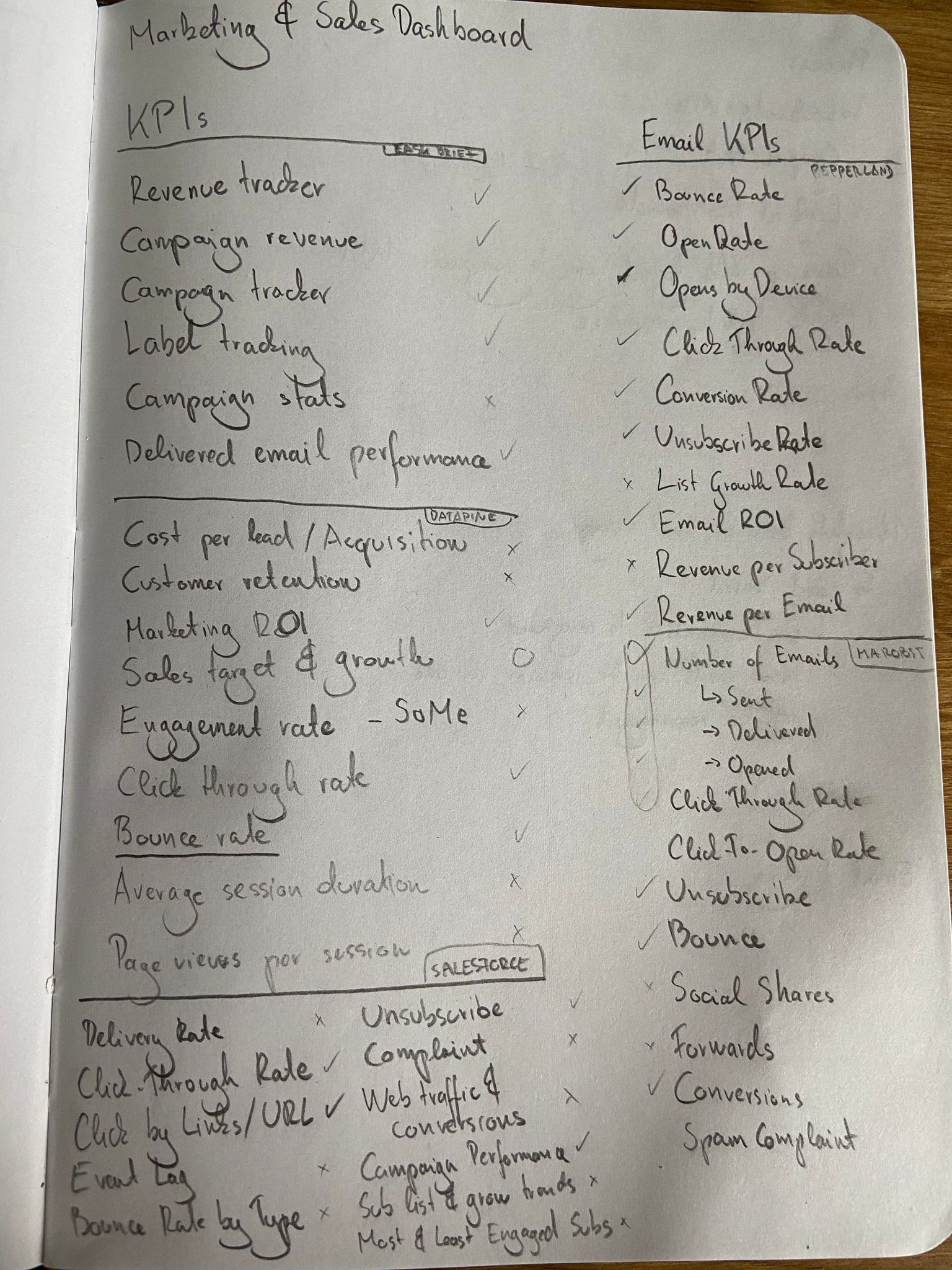
My process was looking into relevant KPIs and compile a comprehensive list of them, then decide on what makes sense to include in this dashboard. Then I looked at other dashboards to get an understanding of best practices. After this, I looked into logical ways to organise the KPIs, and finally I made a desicion on how to visualise the data.
Research
The brief stated that we were free to use the KPIs that were presented in it, but researching important email marketing and sales KPIs was encouraged. I looked at a number of different sites, and compiled a list of KPIs. I then worked my way down the list, grouping the same or very similar ones, and striking out those that were not relevant for the task at hand. Finally, I had a list I was happy with, and began looking at other dashboard solutions.
Looking at other solutions allows me to get an understanding of the state of the art and best practices, so I can avoid making some obvious mistakes in the design.This step of the research helped me cement some ideas. I wanted to create a card-based solutions, which would allow for easy reorganisation and customisation of different data, so each potential company could tailor their dashboard to suit their individual needs.
Finally, I looked up different ways of data representation. I opted to use a different one for each element just to showcase how the dashboard coult potentially look, but the idea with the design was that the users would be able to swap between different charts easily, so they can set what is represented in a way that suits them best.
Designing the dashboard
I wanted to go for a happy, colorful look, so I created a palette of nice and bright colours. This was also done with accessibility in mind: I wanted the colours to be easily distinguishable by most users. However, the short timeframe I had for this task did not allow me to make sure that the colours are colourblind-proof, accounting for all types of colourblindness. The idea for a fully-implemented version would have been to allow users to customise each colour to their own liking, as this makes sure that everyone can interpret the data at a glance without difficulty.

I created a sidebar for the dashboard to indicate how I would separate content. The first tab is of course "Email", and this is where all the relevant statistics would be displayed for the email product across all different campaigns. This would allow to gauge the long-term performance of the product, regardless of the sizes and periods of the different campaigns. The next one is "Social", where KPIs pertaining to the social media of the company would be shown. This is followed by the "Campaign" tab, where the performances of the different campaings would be displayed. Finally, there is a "Contacts" tab, that could house the contact information of people of interest.Again, due to the scope and time, only the first tab, "Emails", was created for this design. Overall, I believe that I achieved a logical separation of content, but I can not know for sure without validating it with users from the industry.
The top navbar features a search field, a link to the "Support" and "News" pages, which would be to offer assistance and revceive one-way communication regarding the product. There is also a notifications button and a button to access the user profile settings.
There is also a secondary menu, where users would be able to filter data based on a time period. The dropdown would let users select between predefined periods, such as year, week, month and quarter (in a real setting, this would determined by user interviews to see what are most commonly used in the industry), which would automatically set the dates in the fields next to them. Selecting the "Custom" option from the dropdown (changing any of the dates would trigger this selection) would make it possible to narrow the data down to a custom time period.
Finally, the "Edit" and "Add card" buttons would be used to rearrange or otherwise change the layout of the dashboard by moving the cards around, deleting the unwanted ones, or adding new cards based on what is required. “Add card” is of Primary button type, as that is what I think the primary action would be on this dashboard. Clicking on “Add card” would allow the user to add a new card of the desired layout and graph style to the dashboard to track another metric. These could be premade ones or the user could have control over setting the card up, it all depends on how and where they get data from. “Edit” would unlock the cards and allow the user to move them about relative to each other and possibly resize them. This way, they can organise the data in a manner that they find logical and convenient. Below is a video of the dashboard in action.
Keeping the cards flexible
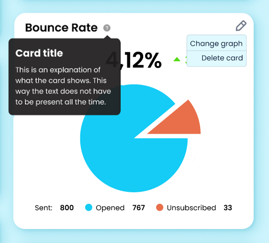
As mentioned above, I wanted to keep the entire design of the dashboard flexbile and customisable. In the top right corner of each card, there is an "Edit" button, that can be used to either delete the card entirely, or just to change the type of data visualisation of the individual card. I also had in mind that certain cards could be combined into one on demand, but this was out of scope for this task.
Next to each card's title, there is a little "?", that can be hovered over to get a detailed explanation of what data the card is displaying, and how the results are calculated. I added this element because in the screenshots provided in the brief, each graph had its explanation always present. This can lead to a cluttered UI, and if someone has been using such a tool for a while, this information is redundant to them. With this design change, the information is still easily accessible for those that need it, but without overcrowing the interface.
Retrospective and takeaways
This was a very fun task to work with. Each step, from research to design offered something to learn from. I also learned about some of Figma's features that I have not used or seen before. This was exactly the reason why I wanted to do everything from scratch myself - not only to have a design made entirely by me, but I also wanted to use this opportunity to supplement my learning while doing UX at DigitalGuest.
I am quite happy with how this dashboard turned out, despite the difficult working conditions - using my old laptop on the train. In case I ever revisit this project to flesh it out a bit more, I would probably take a look at the colours, the spacing, and some additional features, such as a Light mode/Dark mode switch that I thought would be neat to implement.