Esports Analytics Portal
Offering platform improvements for Esports Analytics Portal
Overview
This project was a take-home task for a job interview. The goal was to go through the company's esport analytics portal and come up with potential improvements for it.
Due to the nature of this task and the limited time I had at my disposal, I did not choose make a prototype. It would have taken too long to recreate the necessary assets, so my workaround was to edit screenshots to illustrate my points.
Role
UX/UI Designer
Research & Design
February 2021
Background
Skybox is an analytics portal for the game Counter-Strike: Global Offensive. With the use of this tool, players and teams can evaluate their match performance, analyse their movement and economy in order to improve their strategy as a team and as an individual player. The platform is quite robust and offers abundant insight into nearly every detaila and aspect of matches.
As a long-time Counter-Strike player, this was an extremely fun task to work on, because I got to use my experiences as both a UX&UI Designer and a veteran player as well. My history with the game helped me look at this project from a different point of view, as I know exactly what information and visualisation would help me as a user of this platform.
What I achieved
I systematically went through every page and tab of the platform and came up with small improvements that in my opinion would make the product even better. I looked at both the user experience and the user interface of Skybox, so my suggestions cover a whole array of improvements. While going through the program, I took notes at every step for both the analytics portal and their 3D viewer, which allows users to replay and inspect the matches using a variety of settings and camera angles.
As mentioned above, due to time constraints and the nature of this task, instead of creating a prototype in Figma or XD, I took screenshots of nearly every page in question and edited them to illustrate the point I was trying to make. My process was the following: I spent the first day on research and analysing the platform, and then used the next day to create the images based on my notes, and finally I combined my notes and images into a presentation. For this task, I also looked into competitor products to see how Skybox measures up to them and what extra features would be nice to have.
Exploring Skybox
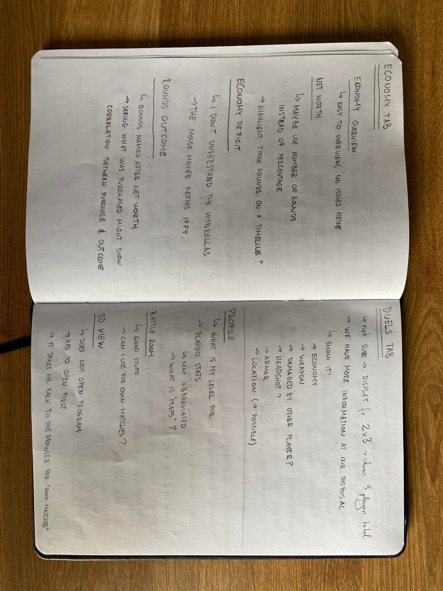
First thing I did was read up on the product, to make sure I understand what it is that it does for the players. Once I got a good enough understanding, I proceeded to download it, and go through the entire thing with fresh eyes, as a first-time user. At every step of the way, I took notes of everything, supplementing the notes with my ideas on how the feature in question could be improved.
Once I covered everything in the platform (that includes the Analytics Portal, Battle Room and 3D viewer), I started looking into similar products and websites that collect player performance statistics. Skybox offers a great deal to users, but I felt that it had untapped potential, as it was not doing enough with the data collected. From my experience as a player, I knew exactly what kind of information can be gathered from the game, and using these extra titbits, Skybox could offer even more to its users.
Coming up with improvements
Having taken screenshots of all the pages and elements in question, I edited them to show how it could look like instead. These suggestions included showing additional information to the player in the form of extended weapon kill stats, correcting minor UI errors, such as incorrect display of certain data (such as the economy deficit graph), or changing the colour and display of certain statistics to make it more colourblind-friendly.
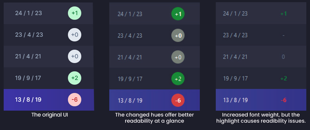
Once I created all the images based on my notes, I began working on the presentation for the interview. The document included a brief description of my workflow, a brief description of my suggestion which was paired with the edited image to illustrate my idea. The end result is a comprehensive document that covered almost every aspect of the platform. You can read it in the following section.
The presentation document
With the look of the document, I tried to use the brand look to the best of my abilities. I used the colours skybox uses, and I found the font they used on their website and UI. During the interview, I went through the entire thing, explaining my ideas in depth.
Retrospective and takeaways
Overall this was a very nice task to work on, as it mixed my work with my personal interests, and my suggestions came not only from a professional point of view, but they also tapped into my extensive knowledge of the source material. The company appreciated all the thought and work that went into this project, and I got a nice thank you gift from them, which was definitely a first for me.
It would have been nice to dive deep into this and create a nice prototype for the project, but seeing as I'd have had to recreate all of the assets, it was not feasible this time around. I still did the very best I could do, and covered the platform extensively. This should show you the level of dedication and detail I strive to work with on every one of my assignments.
