Point-of-sale system


Proof of concept of a POS system for employees with disabilities
Overview
Done as a take-home interview task, this is my take on a point-of-sale ordering system meant to be used by people with various disabilities. This is only a proof of concept, so this is not meant as the final look of the platform.
I found this to be a genuinely challenging task to do, due to the limitations I had to work with to account for accessibility. The idea was to use a simple UI without any fancy bells and whistles, because even the final implementation would not be a product meant for commercial marketing, as this is just a tool.
Role
UX/UI Designer & Researcher
Research, Design & Prototyping
April 2022
Download XD file: Click here
Background
This task was a Product Design task for a company I interviewed for. According to the Client challenge in the brief, this was to be done for a charity company that partnered with restaurants to employ people with learning difficulties to work in the hospitality industry.
As per the scenario, people with learning difficulties work in partner restaurants, taking drinks orders and delivering them to the customer tables, however there are some problems with the service (see below for details). To address the issue, the charity wants to investigate the possibility of digitising the ordering and payments process. They would like to run an 8-12 week Proof of Concept phase to test out the idea and get buy-in from restaurants for further rollout.
The problem to solve was about the people receiving the orders having various challenges when it comes to reading, for example. Poor eyesight, reduced cognitive ability, limited reading skills. Our research has shown that the wait staff respond better to symbols and simple images instead of complex words and sentences. They also prefer to avoid interacting with customers and as such, struggle to take payments from customers.
What I achieved
I designed a POS system whose UI does not rely on written text or numbers. I felt that the learning difficulties laid out in the brief were a bit vauge, and based on the wording I worked under the assumption that the target group included people with Autism Spectrum Disorder (ASD) as well.
I did research into POS systems, various learning difficulties, and of course existing restaurants that employ people with reduced cognitive abilities. I incorporated all the knowledge yielded by the research in my design.
The brief did not mention how the customers would place their orders, nor was it described in what other ways can the restaurants aid their employees, so I worked off of assumptions, as according to the brief it was okay to do so.
Research
I begain research by looking into accessible design practices. I looked into various solutions that targeted poor eyesight, dyslexia, dyscalculia and ASD. I have had some experience in accessible design, as one of my projects during my studies was about creating a digital diary for a person with autism with the goal to replace their physical one.
I took note of what the design needed to cover, such as no text in the interface, minimal colour usage to avoid sensory overload, not having menus within menus (so everything is easy to find), audio feedback to aid those with poor vision, and high contrast.
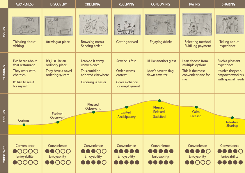
I created a user journey map to illustrate the process from the customer's point of view. I opted to use them as a subject rather than the employees, because this way, the benefits and values such a system can bring to the establishment can be better communicated.

I also looked into existing restaurants that employ people with disabilities. There were quite a few, but the results varied a lot, as the employees had vastly different disabilities from place to place. It was still an excellent learning opportunity, as I could see what these employees could accomplish, and what level of assistance they required. I saw some unique solutions, such as cashless or coinless payment systems.
And finally, I looked into POS systems in general. I've had some experience with them from my student jobs at restaurants, but I wanted to get a better sample size.
Designing the system
In the previous section, I laid out some things I wanted to account for with the system. Some additional things I kept in mind was to give the customers the ability to customise their orders, and of course to avoid putting undue burden on the establishments. By this I mean I wanted to have a system that is really easy to implement and install in various restaurants without requiring specialised hardware or having to make major changes to their existing infrastructure.

I thought of additional help for the employees, such as marking certain shelves and glasses with easy-to-see labels or icons, to know where they can find certain items, but I found this an extra step that I didn't want to subject restaurants to. Furthermore, this would have involved having the employees learn an additional system, and that would have reduced the efficiency that I was going for.
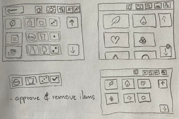
The idea about the ordering process itself was to have the customers interact with a regular menu and the servers would see the order in a simplified manner in the POS system. The customers could either use their own smart devices to order, or the restaurants could provide simple tablets connected to their internal network. The server would then see the order, prepare it, and mark completed items as "Approved", which would move it to the table's order history, separating it from incomplete items. Finally, when the customers are ready to leave, they would send a request to the system, from which the server can send a payment request back to them, which can be completed using online payment or by using a system equivalent to MobilePay (if applicable in the establishment's region). Upon completed payment, both the customer and the server are shown confirmation, and the table is removed from the list of active tables. Below is a video showcasing my solution.
Interview presentation
For the interview, I prepared a short presentation that I would go through that covered the conent above in a shortened form. I also made a quick storyboard to illustrate the process of interacting with the system both from the customers' and employees' standpoint.
Retrospective and takeaways
As mentioned before, this was quite a challenging task to do, especially since it was my first Product Design interview task. At the time, I was not sure what level of detail or completeness are they looking for, or whether the process and reasoning weighed more than the design itself.
I understand that when dealing with product design, certain topics, such as brand look, typography and color theory are important to touch upon. However, in this specific project, I found that none of those mattered. Typography was irrelevant because this was meant to be a textless interface. For color theory, I mentioned earlier that I wanted to avoid using too many colours in consideration for possible users with ASD. What little colour I have in there was to make the look of the system not too boring for the interview, and the color choices are by no means final. Finally, I did not consider brand look, because this is a backend software used for utility by people who are unlikely to care about marketability or brand colours. It also has to be applicable across multiple different establishments.
Overall, I did the best I could in the time that I had. I spent a lot of time on research, as this was a sensitive topic with out of the ordinary use cases, so it was important to try to get as many things right as possible. And while the system may not be much to look at, I think it could accomplish what it needs to fairly well, so I'm content with how it turned out.