Knowledge base
Comprehensive redesign of a knowledge base system for a client
Overview
Our solution had an FAQ module. It needed a redesign, but with the design team we felt that this called not only for a visual overhaul, but a comprehensive redesign of the functionality, on all platforms (mobile, responsive web and web admin). The goal was to create a help center with business critical and important information that the user should be able to navigate easily
The end result is a vastly different module, now called "Knowledge base", that is closer to other help center solutions by other companies. A new structure ensures that there is at most 3 tiers in the hierarchy, making the organization of the help articles better and more accessible as to how it was done earlier.
Tasks
This project involved:
Research, Design, Prototyping & Testing, Validating, QA
3 sprints
Background
The existing FAQ module was made for the mobile application and it had an interface on the web administrator portal, where users could use the content creator to create and publish articles, and sort them as they wished. At this point in time, I already started working on the responsive web application version of our product, so the task involved bringing the FAQ to responsive web. This was part of the reason the module needed a visual overhaul, so that the responsive version and the app version resembled each other so that the users would be able to navigate it easier on both platforms.
Due to the organization structure of the existing solution, we've seen clients create a bunch of top-level groups featuring just one article each, some of which had just a single sentence, and we felt that some of those articles could be grouped together because they contained important information about the same topic. Furthermore, the client had multiple brands in their business, so we wanted them to have the ability to be able to better sort the information, with the possiblity that certain articles showed up for employees belonging to the respective brand.
Competitive research
To lay the groundwork for this task, I started looking into other help center websites on the web. I looked at solutions from Lyft, Spotify, Zendesk and more. I took note on how these are organized, and came up with a new proposed structure. Based on the findings, help center sites most often employ a top-down approach that starts with broader, more general topics and then gradually narrows down to more specific details. I found this to be the best approach due its user-friendly navigation. Firstly,this allows users to quickly find the general area of their inquiry and they can drill down to the specific information they are looking for. Secondly, the information is presented in a logical sequence that mirrors how users typically seek help.
I also looked into how navigation was handled on these sites. Typically, they had breadcrumbs to show a path to the page the user is currenlty on, and some of these also had an index on the side which allowed for a quick access to information, improved usability and visual organization. These elements I wanted to incorporate into the design.
Problems with the current implementation
After looking into state-of-the-art solutions, I analyzed our solution and its usage by the clients. The single biggest issue I identified was that the users could create subgroups within subgroups with no limitation, this, coupled with the issue in usage I outlined earler, made it very hard to find any piece of information efficiently. Users had no overview of the structure of the FAQ, and sometimes one had to drill down deep, only to realize that what they were looking for was elsewhere, or to find that the article was a simple, one-sentence piece of information.
The issue with this structure was also the naming conventions. When we were talking about the module, we often used terms as "sub-sub group" or "sub-sub-sub group", everything was either a group or some version of subgroup, amking it harder to convey what we were talking about. The new structure I proposed aimed to solve this with an overhauled naming covnention. This strcuture is as follows:
- At the top level, we would have Collections
- Collections have categories within them
- Categories may or may not have sections
- And finally, the last level is articles, that can either be in categories or sections
At first, some managers were reluctant to accept this proposal, citing that this loses some flexiblity for the cliens to organize the content in a way they want to. I was adamant in this decision, so I spent time going looking at and categorizing how the clients used the FAQ, and visualized it to the managers, showing that to some extent they are alredy adhering to this structure, and I gave them examples of very short articles that had their own collection and category. This data convinced them that the proposed structure is worth pursuing as it will not upset the current usage, but will also be more user-friendly.

Simultaneous design for multiple platforms
Now that we were set with all the preliminary work, it was time to start the wireframing and design work. We wanted to roll out the update on all platforms at the same time, so the other designer and I collaborated heavily to achieve this in the allotted time.
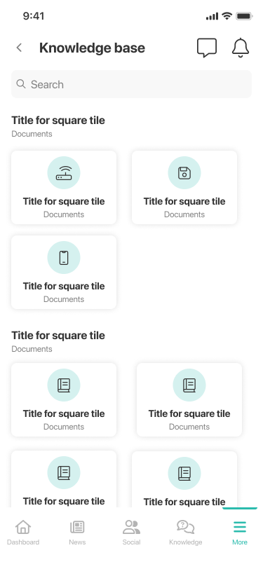
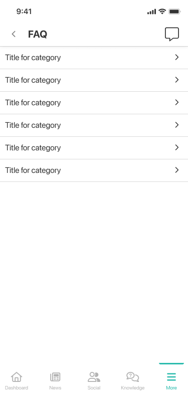
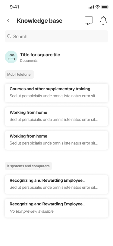
Since we wanted a uniform look, we separately worked on proposed UI elements and we reconvened to agree on the elements that we would be using. We agreed on using "tiles" for categories and article previews, and collections and sections will just be a text label.

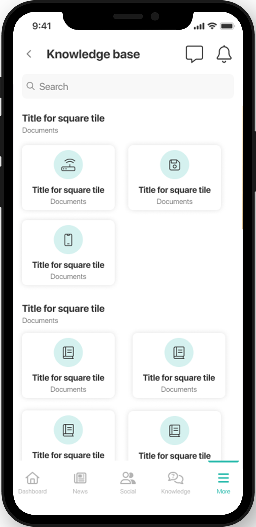
Following this step, we had an idea about the structure, the layout and the steps necessary to finish the designs on the mobile and responsive web platforms, so we got to work on our tasks. The end result for the app can be seen below, where you can use the slider to see the before and after. As you can see, the new system is able to show more information with the addition of article previews, and provides a better glimpse into the structure by showing the amount of items within each category.
Responsive web version
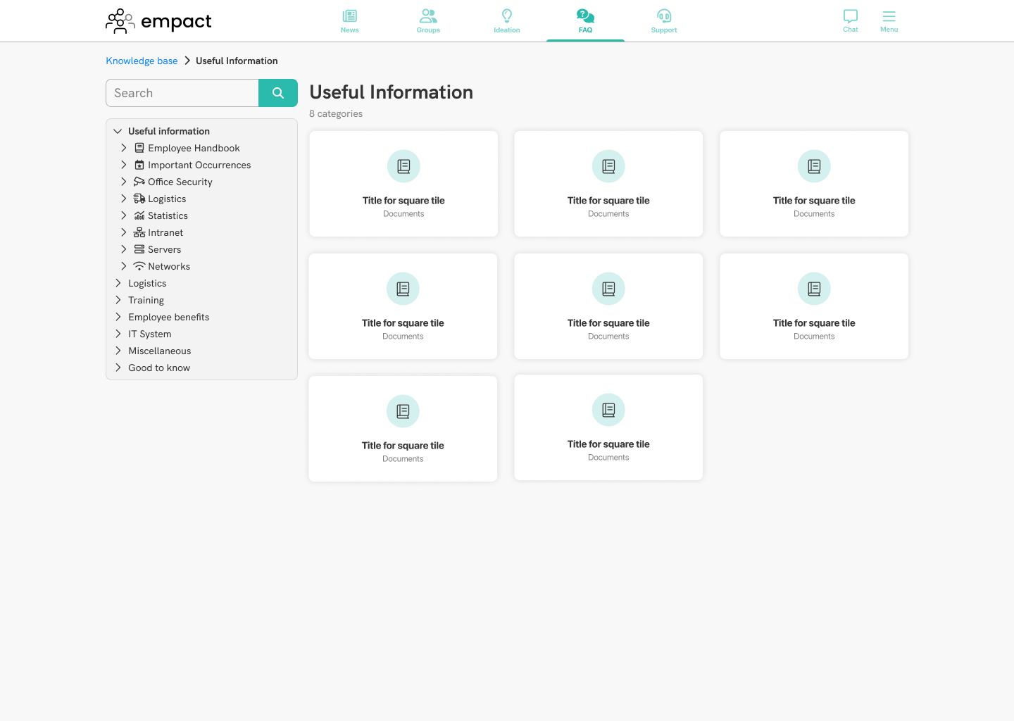
This version was created from scratch as part of this task, and was part of the reason why we did a visual redesign for the module. The challenge in this was to make efficient use of the more space that is available on bigger devices, as well as designing the UI in a way that scales down to mobile devices without losing functionality.
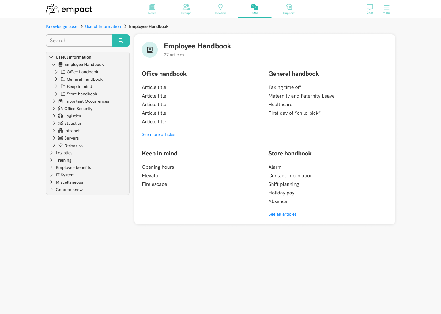
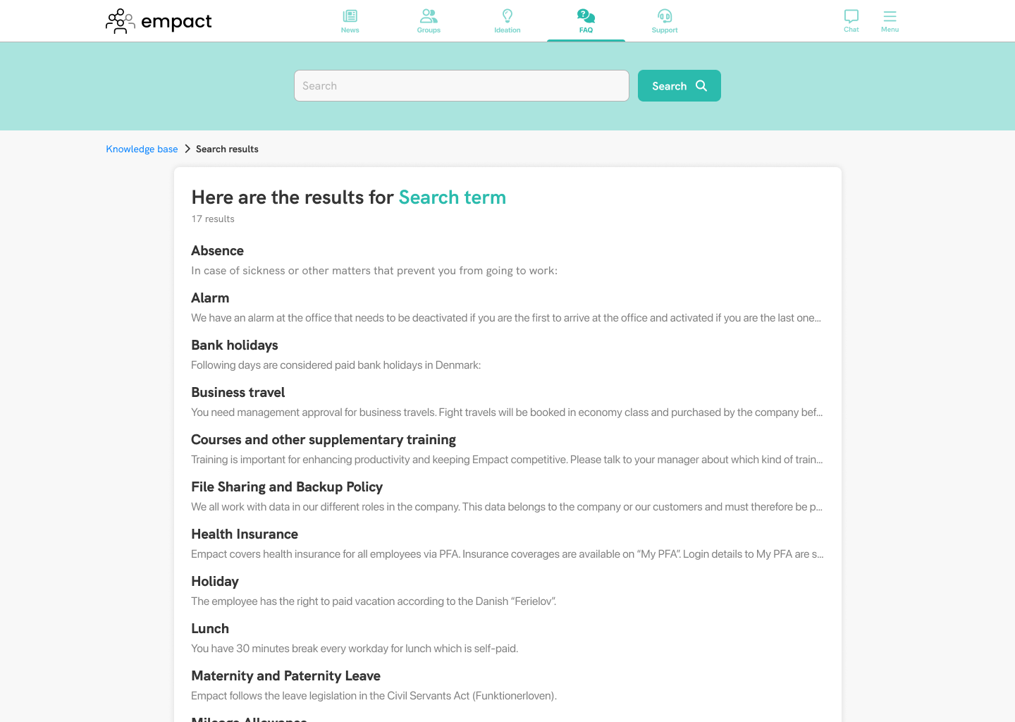
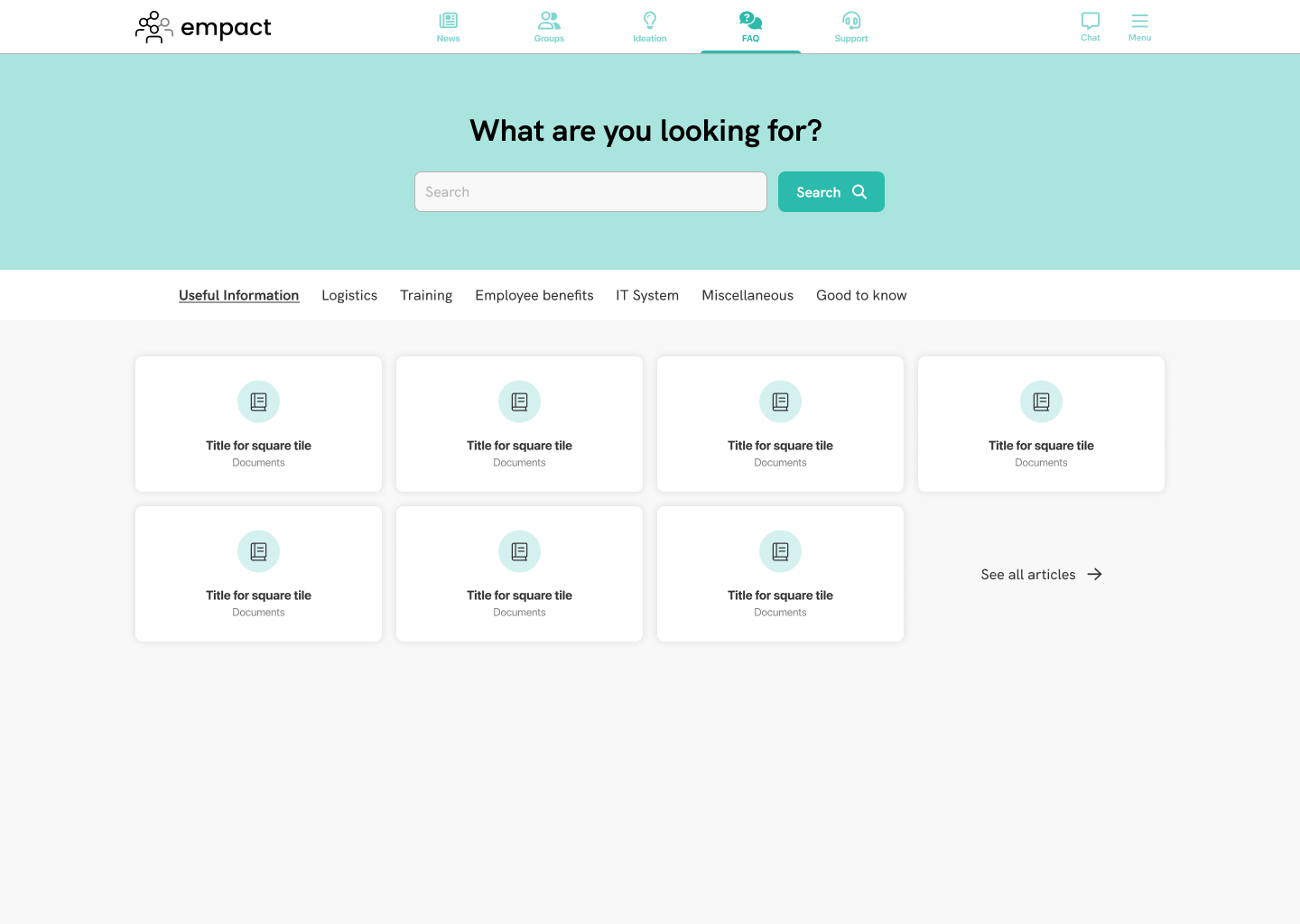
I took inspiration from the research I did on other help centers, and tried to combine the best aspects to provide good user experience and a nice overview of the contents in the knowledge base. It was my intention to fill out the green area housing the search bar with an illustration, but unfortunately we did not have the time or the resources to do it, and it kind of stayed that way. The main page has a prominent search bar, the collections are featured in a ribbon menu that has horizontal overflow on smaller screens, and the categories are displayed underneath in tiles. just 7 to begin with, but the user has the option to reveal all of them.
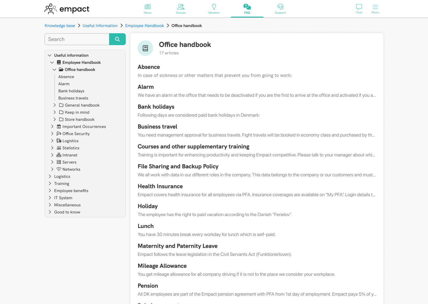
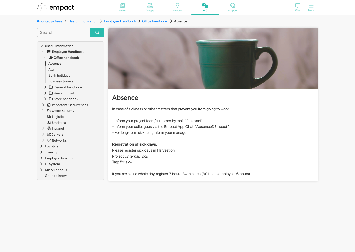
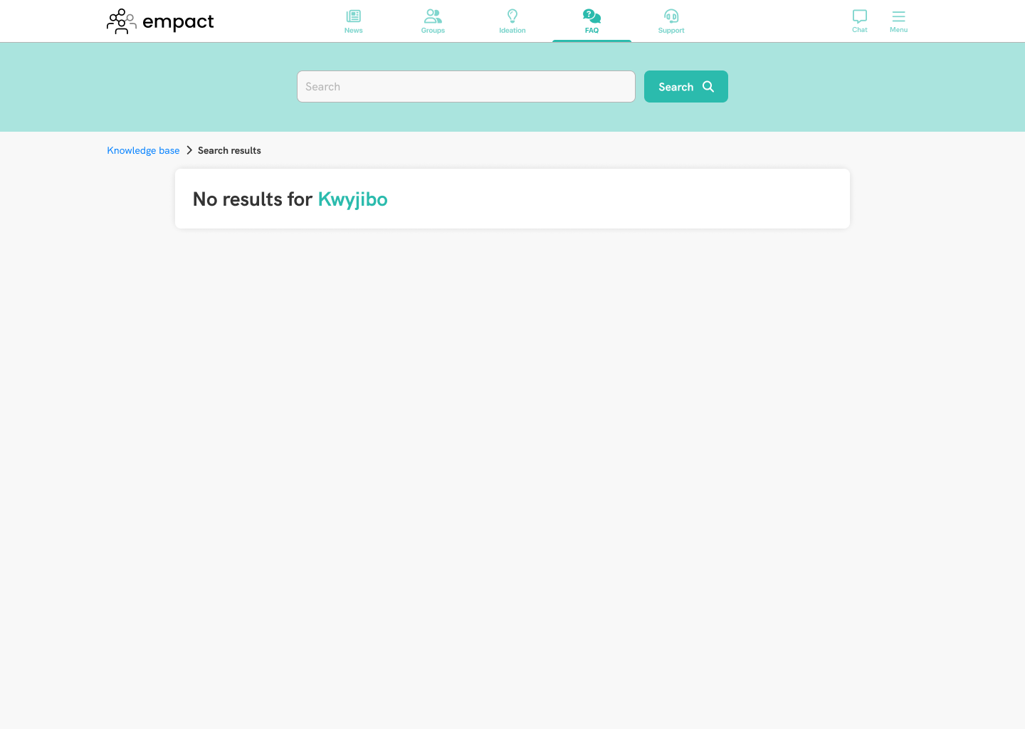
On the the pages for categories, sections and articles, I featured breadcrumbs and an index navigation. The goal was to help users orient themselves as to where they are within the knowledge base. I included a smaller search bar just above the index so that users have access to the search feature conveniently at all times. I used a 12 column grid to aid with consistent layout across the platform. In this case, the index navigation spans 3 columns, and the categories, the contents of them and the sections and the article itself ook up 9 columns. You can use the carousel below to view the rest of the pages in the knowledge base.
The web administrator platform
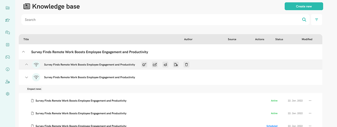
Now that we had designs for both mobile and responsive web, it was time to tackle the web administrator platform. This is the interface where users can create new collections, categories, sections and articles, and sort them as they please. Unfortunately, I have no "before" images of this version, only of the redesign.
The issue with the old implementation was that it was hard for users to oversee the structure, as it worked as nested tables, and it took considerable effort to move the articles around to different groups if the user wished to do so. With the new implementation, users can drag-and-drop items to different places in the hierarchy, and they could access actions through buttons that appear upon hovering over the item in the table. They could now easily move, duplicate, edit and delete items, and get a better overview through a table that organized its contents in accordions. Each level of hierarchy has actions that make sense: in collections, categories, and setions, users have the option to create new categories, sections and articles, respectively. For categories, the user can also select a new icon from a list we provide to the users.
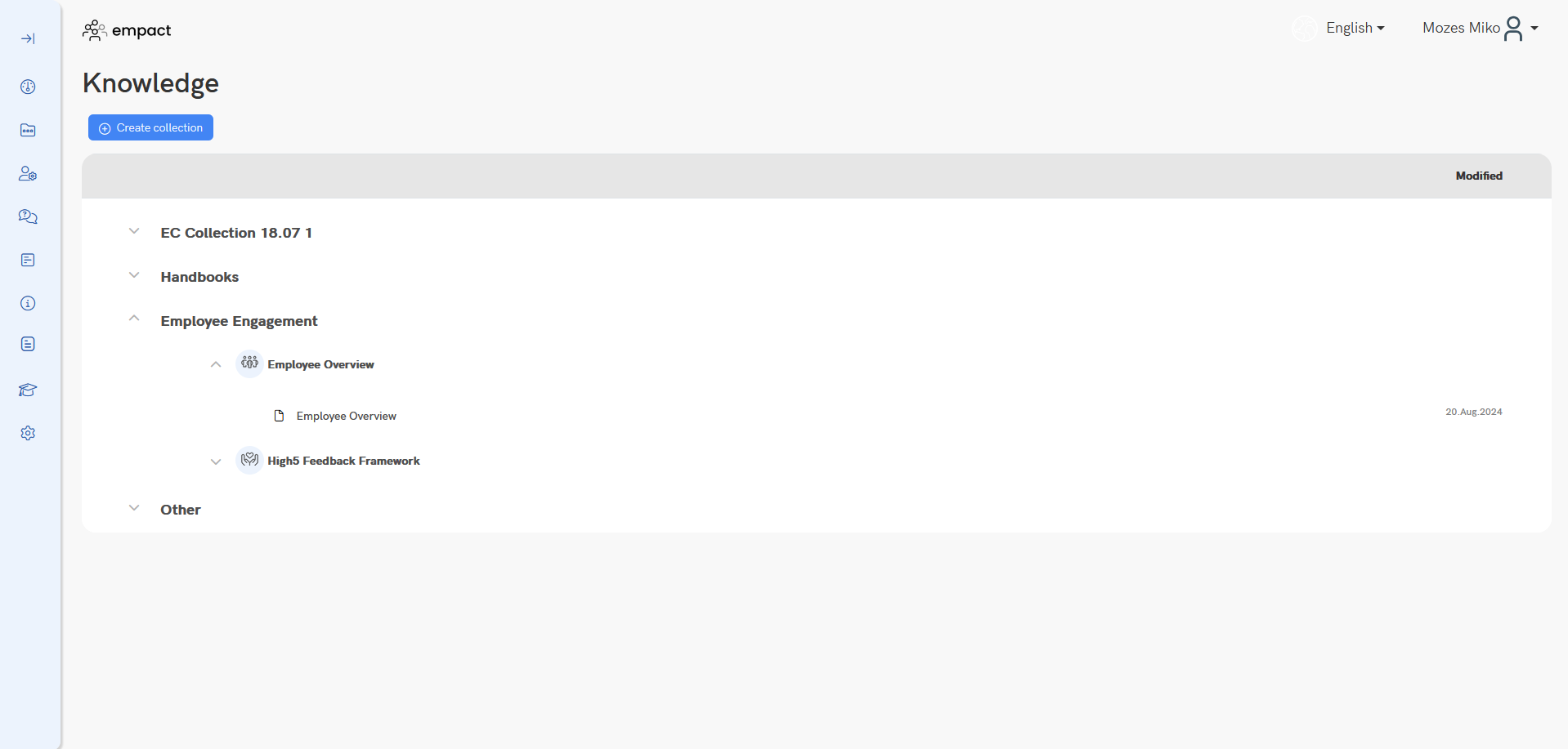
There are some things that are as of yet still missing from the implementation: statuses for articles that show whether they are live or still drafts are not shown, and a search bar and filter are not yet present in the final design. The purpose of these would be to offer improved navigation for users to find specific pieces of content, or perhaps filter them by author or date for last modification.
Reflection
The outcome of this project is a much improved system that offers significant improvements in looks and user-friendliness. The new hierarchy offers better overview over the contents of the knowledge base, mainly because users are no longer able to create subcategories infinitely. The new design for the table allows easier organisation with context-specific actions, and the different levels of hierarchy are visually distinct so that users can understand the structure at a glance.
Despite all the research that was done for this project, it would have benefitted both us and the users if we had access to users from the clients so that we may further tailor our solution to their specific needs. Unfortunately, we did not have access to user data from outside our company at this point in time despite my efforts to include them in the process.
I never stopped advocating for conducting wider user research with our clients, but due to the timeframe we were operating and decisions from management, we were unable to secure test participants for research. I believe the outcome would not have been much different, because the new structure and organzation were based on state-of-the-art solutions, but I am certain we would have benefitted from additional insights that would have allowed us to tweak certain aspects of the UI and user flows.
Regardless, we were very happy with the result, and through subsequent feedback we learned that our clients found the new design satisfactory and an overall improvement.
