Responsive Web App
Designing a responsive web app from our mobile app
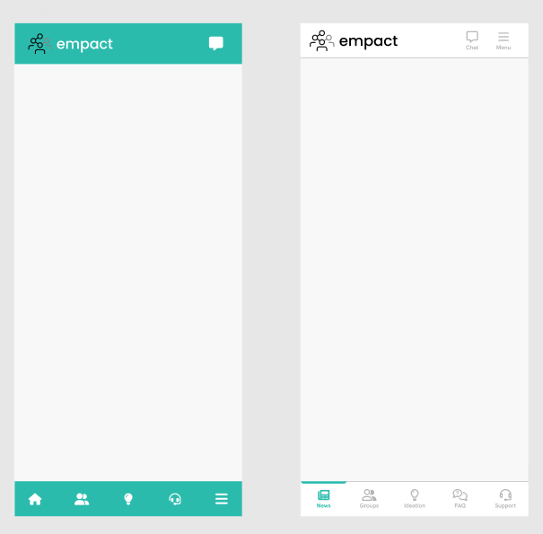
Overview
Our software was a mobile-only application made for deskless workers with the purpose of increasing engagement. People in management used the Web Administrator platform to manage content and adjust application settings. Our management wanted a solution that would bring the contents of our mobile app to more devices, making it accessible for people who work in the offices.
I started working on this as a proof-of-concept but it became a priority soon after, so the task involved bringing al current modules to the responsive web app as soon as possible, and from then on, each new module and update had to be accomodated for this platform as well.
Tasks
For this task, I performed
Research, Design, Prototyping & Testing, Documentation, QA
Spread out over multiple sprints
Background
Our team embarked on the challenge of expanding the reach and functionality of our mobile application by developing a responsive web application. As mobile usage continues to dominate the digital landscape, we recognized the need to offer a seamless experience across all devices, ensuring our users could access the same powerful features of the mobile app on their desktops, tablets, and other web-enabled devices. The primary goal was to create a web version that retained the intuitive design and performance of the mobile app while taking full advantage of the larger screen real estate and capabilities of web browsers. This initiative was driven by user feedback, market trends, and the strategic aim of increasing accessibility and user engagement across platforms.
Research and competitive analysis
The first step was identifying solutions our target users were familiar with, so that we gain insight into user expectations. Through these intial rounds of interviews, answers that commonly came up included various HR tools, but the most mentioned were Facebook and LinkedIn. These both offer an application and a web version of their product, and these were the platforms I took most inspiration from, leaning more on LinkedIn because that seemed to lend itself well to what we were going for.
Independent of these user insights, I tried looking up other similar responsive web applications, either through online research, recommendations by people in my network, and I utilized ChatGPT in this endeavor by giving a detailed prompt of what was the end goal and asking it to provide some examples of similar systems. It provided me with a number of leads, but few of them matched our purposes. Our main feature was still communication from HQ to deskless workers, so the news feed was the most prominent feature, and that is why LinkedIn was used as the main source of inspiration.
I looked into how different modules are laid out on the relevant competitors, and some utilized the entire width of the viewport while others adhered to a different layout. For example, LinkedIn's Feed, Chat, Jobs used the same layout, but LinkedIn Learning uses the full width. Facebook has a similar approach, where some modules take up more width than others, but their menu is always docked to the side, but the home page Feed has a different menu. Through discussions with the developers working on this project, we decided to just use the same width for each module, at least to begin with.
The Design Process
The first step was identifying breakpoints and the layout we would be moving forward with. I looked at data provided by StatCounter Global Stats to get an idea about the most commonly used device sizes. I also had some discussions with the developers assigned to this project whether they had any insight or knowledge from their experience.
Through this process, we decided that the minimum width we would design for was going to be 320px, which also adheres to Microsoft Teams' guidlines as at some point it was also a plan to bring this app to that plaftorm as well. So this means we would be using the following breakpoints:
- Mobile: 320 - 739px
- Tablet: 740 - 1023px
- Laptop: 1024 - 1139px
- Desktop: 1140px - onwards
The next step was to figure out a layout. Based on previous experience and research, I opted to use a 4-column layout for mobile, 8-column for tablet, and 12-column for laptop and desktop. Initially, I used different gutter widths and gaps based on the device, but after some iteration and conversations with the developers, I decided to use 1 set of gaps and gutters on mobile and another set for all the larger devices. This was easier to work with both for the developers and me. They mentioned that they are not using a setup where the column grid would help them, but it was still beneficial, because it aided with a more consistent layout where the different elements or sections on the page would all have proper widths.
I set up a template file in Figma with 1 screen for each device, and set up the colum grids to aid with placement and sizing of components and other elements. Because in its early stages, we were focusing on recreating the app, which at that point mainly had a couple of different feeds, this setup was sufficient. At later stages, with more complex modules, I would group flows for the different breakpoints into segments.
Following the research and setup process, it was time to start working on the elements and modules for the responsive web application. I took note of was was part of the mobile applications, and I drafted a pipeline showing what would be designed in what order. As mentioned earlier, to begin with we had no real deadline to work with, so I just gave an estimation about how long the next couple elements would take.
Designing the navigation
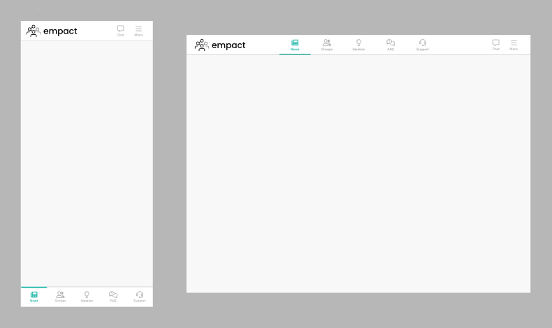
For this project I chose not to do a mobile-first approach, I decided to work on the larger breakpoint at first because the core idea was to bring the apps to desktop. With the breakpoints and content width already decided, it gave a nice framework I could work within.
Even though navbars are fairly simple, I did some research into what they should allow and how the layout should be. The decision was to put the company logo in the left that would navigate the user to the landing page upon clicking it, the middle would house the modules that are present in the navbar in the mobile applications, and all the way to the left, the burger menu button would take place, along with access to chat (which is palced in the header element in the apps), and I made a design which would display the bell icon for notifications at a later date (our application had no notification center at the time).
Using the layout columns, I made it so that on the largest the module selector in the niddle would take up 6 columns, regardless of how many options are present (minimum 1, maximum 5). The cards in the feed would take up the same width as well. It would adjust its size as the user resizes the window down unitl the mobile breakpoint, where the navbar has a different look, with the modules present in a bottom bar, and the logo, chat, and menu present in a top bar. The idea was tht upon scrolling down, the bars on this breakpoint would hide until the user scrolls a tiny bit up as to not take up too much space in the viewport, since the mobile browser controls are also present.
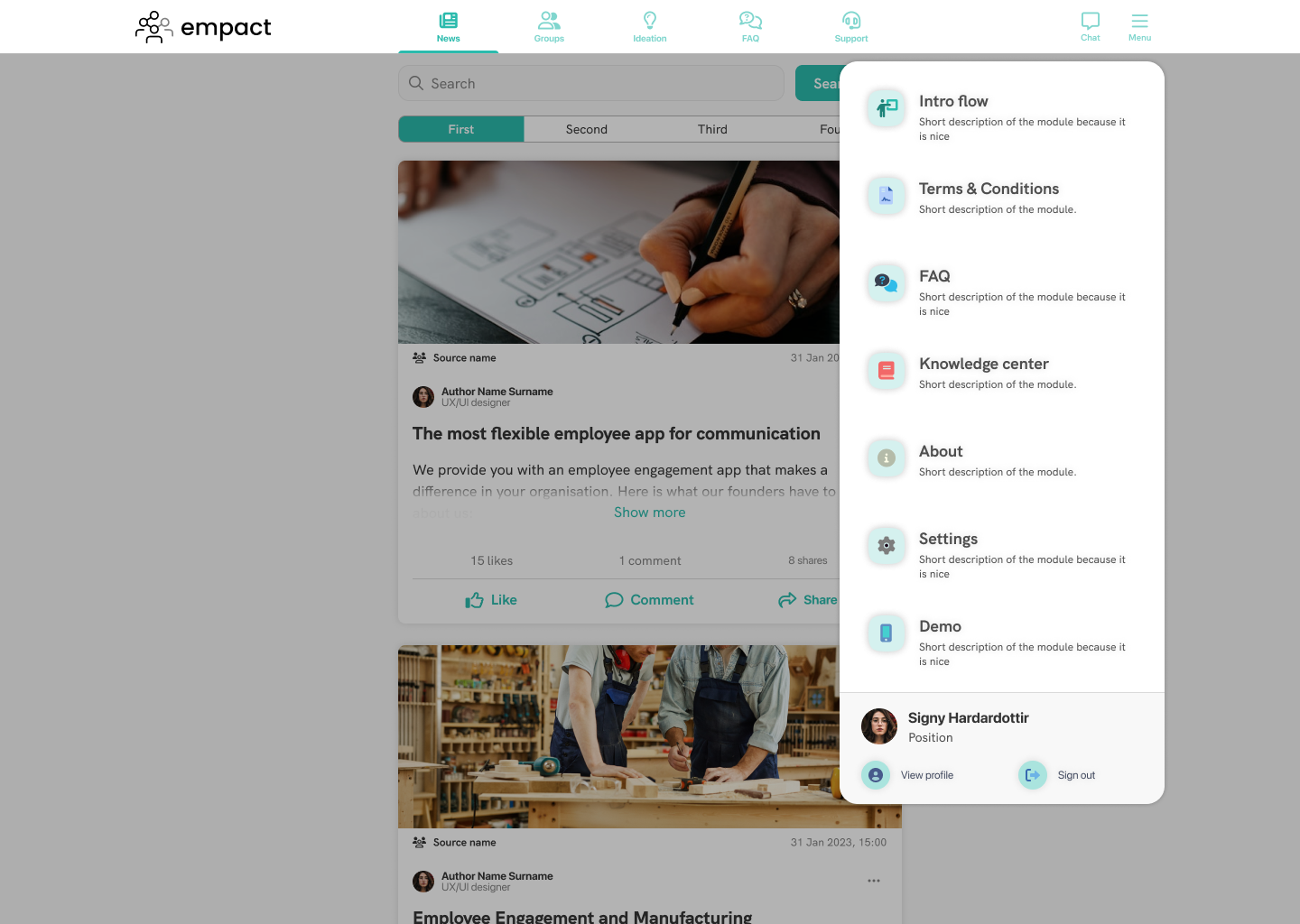
Designing the menu
With the navigation complete, the next step was to design the burger menu and the items within. In the mobile apps, tapping on the menu icon takes the user to a new screen which houses all the other feautres of the solution, so this was a good place to diverge from the application, moreso than with the navigation.
I looked at various menu implementations across other sites to get some inspiration and find a solution that works for us. I made some quick mockups of some ideas, trying different approaches on what to include and where in this menu. There were versions where the menu would slide in from the top or the right, occluding a large part of the viewport; I made versions where recently used modules would appear in a separate list from all the menu items, and some where the users' account could be accessed. You can a few examples of these quick iterations below.
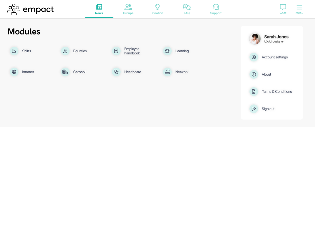
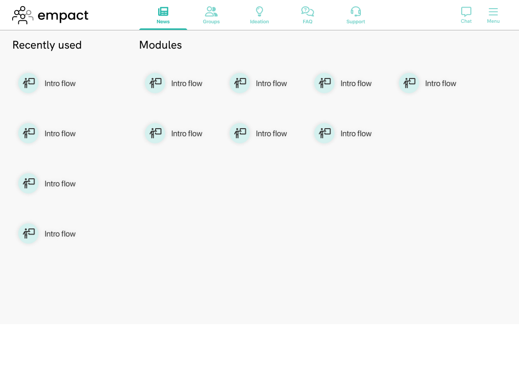
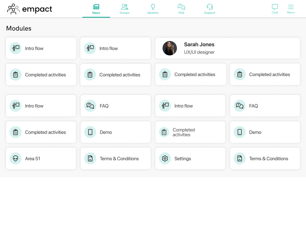
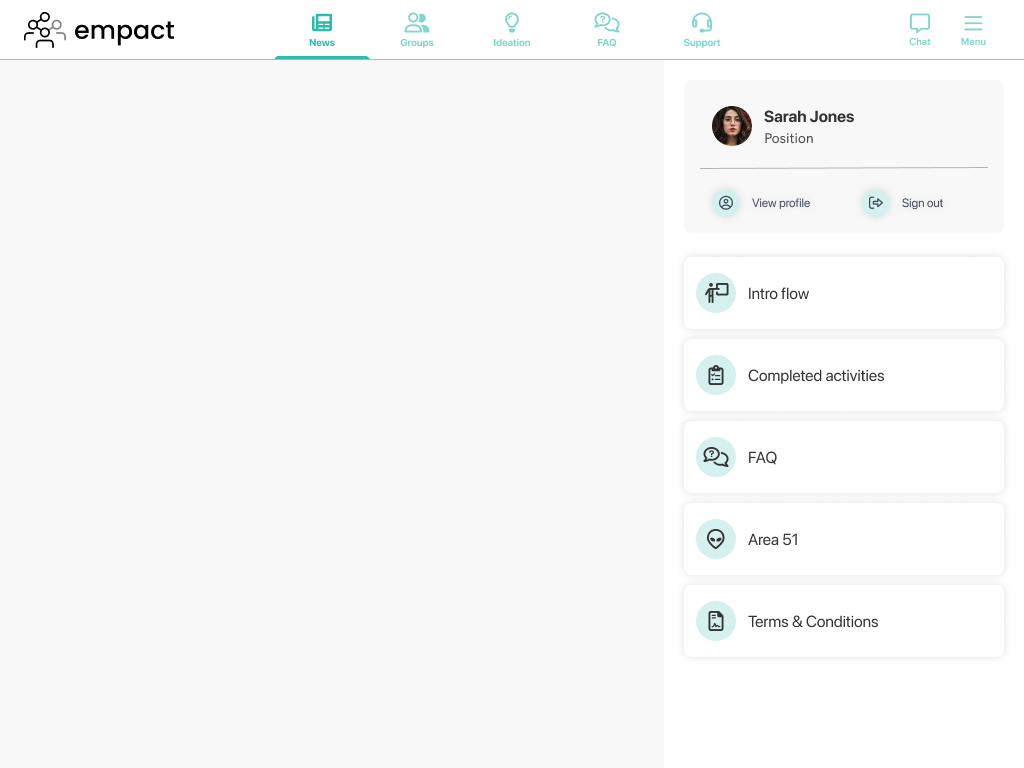
Some of these ideas didn't really work at the time due to low number of modules, and in the case where the client's solution only includes 2-3 modules, the area taken up by the menu would have been excessive. I needed to find a solution that would work well with any amount of modules. It was also important that it is not always present, like some of the options on the home page of Facebook. I iterated over the mockups I have been making so far, and looked at the other solutions to look for inspiration. The end result is a little dropdown menu. It contains the modules included in the client's solution, and access to the user's account.

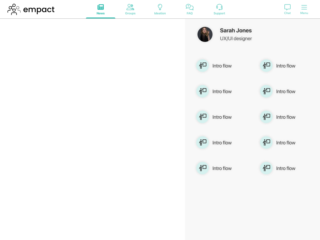
The items within have a little colourful icon within a "squircle". They show the module's name an a short, maximum two-line description of the module. Upon hovering over the menu items, it would fil up with a slightly darker colour from left to right to add some visual flair to it. In terms of behaviour, I imagined it could either hide additional modules with overflow, or it could just expand horizontally to display all options to the user in two columns perhaps. But to start with, the initial design was sufficient.
On mobile, we have the same-looking menu items, but in that case, the menu fills the viewport between the top and bottom navigation bars, but the user account is at the top to better mimic the layout of the mobile application.
Designing the news feed
The news cards
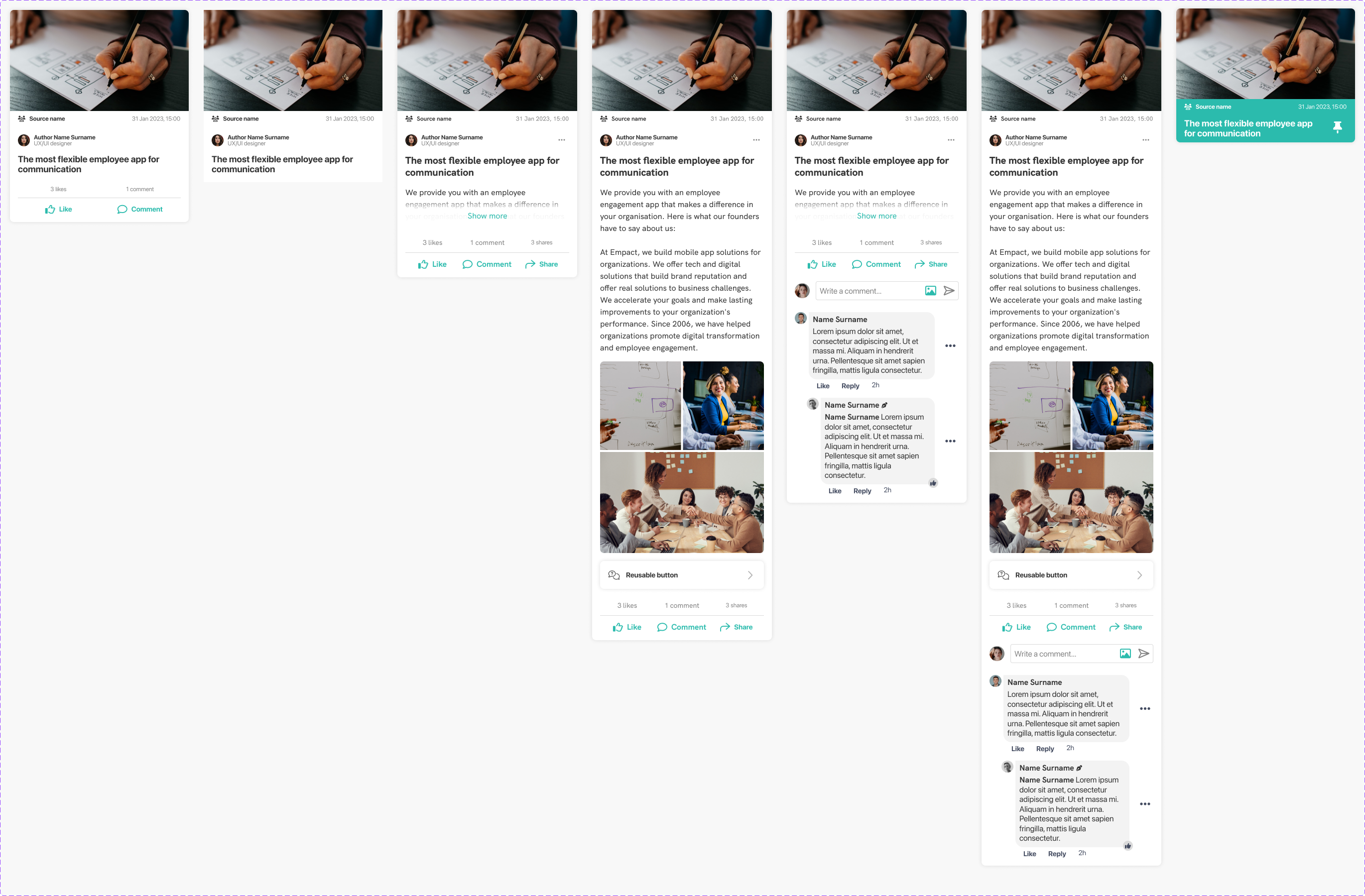
It was time to design the first module for the responsive web application: the news feed. This is the core of the solution, allowing communication from HQ to deskless workers across the business. The design of the components was made easy since we already had a version of them used in the mobile solution.
However, these components were made before my time with a fixed width, and as such they were not really scalable for different widths without breaking them. Therefore I rebuild the originals, including the web versions of them, and made sure they could be scaled to specific widths incorporating the latest additions and advancements in Figma.
The web version of the components differed in some ways. On mobile, the cards for the news feed only had the featured image, the author and publishing info, tag and source, the title, and finally the reaction bar. Tapping in a card opens what was referred to as "details view" which included the entire content of the post with a comment section at the end. For the web version, I wanted to keep it easy for users to interact with the content, not having to navigate back-and-forth between pages.
Therefore, the design occludes content after a predetermined height, where a "See all" button can be used to expand it to show the entire content of the post. It was not done the way LinkedIn and Facebook handle posts, because those, in the case of mixed content (text and images), always display text first, so they can cut it off after 3 lines or so and show the "see more" button at the end of the line. In our case, we have a flexible order of contents, so in case the post starts with an image, the solution designed by me works just as well.
We needed a new design for the comment section, so one was designed for web. This would show under the post originally, however with longer conversations, the card would expand to be too long, making it an issue in the overall feed. We never got to it, but I wanted to use the approach Facebook uses for example: if the user clicks on the "Comments" button, it would open the post overlaid the feed as a modal or popup, and users could interact with the comment section there.
Controls
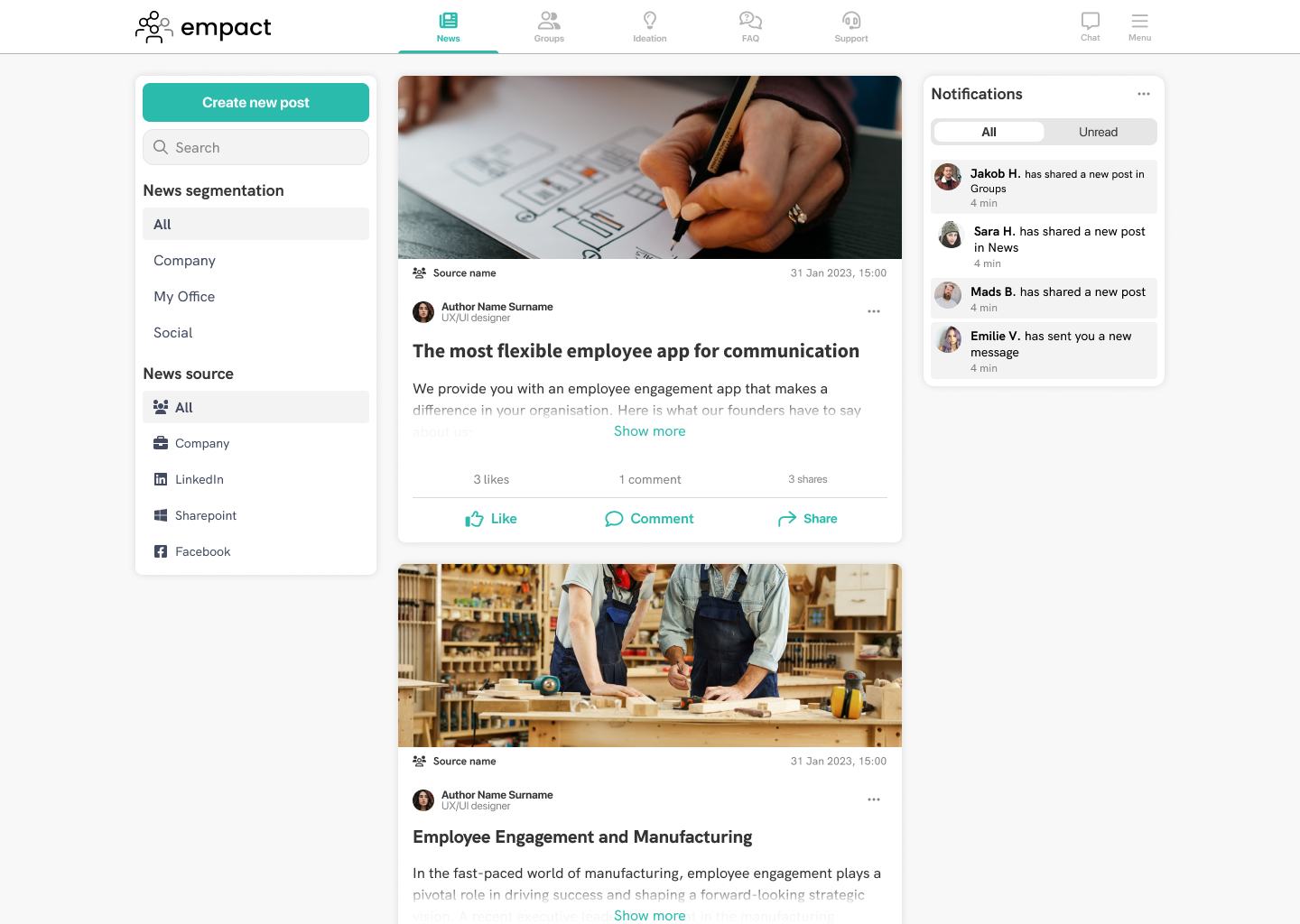
One challenge with translating a mobile app to larger screens is making use of the space in a logical manner. Here, the challenge was housing the segmenter that would filter news based on which segmentation it was posted to, and including a serch bar with the ability to create a new post. As mentioned earlier, I am using a 12-column grid, so with the feed taking up 6 columns, I had 3-3 columns to the right and to the left.
Since LinkedIn was one interface the users were familiar with, I decided to do a similar approach, and house these controls in the sidebar. Here we could also filter news by source, which was not possible in the mobile version. The sidebar would be in the same position down to the tablet breakpoint, and in the mobile version, it would have a slightly altered form to accomodate for the decreased screen width. I will touch upon this in the next section. Below you can see an image how the mobile module was translated to mobile and large breakpoints.

This, of course poses another challenge: make sure that all actions afforded by the desktop verions of the responsive web application should be afforded on all breakpoints to have a cohesive user experience. That is why on mobile breakpoint, the segmenter is presented the same way as in the app, to use less space in the sidebar, and the source selection is hidden behind a "Show more" interaction, but the two most important actions, post and search is always present.
Since the solution we were using had 3 similar news feeds at the time: News, Ideas and Groups, this design would be reused across these modules, with the contents of the sidebar changed accordingly.
Making use of space
Regarding displaying elements at different breakpoints: the idea is to have the main content of the page displayed promintently, such as it taking up 6 or 9 columns, and have a page-specific control, or sidebar, on the left taking up 3 columns. This way, from tablet to desktop, we can display both the sidebar and the content comfortably, and only a small adjustment is needed for the mobile breakpoint. The laptop and desktop breakpoints are nearly identical, with elements on desktop being a bit wider. On tablet, with its 8-column layout would see the sidebar and content split so that they take up 3 and 5 columns, respectively. On mobile, the elements would widen according to screen width, or until they reach the maximum width allocated to them.
In case of the News module, for example, there is still a 3-column space that is left unused. My idea was that we could put and element called an "aside" there, which would house either a notification center or a small action center. The notification center just displays a few of the latest notifications the user had received, and the action center would house quick access to items from different modules that require the user's attention. On modules where this would be present, it would have the same content. So to recap simply: the sidebar would be page-specific but the aside would have fixed content across all pages. Unfortunately, we never got there. You can see a mockup of the aside included in the module below.
Of course, this idea was still in early stages, so there could be any number of things be presented there. The purpose of the aside would have been to just offer an easy way to access different content in the app, these would be reachable via other means, such as from notifications or from the menu. As such, it is not as important as the sidebar, and on tablet and mobiule breakpoints the aside would not be present. If we got there, maybe it would have been incorporated in a different way, such as being inlcuded in the top navigation bar perhaps.
Designing the chat
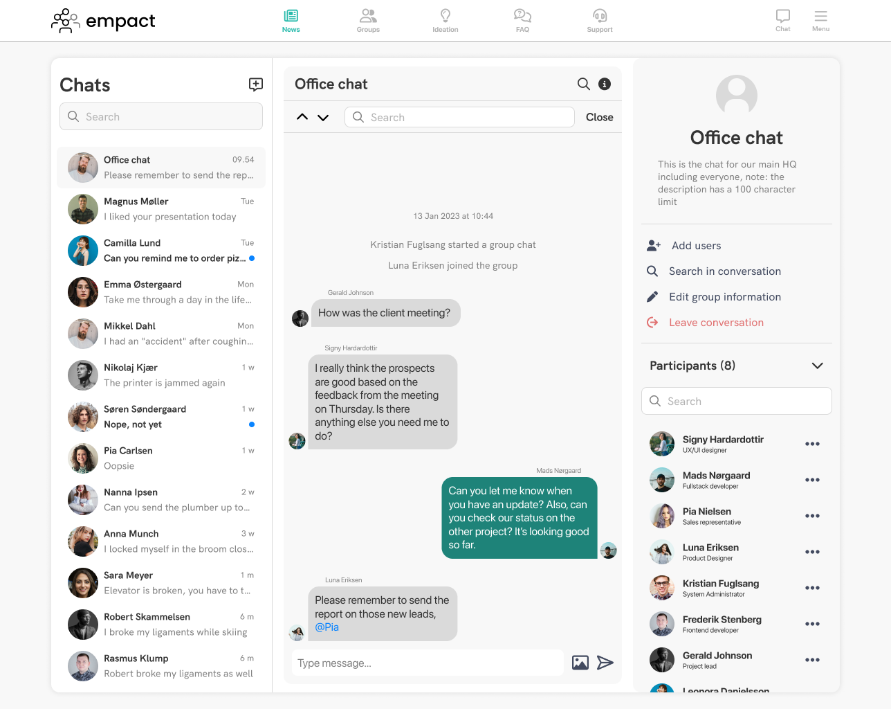
Direct messaging is pretty straightforward, especially on bigger screens. Luckily there are ample examples I could look into: Discord, Slack, Teams, Facebook Messenger, Linkedin. As such, the layout was clear to design: different chats in a list on the left, and the message history takes up the rest of the space.
Our chat was very barebones in the application, so with the design I tried to account for features I wanted to include in the future when we got around to it: ability to search for strings in the various chats, easier management of participants, and a way to give names to group chats, among others.
I made mockups of various designs to present it in a nice way, for example having the message list and the information in separate elements, kind of like the sidebar and the aside, but in the end, I decided to have everything in one big element and frame them up individually, separating the elemetns with different background colours and strokes. Users can display or hide chat information by clicking on the "i" button.
The goal with creating modules that are available on other platforms, like the chat or the news feed, is not to reinvent the wheel. I found it important to have a layout similar to these solutions so users will have an idea what different UI elements alloow, and commonly used actions should be where the user expects them to be from their previous interactions with other similar solutions. as such, the end result reflects LinkedIn and Messenger, two solutions that the users are already familiar with. You can see an example of the latest design below, with the chat information open.
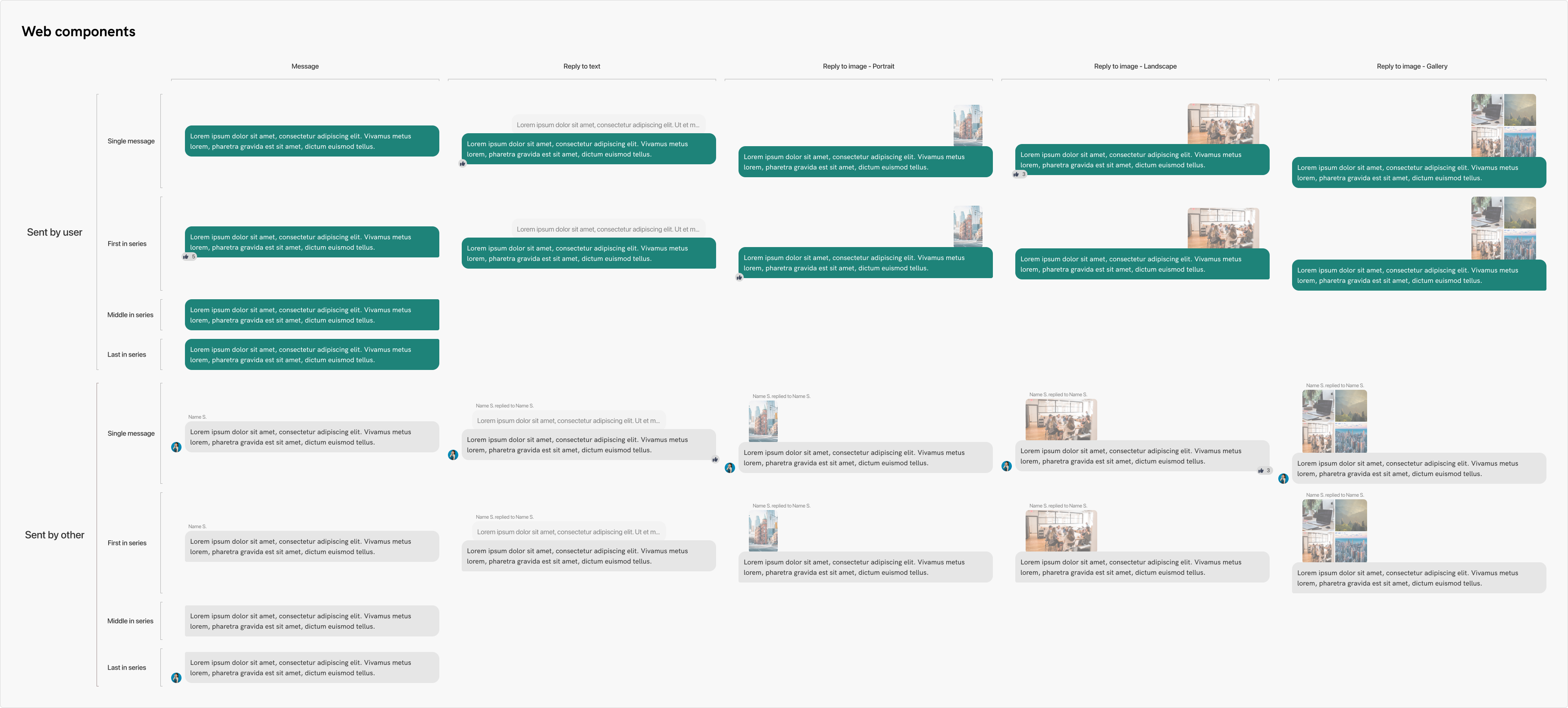
Message bubbles
This was the biggest technical challenge at the time. I wanted to create a robust set of components that could be easily switched between web and app version, change between sent and received messages, messages and replies, replies to text, images and image galleries, etc. I tried and tried, but even putting all of what Figma had to offer to use, it was impossible to create what I had in mind. I created simple components to use those in the same time, but I always wanted to get around to doing it the way I imagined.
Luckily, as Figma added more features, sometime later I had all tools necessary to make these components to my liking. I utilized nested components, minimum and maximum width, instance switching, auto layout, absolute positioning, pretty much everything under the sky. I am very happy with the end result. The user can just insert an instance into the design file, and change it to any variant that the chat might include. It's responsive, so the users can set the maximum and minimum widths so they would mimic actual sizes on different breakpoints.
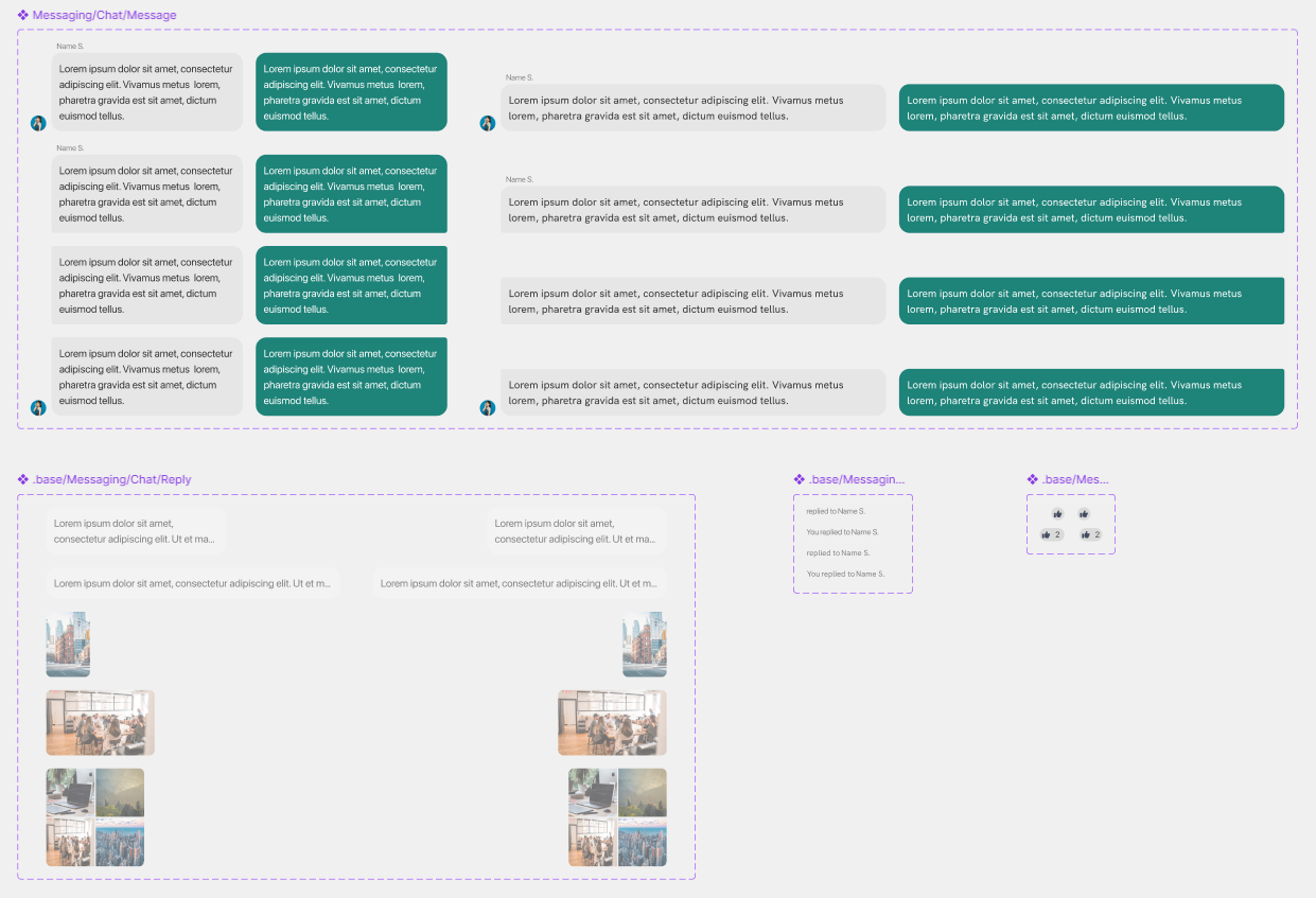
Below you can see all the possible states of the message bubbles for web. Within Figma, users can toggle likes, set wheter it is a standalone message, or first, middle or last in a series by the same author, whether they have profile image, or whether it is a reply to a landscape or portrait image, an image gallery, or another text message.
Designing the survey
Our solution included surveys but the issue was that a survey was hard to set up in the web administrator portal, causing frustrations to the users, and they didn't fucntion as standalone content, meaning they had to be deeplinked in a news post, making the process drawn out and tedious. It didn't boast a lot of features either, but redesigning it was not the goal now. This time around, the we just needed to give it a bit of a visual overhaul on the mobile, and bring it to the responsive web application.
In the mobile version, each question is presented on its own screen, with a header at the top displayin the name and the users' progress, followed by the answers or an input field, with the control buttons at the bottom. Once again, as with the some other modules, we had pretty much all the components readily available with the only caveat that they were not created to be adaptable to other screen sizes. So to begin with, I rebuilt these components to suit our needs on the web.
Following this, I made a header element for the web, to display the survey name, the users' progress, and if it was an anonymous survey, display that information as well. The latest design for a survey page looks like this:
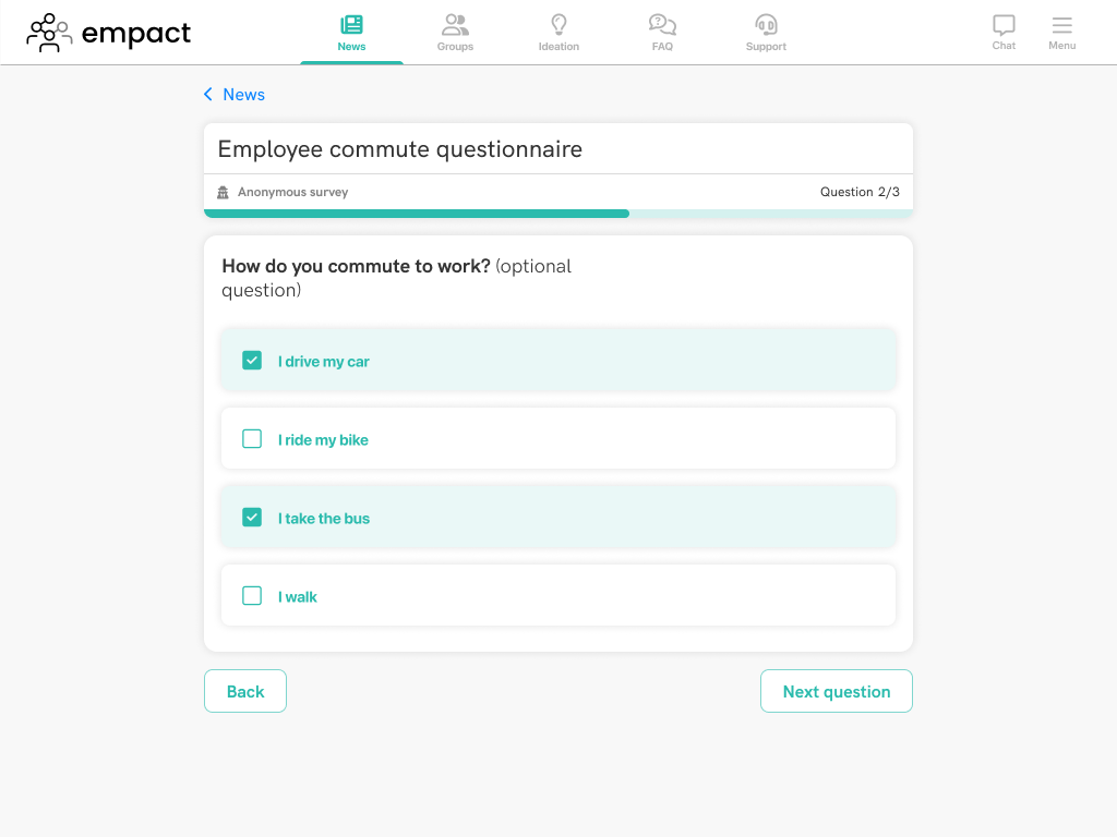
One minor change was to use the secondary button for "next question". In the app, it used the primary with the brand colour, but from what research I saw, that button is only used when reaching the end of the survey to finish and submit the answers. This also helps users understand better when they are about to complete the survey. The UI for surveys is simple enough that they scalde down to mobile without having to adjust anything other than the width of the elements, so all-in-all, this was a relatively short task.
The next step regarding this module would be to overhaul the creation process, making surveys standalone pieces of content, being able to publish them without the need to embed it into a news post, adding new features to better hold up against other survey solutions, and of course adding ways to better visualize gathered data, as this was not possible with our current implementation.
Designing user profile page
Within our app, the user profile is very simple. It displays the user's name, company email, phone numbner and location, with the only editable piece being the phone number field. On mobile, it is displayed on its own page.
Once again, the challenge is bringing this to a larger screen, making use of the available space. Due to the brevity of the contents of this page, there was not much to do with it unfortunately. I basically made a single, responsive component that would be displayed in the top center of the page, and it scales down perfectly to smaller sizes without an issue.
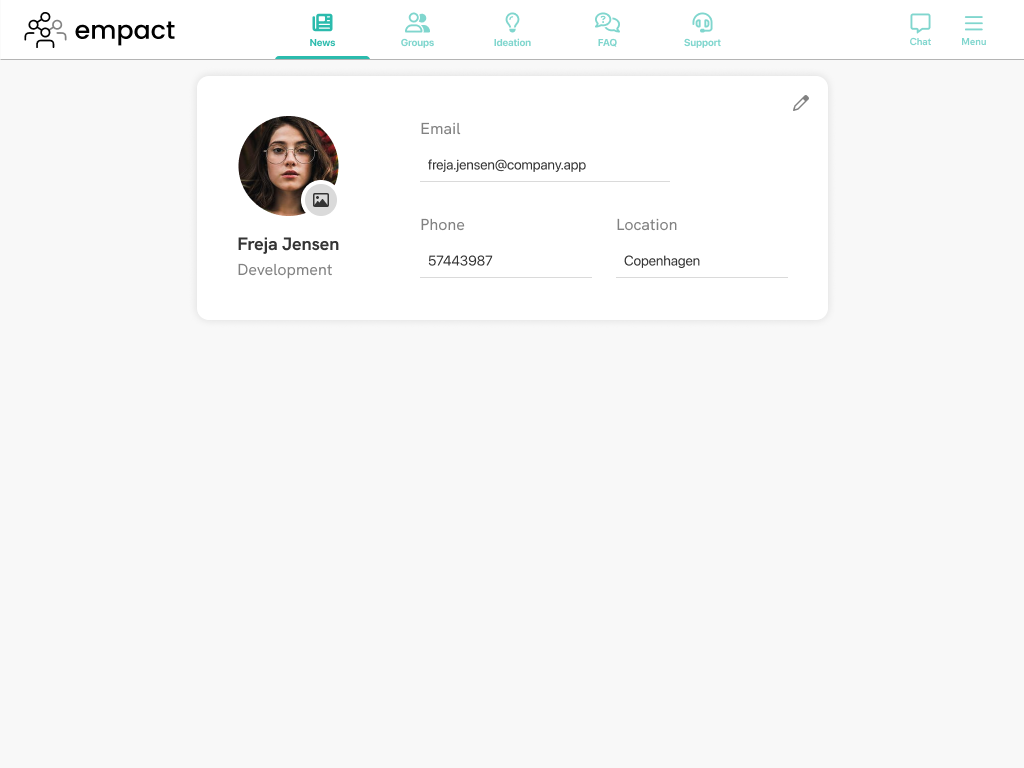
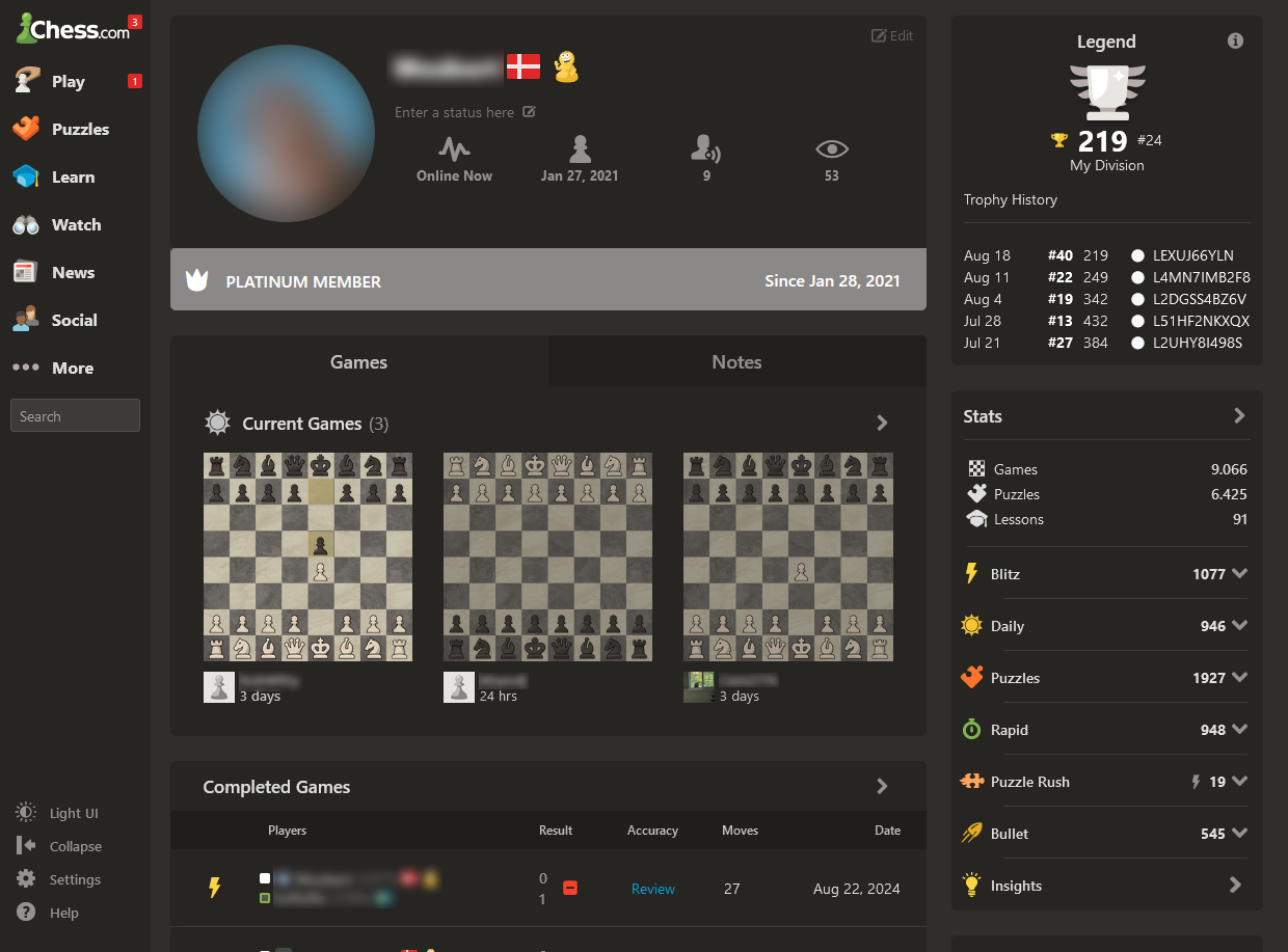
In my opinion, the lack of content on this page is not much of an issue on mobile, tablet and even on laptop breakpoints, but the page seems rather empty on larger screens. My idea was to include more stats and data on user activity at some point in the future, once more modules are developes, and existing ones are better connected throughout the platform. I imagined something along the lines of the profile page on chess.com, which displays various stats about the different features from across the site.
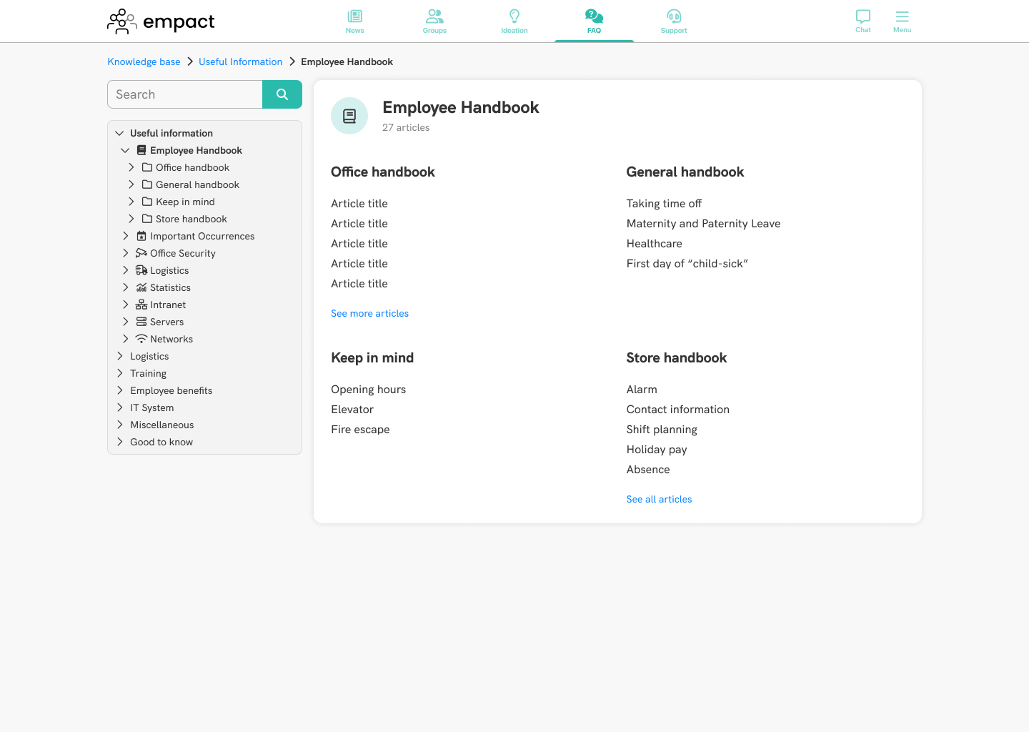
Designing the Knowledge base
This was the first module that was done from scratch, as the design of this for larger screen was not as straightforward as the design for something simpler, such as the news feed was. You can read about the entire process for designing this page over on the knowledge base page.
This was probably the biggest task for the responsive web application at the time, because we didn't have components ready to use, so everything was built from the ground up, and in this case, the look of the module is vastly different from its mobile counterpart. In this case, it was important to make good use of the screen real estate, and we had the chance to include more elements to help users navigate these pages. Here is an example screen from this module:
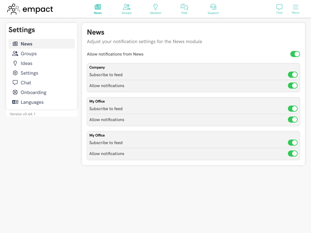
Designing the settings
One of the last remaning piece from the the internal solution we used at the company that was missing from the responsive web application was the settings. The app had just a few settings available to the user, which mainly consisted of subscribing to various feeds, and allowing notifications from certain modules.
Even so, with the knowledge that more features are coming to the app in the future, I needed to make a design that was future-proof, and allowed easy addition of new settings as they were developed.
Since there was an established layout, it was easy to adhere to this. The verious modules would be housed in the sidebar, and clicking on them would replace the main content with settings of that module, spanning the remaining 9 columns. You can see an exmaple of this page below.
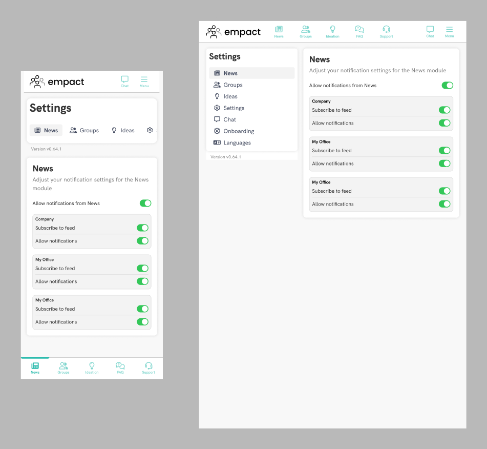
The only challenge for this page was designing a mobile version of the sidebar. Its placement would be the same as for news, at the top, but I wanted to have a way of easily accessing all pages without a lot of effort. I decided to have a horizontal menu that is scrollable, and have the settings show up below this. Below you can see how the settings page looks like on mobile and tablet.
Implementation
Throughout the process of bringing the responsive web application to life, there has been continuous coomunication between me, the CPO, the product owner, the project manager and the developers. This was to ensure that we were always on the right track and we had a manageable workload.
The most important part was me being in touch with the develoeprs. FOr each module, I began with a simple mockup or a wireframe and walked the developers through of what the idea or intention behind each decision was. It was important to me to hear from the developers as to what was feasible, what we could do, and what I needed to change to make it work not just in time, but considering the big picture regarding implementation.
One such example of the benefit to these ongoing discussion was regarding the navigation. In the original design, the bottom and top navigation aimed to imitate the app's navbars, where the burger menu was placed in the bottom nav, replacing one module there. We talked with the developers that this required rerendering the navbars, and it would be easier, if the top bar was just like on larger breakpoints, with the module selection section being moved to the bottom, so that is what we ended up doing.
It was also important for me to understand what tools, libraries and other technologies they were using, so I could create my designs with these in mind. This helped us avoid retreading our steps, and streamline the entire process. I knew what they were working with, what could be customized to match our design language, and which ideas would not work with the current front- and backend of our solution.
For example, I mentioned that I was using a 12-column layout for designing the pages on desktop. We had a conversation with the developers as to whether this works for them, or what else can I do to help them with their job, like should I use pixel values, should I define them as percentage of the viewport, and so on. I was told that they were not using the layout, but I should proceed with using them for my designs if it makes it easier to work with because it does not make a difference for them. So I decided to stick with it to achieve consistent spacing and layout.
Another discussion involved the width of the content. We were sticking with 1140px width to begin with, but at a later point, when I was in the process of making a web version of the task manager module, I found that width a bit constraining. I asked developers whether it was possible to use a different width for certain modules. I was told that that would be difficult to work with, so I stuck to the original width of 1140px, with the intention of expanding it just a bit in the future.
I also saw some issues with the handover process when working on moble features earlier with the other developers. The first time they sa the design was when the design work concluded, and this lead to many questions coming up at the end of the design process, leading to extra work and a slight delay in the handover. This is why I kept the web developers in the loop, frequently talking with them, and went over the design before locking it in, so any questions or challenges were brought up ahead of time. This lead to a smoother process and better adherence to the pipeline and deadlines.
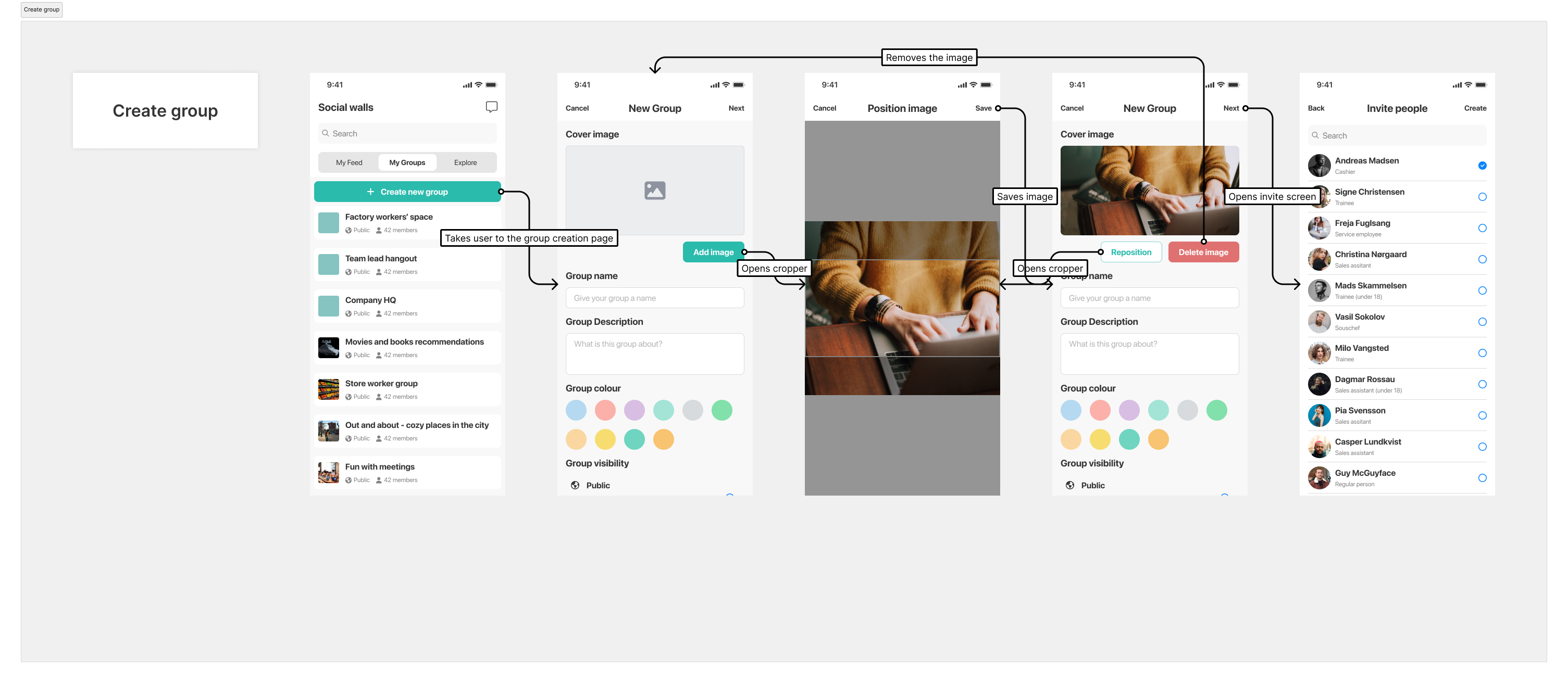
Additionally, I created detailed user flows, separate from the interactive prototypes, so each action and interaction was labelled and visualized with arrows. This helped them get an easier understanding of how the modules and features worked. In certain cases, I included notes to better explain some more more detailed things. You can see an example of it for creating a group in the Social Walls module.
User testing
During the design phase, in order to decide the best approach with certain aspects, we did A/B testing, having colleagues interact with two versions of the design to see which they preferred. For some other parts, we thought we could forego extensive user testing, since most of these modules were either the same as on the mobile app, or were very close to other solutions that the users were familiar with. Still, in order to make sure that the interface was clear to the users, we did some in-house testing with colleagues who have not yet seen the designs before.
Since we had most of these modules in the mobile solution, we iterated mostly on the presentation of the interface, so that management was also satisfied with the end result. Once the mockups were made and we were in agreement with the developers, a couple of designs were created, we chose a few of the best candidates with the other designer, and asked for the opinion of the stakeholders, both internally and externally.
Final outcome
Results
The implementation of the web platform increased the usage of our solution internally within the company, as users already had browsers open, so they interacted more with the application. Colleagues expressed how nice it was to have access to the chat on the devices they were using for their daily tasks, and not having to switch between their computers and phones for keeping up with internal communication.
Key learnings
This was the first major work I did for web solutions, outside of this portfolio and some other tasks during my internships. I did a lot of research into best practices in responsive design and web design. There are a lot of approaches within this domain, so I had to decide which one we were going with, but discussions with the developers helped make some of these decisions. What I found hard was that there was no single best solution for some things, such as the wdith the content was using, the column widths and the gutters, for exmaple, all the examples I've seen seemed to be very subjective and up to the designer. Still, I think I got a good grasp of it, and while there are certainly areas to improve, bringing the mobile solutions to web was a success.
Next steps
As I mentioned above, some next steps would include coming up with ideas for the "aside", and added content for the profile page. My goal was also to better connect the different modules throughout the solution, making it feel as a cohesive unit rather than a bunch of different features bundled together. This initial design for the responsive web application intended to adapt the solution we used internally, but clients have different features and modules that would be a part of this one day.
I played with the idea of adding more personality to the UI, such as illustrations on the knowledge base home page or the login page for example. It was also my intention to do user testing to see whether users could achieve the same tasks with as much ease as with the mobile solution.
And finally, I saw this web platform as a great opportunity to push for changes in the mobile solution as well. For example, I wanted to add more features to the chat, and redesigning some aspects of it on the mobile. I thought the web platform would be a perfect justification to revisiting some of these in order to make them hold their own against other, state-of-the-art solutions. I had ideas for Surveys, the Profile page, content creation, overhauling the groups module (which was a carbon copy of the news feed, and users were not sure what it is even for). Some of these I got around to doing during my tenure at Empact, others I could not get to before I left.
Conclusion
I am happy with how these initial designs turned out, but I felt that it lacked a bit of colour. I tried overcoming this with the menu, as outlined above, but at the moment we were iterating on the colours we used internally, and for management it was important that we get the responsive web application off the ground so we stuck to what we had.
For some modules, such as the news feed, the layout was pretty self-evident, while others that came later proved to be more difficult and gave me a hard time. The challenge is not bringing the mobile content to the big screens, but making good use of the space, and expanding the functionality to offer improved user experience and make use of what these devices offer.
Overall, I feel like this helped me get ideas on improving our design and testing process, communication with stakeholders and developers, and of course my design skills and approach to work.