Task manager
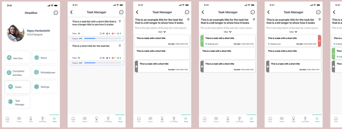
Creating a task manager for a client
Overview
In this project, our team was tasked with designing and developing a task manager module for one of our clients. The client required a solution that would allow users to create, track, and manage their daily tasks efficiently within the client's soluton. Our goal was to integrate this module in a way that not only aligned with the overall user experience but also enhanced productivity by providing intuitive task management features.
The task manager module was first designed to serve as a simple to-do list, but we had plands to allow for more complex project management workflows in the future. We focused on creating a user-friendly interface that supported task prioritization, deadlines, and progress tracking. Unfortunately, the entire process was less than ideal due to different factors which I'll get into in later sections.
Tasks
For this task, I performed
Research, Design, Prototyping, Documentation
Spread out over multiple sprints
Background
One of our clients expressed interest in a task management module for the solution we were providing them with. The need for a task manager module arose from the client's desire to improve the productivity and organizational capabilities of their user base. It was also seen as a good opportunity to create standardized flows for managing their business across different locations.
I sought to engage key stakeholders from our client's company to collaboratively develop requirements, user stories, and gather insights into their daily workflows, ensuring the task manager module would be precisely tailored to their specific needs and challenges. However, the client told us that we should come up with a design first and then we'll talk about it further.
Due to this, the project became more complex due to our limited understanding of their existing processes, unclear expectations for the module's capabilities, and the absence of information about the end users, particularly regarding their technological proficiency.
The project suffered additional setbacks and delays due to external factors, but despite these a solution was rolled out and achieved client satisfaction.
Starting out
Competitive research
I wanted to secure some interviews with employees of different roles who would be using the task manager, both frontline and office workers. This would have hepled in establishing user requirements, user stories and understand the scope we were working with so we could plan the sprints accordingly. As mentioned above, I did not get the chance to do this, because the client wanted to see a design first. I unsuccessfully tried to appeal this process, so the best I could do was start competitive research to see other task management solutions.
I identified several popular solutions, including Monday, Trello, Any.do, and solutions from Google and Microsoft, and took note of the similarities and differences and all feautures they allowed for. With the project manager we proceeded to boil it down to the most basic and critical features, so I could make a proof of concept in an acceptable timeframe and to ensure that we would not create something overly complex and waste time on unnecessary elements and features.
Scoping
Since the client did not provide any sort of guidance or requirement, I initially chose to do a relatively simple prototype that allowed the creation of tasks lists that could be set as recurring or one-time lists. These would house the individual tasks, and the users would have the ability to mark tasks as complete or blocked (employee unable to complete them). The task manager would be split into manager and user flows, where managers are able to set up task lists and tasks, ad users could only view them and mark them as complete or incomplete. I presented this idea to management, and came up with a scope of how long it would take to do this.
Initial challenges
This was the first task I worked on at the company. At this point, we did not have a design system yet (but this experience was the catalyst for me to create one), we just started using Figma and were in the process of moving assets over from Sketch, and I was unaware that some of the elements and flows in our application were deprecated, despite still being in use.
I created a wireframe for this module, after I looked at some example content creation flows from the other modules, and replicated the elements that were not in Figma. When presenting the wireframe to the developers, I was told the designs for elements such as the input fields for "Title" and "Description" are not used in the application. I pointed out where I took it from, and it turns out that feature was a custom module for one of the clients, and we were not using those kind of input fields at all.
For the next iteration of the wireframe, I corrected these input fields to resemble ones that are actually in use in other modules. I also sat down and discussed with project management and developers whether I had freedom to create new elements for this project. There was some pushback from developers on this, but I presented my arguments and was given green light to do this. I felt it was necessary to create more elements because so far, our solution we used internally was very basic with only three feeds as the majority of the content, and what elements we were using at this point would not suffice for more complex modules and features down the line. The UI was also a bit dated and lacked certain quality of life improvements that would have made it easier to interact with.
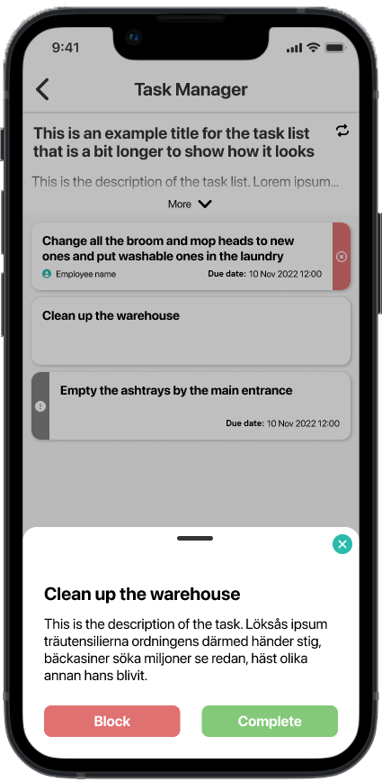
In most cases, interacting with a piece of content would navigate the user to a new page, and from what experience I had with the app, I saw that for something like task manager, where users would only need a glimpse at the content, this would become tedious fast, so I added a bottom sheet that would slide up and present the content of the tasks, and I designed elements for the tasks themselves that would allow marking them complete or blocked by simple gesture controls. Additionally, I added a floating button that would be placed conveniently for the user to access it and create new task lists and tasks.
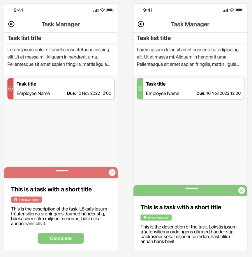
Following a discussion with developers and project management, I iterated over the wireframe once more, and we reached an agreement on the elements, the functionality and the interactions, and I began working on the high fidelity design for the task manager MVP.
Designing the MVP and dealing with scope creep
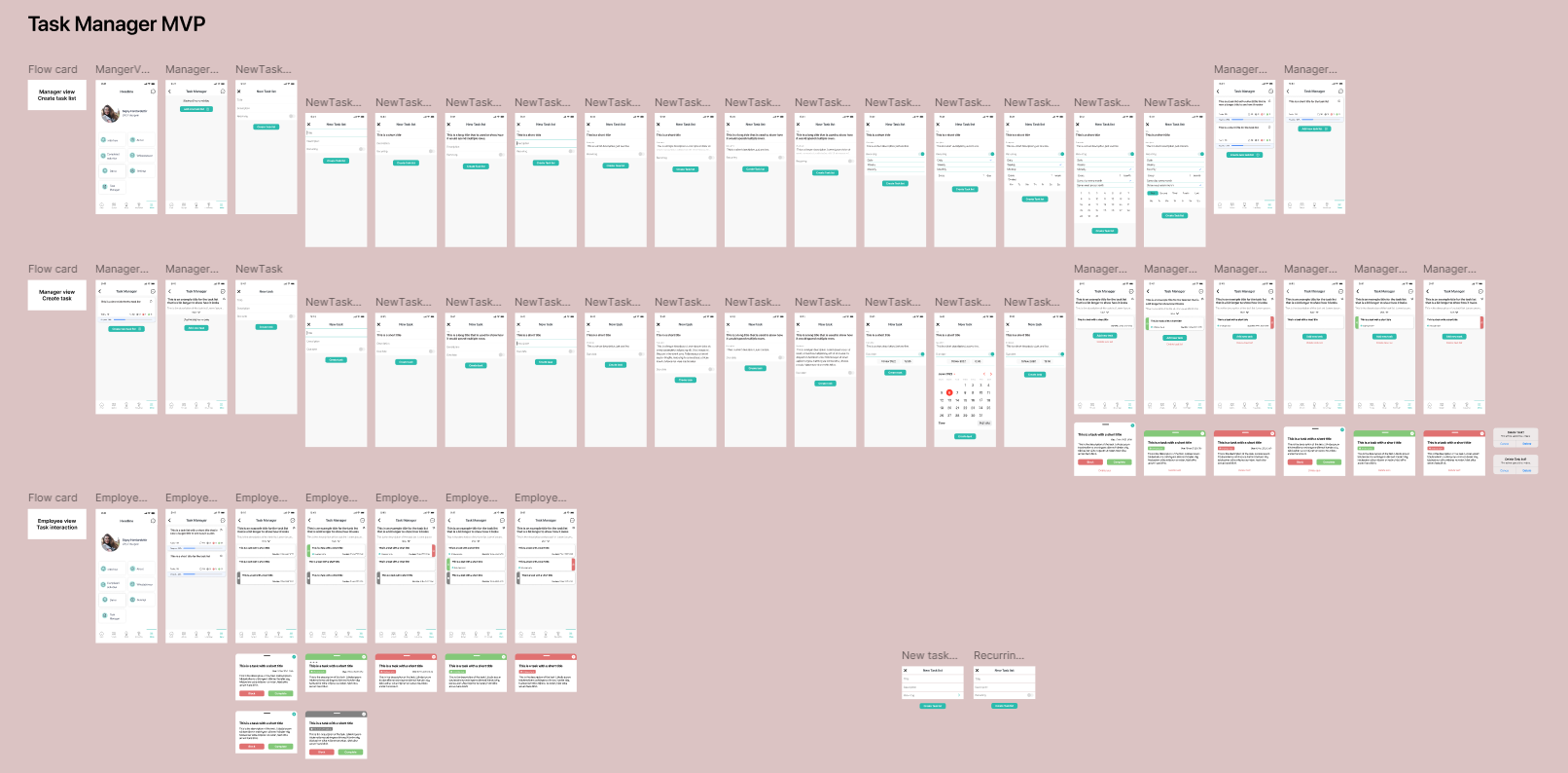
I designed the end-to-end prototype for the minimum viable product for this module. This version allowed managers to create a task list in the module, give it a name, a description, and I included settings that allowed them to set up a task list as recurring. I revisited the task elements, created the components for the task lists and the associated settings for it.
Wireframing already laid out a pretty good groundwork for this, so this phase did not take long, and we had a viable solution to present to the clients. Unfortunately, despite our best efforts, some minor things were overlooked, such as deleting a task or task list, and these were quickly rectified in a quick iteration over the MVP prototype. At this point, we had 3 simple flows: one for managers setting up a task list, managers creating tasks, and users interacting with these tasks, marking them either complete or blocked. Based on what requirements we had, this was sufficient for the initial design.
Scope creep
This was presented to the client and we received approval of continuing the work on the task manager. But before implementation could start, the client came up with additional requirements for the module, which added more complexity and required the revisit of components and flows.
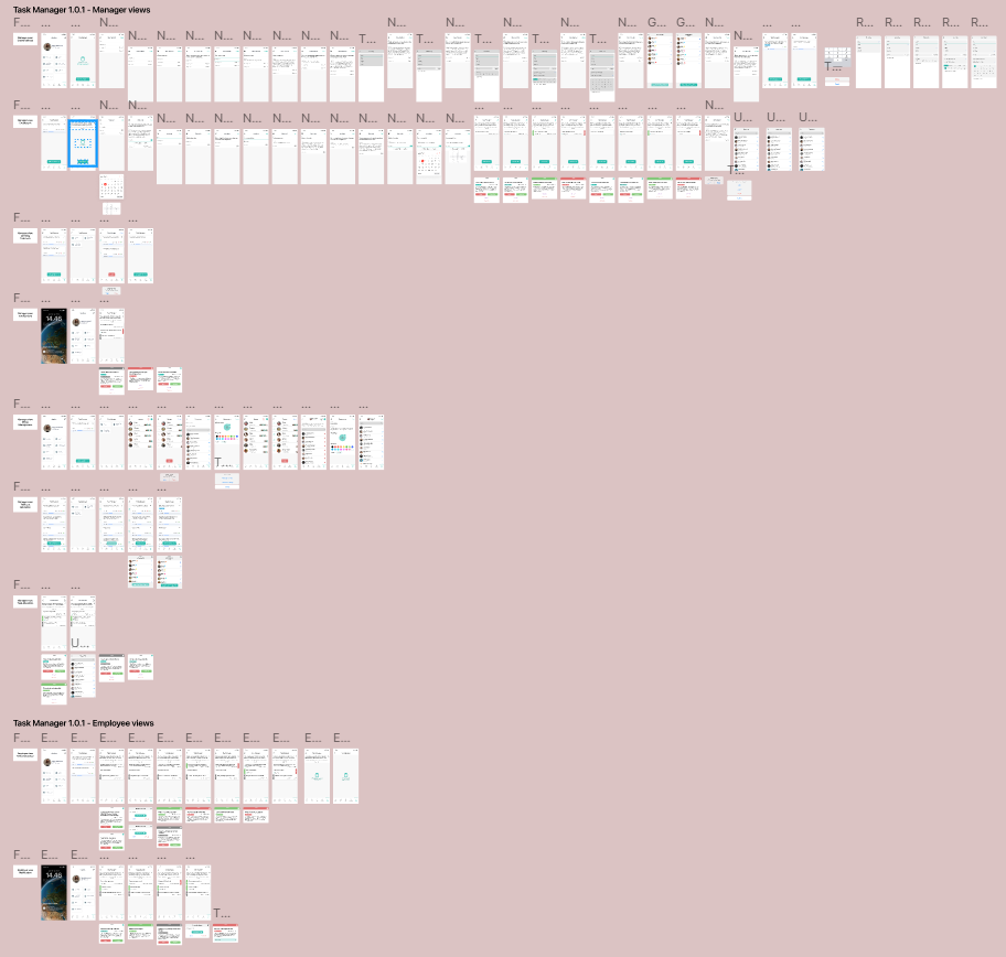
We suddenly had a need to implement noficiations, but our app had no notification center, we needed to allow the managers to set up groups of employees, and allow them to assign tasks and task lists to these groups or individual employees, and I needed to add a flow for when managers and employees interact with notifications.
So going back to the drawing board, I created new flows, which required new components and UI elements. I relied on existing elements from the app, but we still did not have these in Figma, so I made them from the ground up based on screenshots from the application for maximum accuracy.
Shelving the task manager
After accounting for everything, following a few iterations based on discussions with developers and project management, the task manager 1.0 was ready to be developed. To much dismay, due to external factors, the task manager was no longer a priority for the client, so at this point design and development halted until further notice.
This did not mean that the work and effort put into this was wasted. It was a great learning opportunity for me to see how to improve the existing processes at the company, and it highlighted some important things that needed to be addressed as soon as possible. Namely, the creation of a design system, unifying the UI across modules, and coming up with ways to better include the stakeholders in the process, both to streamline it and to avoid retreading our steps that could have been avoided had we agreed upon full requirements and scope from the beginning.
Task manager revisited, additional difficulties
Issues caused by lack of communication
A few months have passed since development halted on this module. In the meantime, I worked on our responsive web application, some other modules and visual overhauls, and work on the design system was well underway.
Due to internal changes in the client's company, the task management function became a priority again. Unfortunately, client has reached an agreement with a competitor about a trial with their solution, so we needed to implement task manager into ours with haste. This would not have been an issue, since we had the design for the full prototype, but things got more complicated.
The largest issue was still that I did not have access to stakeholders from the client's comapny. A project manager handled all communications with them, reaching agreements I was not privy to, and setting timelines not based on reality. It added to the difficulties that this project manager seemed to have a disdain and a lack of understanding of design work, with multiple instances in the past where they presented mockups made in Windows Paint to the client to choose from, and had us design it as it was because, they already reached an agreement with the client based on those.
So unbeknowst to me, this project manager came up with a rather long list of requirements and feature requests for the task management module. At this point, this wasn't an MVP or a 1.0, a module to be implemented into our solution, but a full-fledged task manager application that was quite a step up from what was designed up to this point.
To make matters worse, I had 3 days to create the crude designs for the changes as well as a mobile dashboard feature at the same time, with just one sprint to turn these intial designs to high-fidelity prototypes.
Additional feature requests
Now, in addition to everything we've had so far, we needed to include a few more things:
- Due dates on tasks
- Attachments to tasks
- Recurring tasks
- Quick tasks
- Task organisation (tags)
- Task statuses
- Task priotities
- Task list and task process tracking
- Reminders in notifications
- Task collaboration and collaboration features
- Task templates (for the web admin interface)
Issues with recurrence
Some of these were not such big tasks, but others provided a larger challenge, that was not thought of when the requirements were made, and affected how the whole feature worked. Namely, due dates and recurrences on tasks. Since the task lists were meant to be recurring ones, we faced the issue of what happens, when a task has a due date that is after the task list repeats, how the task lists handle these, and what if a recurring task is set up in a non-recurring task list.
One such challenge was deadline on tasks. How are deadlines handled when the task list repeats? If it is set on a date, then it would be obsolete once the task list repeated, with the deadline being in the past. Either we needed to add additional settings to control that the deadlines do not occur on specific dates, but rather by time elapsed since the recurrence of the task list, such as 10AM before the task list repeated itself. Or, we could forego this requirement. I argued for the latter, because the extra work and redesign would not fit in the allotted timeline at all.
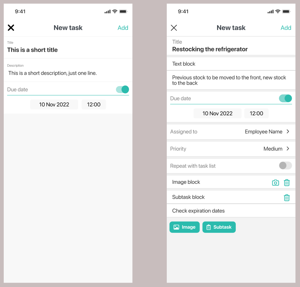
Client also wanted "quick tasks" that could be added easily, foregoing some of the required fields. This fit in without much of an issue, because even if set up in a recurring task list, these would not carry over to the next recurrence. Designwise this wasn't an issue, but it was for backend.
Problems with assignments and collaboration
The next issue was the assignment fo tasks to specific employees. If the employee happens ot have a sick day when a task is due, who can mark it complete? The solution was that users could take tasks from the list and assign it to themselves in order to complete them. Setting up groups has been scrapped for this reason, so task assignments would be part of the creation or editing process.
This tied in with a new requirement, to be able to comment under tasks, to facilitate discussion and the ability to articulate blockers if the employee could not complete task. What would happen to the comments once the task or the task list repeats? The solution was to move the task list to the "Task List History" page, and set up a new one at time of recurrence based on the initial settings, displaying tasks without comments.
Tags were also removed from the final scope, because it added extra complexity without any clear benefit. The tasks needed to be complete either way, so marking them as low, medium or high priority did not add much to this feature in its current state.
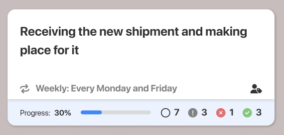
Task statuses remained largely the same: open, completed, and blocked. We added a new type, called "unattended", which would show upon repeat that a specific task was not completed in the alst cycle. The amount of each would be displayed on the task list element for easier overview.
Task templates
Task templates were a bigger hurdle, and one that would remain the the final implementation despite cauring user confusion. Leadership could set up task templates in the web administrator portal, so that managers would have access to them when creating task lists.
The idea was to allow for a more standardized procedure across different business locations, ensuring each of these tasks were completed to the same standard. The problem was that with tasks, quick tasks and task templates, this was becoming overly complex to end-users, and from a design perspective, this was suboptimal, since we were still not sure how task management is handled currenlty within the client's businesses.
User testing
Throughout the process, I performed a few rounds of user testing. Without access to end users from the client, I involved colleagues who were not involved in the process to test and validate the desing.
A/B testing
In the task management module, we conducted A/B testing on the recurrence settings within task lists to determine which configuration would be most intuitive and effective for users. By presenting two different versions of the recurrence options to distinct user groups, we were able to gather data on user interaction, preferences, and completion rates. The insights gained from this testing allowed us to refine the feature, ensuring that the recurrence settings were both user-friendly and aligned with the users' natural workflow, ultimately enhancing the overall functionality of the module.
Usability testing
Before wrapping up work on the MVP, 1.0, and the revisit, I conducted usability testing on the prototypes. The objective of these usability tests were the following:
- Identify usability issues in the task creation and management process.
- Evaluate the ease of use for setting up tasks of all possible task types.
- Measure the overall user satisfaction with the interface.
For testing environment, I used a small meeting room, where only the participants and I were present. Access to the task manager was provided through a smartphone, via the prototype view within the Figma application. I used a laptop with the user testing document open, and I observed users interacting with the prototype while taking notes of the process, encountered usability issues, and I recorded any thoughts and comments by the participants. For this end, they were encouraged to think out loud. Participants were only offered assitance if the participants were stuck.
Once the tasks and scenarios were complete, I gathered additional feedback on their overall experience. Using this feedback, I made any changes necessary to the design. Overall, the UI was simple and udnerstandable to users enough, and people with varying levels of technological literacy had no trouble completing the tasks.
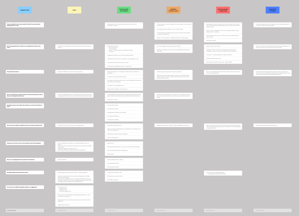
I gathered the data and put them in a matrix where the column headers correspond to categories of responses: correct answers, partially correct answers, and incorrect answers, and finally potential improvements. The rows correspond to tasks and interview questions. The end result helped get an overview of areas of improvement for the design.
Final outcome
Results
The task manager was implemented successfully. We pruned the complicated features that were not yet ready to be included, and formulated a pipeline on how and when to get around developing them. There were some improvements that I wanted to make, and the client had some further requirements, which would have required revisiting the entire module. For example, they wanted people working at headquarter to be able to drill down and view task lists and their progress for all different locations for their business. This would have required an entire "outer shell" to be designed around task manager, and an entire new module for the web administrator portal.
But the implementation was largely according to design. Unfortunately, some elements and components saw design changes that were initiated by the project manager, and none of these changes were communicated towards me, which caused some difficulties, when it was time to iterate on the design again, because there was a considerable mismatch between what was designed and what was communicated.
Key learnings
As my first venture at this company, I gained valuable insight into the processes, internal communication between stakeholders, and the state of the design department. I made some errors that arose from my junior status, but all of these were excellent learning opportunities that I used to improve my design process iteratively through each project I worked on.
I identified certain areas that needed improvement. It was clear that we needed a design system, that we could use for developing a unified design language and reusable components that are kept up do date with design changes. We also had use for better colour management, because all components were using hex codes only, so it sometimes slowed down the design process trying to figure out what colour to use for certain components of various states.
Most importantly, I learned a lot about communication between the design and development teams, something I tried to do better when working on the responsive website project that followed the conclusion of the design of version 1.0 of task management. I needed ot get a better understanding of what they were already working with, what can we introduce without creating a bottleneck, and how I can make their work easier.
Reflection
Success despite the challenges
Despite the challenges in the process and the final outcome, the task manager module was a success from a business standpoint. We observed daily activity from the client, and the data we gathered indicated a strong uptake of the module. We delivered the module within a short timeframe, despite the additional requirements that were added. However, from a design perspective, this project faced significant issues.
Issues with the process
The initial challenge of lacking a unified design language and component library proved to be one of the smaller hurdles in this project. Nevertheless, addressing this was a crucial step toward improving our workflow and resources for future projects.
My goal is to create data-driven, user-centered solutions that address real-world pain points. Unfortunately, as a designer, I was excluded from many key aspects where my involvement was crucial. Instead, I was tasked with creating screens for user requirements that were essentially a collection of features rather than a cohesive unit. Ideally, I would have collaborated with decision-makers from the client side to establish clear goals for the module, ensuring we understood what we needed to achieve.
After that, I would have interviewed end-users from the client’s business to understand their task management processes. This would have included examining how tasks are communicated, the necessary information for employees, and other relevant factors. Such insights would have enabled us to design a system that meets user expectations and improves their existing processes while providing valuable data to headquarters.
The list of requirements that surfaced during the revision phase created additional challenges. I did not receive these requirements before beginning work on the task, leading to numerous issues (beyond what is mentioned here). This resulted in wasted time and energy on features that ultimately had to be cut due to time constraints or because they couldn’t be integrated into the system in their current form.
Throughout the process, I advocated for user involvement in the design stages and continued to do so in subsequent projects. If we’re not addressing real user problems, how can we be confident that our solutions will be adopted? Worse, our solutions might complicate the client’s existing processes.
I used this experience to demonstrate to internal stakeholders the critical role that design plays in the development process, emphasizing how early and consistent design involvement can prevent costly revisions, ensure that user needs are met, and ultimately lead to a more successful product. By showcasing the tangible impact of design on project outcomes, I advocated for a more integrated and collaborative approach in future initiatives.